Pate on toast
« See all ideasFrom adverts to illustrations
Imagine you’re an expert advertising executive, an endlessly brimming fountain of ideas with a long list of clients, creative director at a prestigious agency and a D&AD Yellow Pencil award (amongst others) in your back pocket. Well, that was the enviable position London-based art director Paul Pateman was in five years into his career. After illustrating a successful series of V&A Museum Of Childhood ads, he immediately (and with a large helping of savvy), harnessed this momentum to kick-start a brand new career. Now also an illustrator, his new vocation ran parallel with advertising until he - like so many of MOO’s favourite entrepreneurs - bit the bullet and became a full time graphic artist in 2012. His specialty is ideas-led imagery overflowing with tongue-in-cheek wit, irreverence and a penchant for a visual pun (often involving adorable animals) – which practically makes him part of the family here at MOO.
Paul the poster child
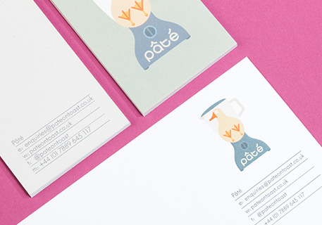
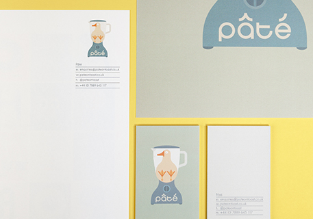
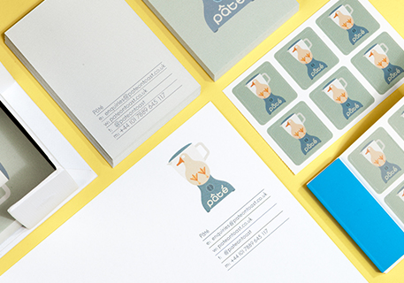
Naturally, with such an impressive body of work behind him, we were thrilled when Paul turned his talents to Letterhead. Already a MOO customer, he was equally excited to put his trademark warm and witty cartoon characters all over his customer-facing correspondence. “Printfinity is great,” he tells us. “It’s what gave me the idea of using the Letterhead like a portfolio with every reverse side being a different image of my work.” Taking the idea to its logical, artistic conclusion, Paul offers another brilliant use case (that we admit we’d not thought of). “I like the idea that people who receive a letter from me also get a lovely printed letter-sized poster,” he says. We agree - a beautiful bonus print is sure to make any customer love him just a little bit more than before.
The collection of images Paul chose for these multi-functional posters is perfect – bold, simple, wry, and unmistakeably his. Most importantly for Paul, the paper stock is premium enough to highlight both the brightness of his colour palette and his dedication to customer satisfaction. “Paper stock and print quality are really important to me. I think it’s essential that every interaction a client has with me is a quality one. I think my Letterhead says ‘Here is a person who cares about his craft.’”
Whose wall is it anyway?
As wonderful as posters for clients are, they’re certainly not the last stop on Paul’s Letterhead tour. In fact, he’s singlehandedly planning the comeback of the letter itself! “I’m planning on using the Letterhead to contact art buyers to arrange portfolio viewings,” he explains. “Sending a letter rather than an email is a much more personal way of communicating and shows a little more effort.” It’s certainly an attitude that freelancers and entrepreneurs have in spades – after all, when the competition is as fierce as it is in the arts, it’s important to do whatever it takes to help yourself become your clients’ favourite. But Paul’s got designs on more than just their minds – he wants to get into their offices as well. “Yes, I want these Letterhead to secure lots of meetings,” he says. “But I also want the art buyers to use the letters as posters and pin them up. That way I’ll have perfectly targeted mini-adverts on the walls of lots of great design and advertising agencies.” Looks like those years in advertising just keep paying for themselves!
Check out Paul’s gorgeous designs and pithy puns – and while you’re at it, why not have a look at some of our Letterhead designs, or make your own?
- Written on:
- 23 Dec 2014
- Categories:
- Business Card Ideas, Luxe Ideas, Letterheads
Create your own Letterheads
- Upload your images These can be photos or full artwork. Alternatively import images from Flickr, Facebook or Etsy.
- Or browse MOO templates Use one of our layouts to create professional and creative cards
- Make your cards! In no time at all have amazing MOO cards to share!
- Start making now


