A layered approach: Steven Wilson on experimental design

A recent host of Friday Night Sketch, Steven Wilson’s designs have attracted globally recognized clients to his studio. MOO finds out how his career took shape.
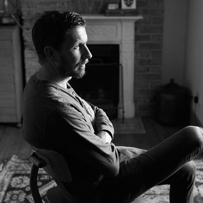
Born in London, Steven Wilson studied illustration at the University of Brighton, where he now runs his eponymous design studio.
His bold, graphic takes on everyday objects, blending analog and digital techniques, have attracted high-profile clients including Nike, MTV, The New York Times, and Karl Lagerfeld.
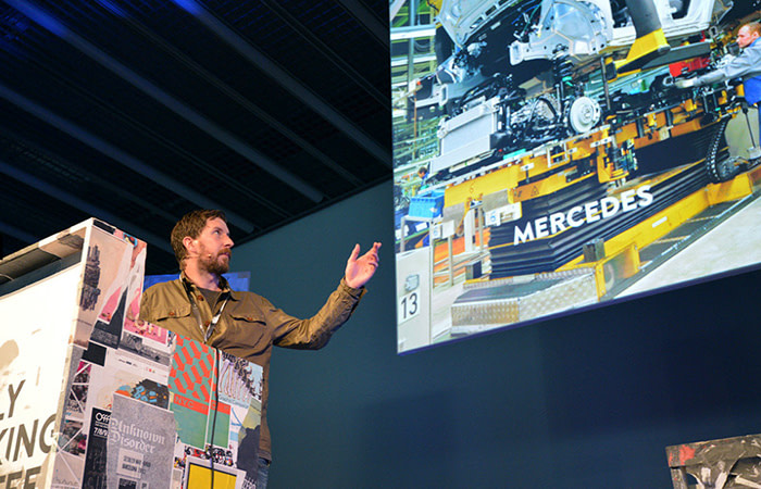
Steven recently hosted Friday Night Sketch at the Design Museum on the topic of drawing with shapes. MOO caught up with Steven to discuss his tips for graduates, how shapes have influenced his work, and how a Xerox machine helped him develop his distinctive style.
How did you develop an interest in illustration?
Neither of my parents were particularly creative, but my grandad enjoyed drawing, and would come over every Sunday so we could sit together and draw. We’d sketch stuff we saw around the house, or he’d bring round a book of photographs and we’d try horses and animals.
Because I was drawing regularly, I eventually got fairly good compared to my peers, and when people tell you you’re good at drawing, it becomes your thing – something you want to impress the other kids with.
How did your style evolve from those early days drawing with your grandfather?
I’d learned to represent an object as the eye sees it – but when you get to university and study illustration, it’s about creating your own visual language. I had to rethink how I was approaching my work – I still find it difficult diving in, doing something abstract and feeling completely satisfied with it.
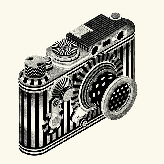
Even if I’ve made an object quite abstract afterwards, I like to have something in it that’s recognizable and relatable. For example, I was asked to draw some icons for the launch of NYCGO in New York, including a hotdog and a trainer.
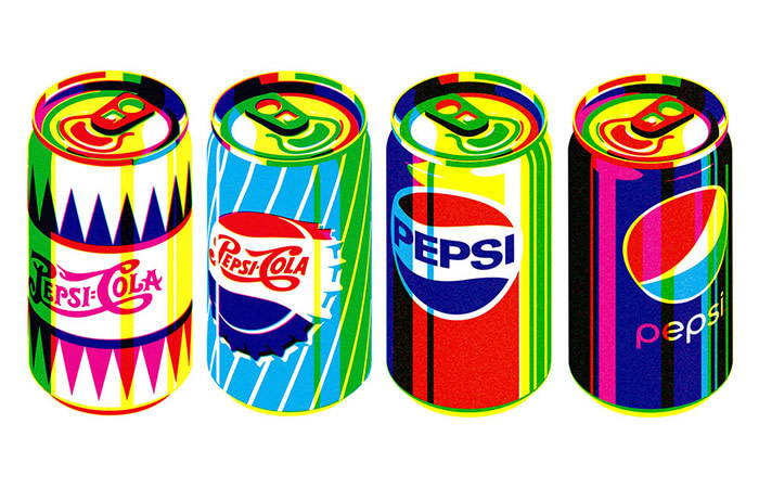
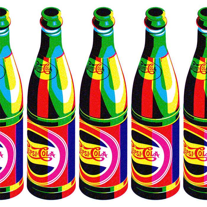
The way I approached the project was to separate each image into different layers of color. Looking at each layer on its own, the image is unrecognizable. But when they come together, you’ve produced a unique take on a familiar object, which is a theme that runs through my work.
What inspired your signature layered printing technique?
At university, the screenprinting studio was always busy – but I really liked that process of separating work into layers and printing them up in a very graphic way.
Then, I read a book by David Hockney, who reproduced the same technique on a color Xerox photocopier. He’d convert a drawing into three layers using black templates, then copy them onto a single sheet of paper, adding a different color for each layer.
With screenprint, you can spend two days on one image, but using Hockney’s method, I could recreate the same look in minutes. Because it was so quick and cheap, I could easily experiment.
I worked out that cyan, magenta and yellow were the three colors that worked best with the technique, because when they overlaid, they produced really nice secondary colors.
I use exactly the same principle today on projects including my Karl Lagerfeld collection – only on a computer. And I still find old books or posters and use them to lift another artist’s technique, rather than their visual style or aesthetic.
How did your career get off the ground after graduation?
I naively set up as a freelancer illustrator straight out of university, and got nowhere for two years. I’d look through magazines and newspapers for art directors’ contact details, then either send out Postcards of my latest work, or email samples over.
Eventually, I got my first paid commission from The Guardian, after someone took a chance on me – sometimes, you just need a break to get you going. After that, a friend helped me land a job creating an album cover, which lead to designing a poster for MTV, which helped me get an agent – and my career moved on from there.
What are the benefits of working with both analog and digital techniques?
At university, everything was analog – when I left, illustrators were on the cusp of using computers. So for the two years after graduating, I had to teach myself how to use Photoshop.
It was a steep learning curve, but exciting discovering digital tools for the first time. I’d combine analog techniques, like paint splats, with digital drawings, and that was the style that eventually got me noticed.
Because of my background, I tend to be quite experimental and versatile – there are a huge array of possibilities of how I might answer a brief. Sometimes I still do things by hand, sometimes I go very digital with 3D or animation, and sometimes it’ll be a combination of the two.
You hosted Friday Night Sketch on ‘Drawing with Shapes’. Do shapes play an important role in your work?
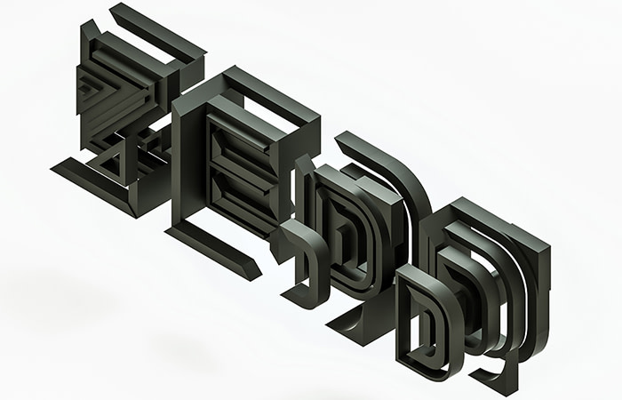
Because I like to experiment, I also try to set rules and restrictions for each project, to narrow down my options – and using shapes is one of the ways I do that. It’s something I’ve learnt to do more of as I’ve gone on.
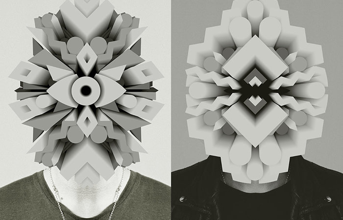
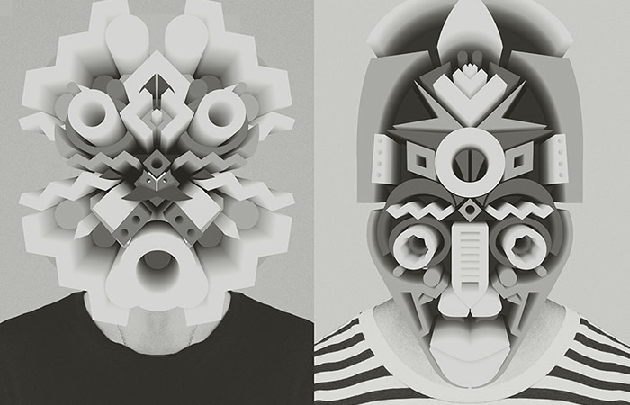
For example, I did a project for the Offf festival in Barcelona, where I had to make a set of masks. Offf’s logo is just three very graphic shapes, so I added some of my own and made the masks using only eight or ten different shapes. Restrictions help to focus my mind, and the end result is work with a stronger identity.
What’s your advice for new design graduates?
Perseverance. Too many graduates from my class got full-time jobs in other areas, thinking they’d come back to illustration – but if it’s genuinely what you want to do, the best time to establish yourself is when you’re young.
I also think it’s important to be open-minded. Too many students get stuck in styles of working, but through trial and error, you can discover great new things. Your mistakes might even lead to the style you end up becoming associated with.
I’ve had friends who’ve been very successful illustrators for a short time, but then their style has become used to death, or not relevant anymore. Being versatile gives you a better chance of a long career.
Excited by Friday Night Sketch? We asked artist and educator Soofiya to give us their take on Mapping Memories
Keep in touch
Get design inspiration, business tips and special offers straight to your inbox with our MOOsletter, out every two weeks.
