Say yes to these wedding invites
Get inspired with these amazing wedding invitation designs by our very own MOOsters.
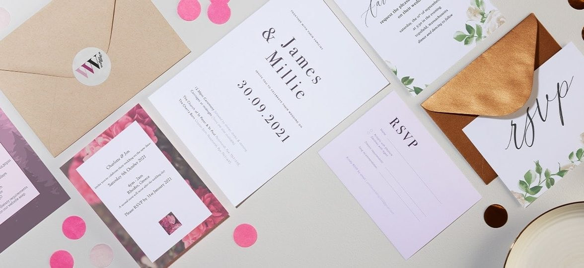
The wedding invitation game is a tricky one. There’s so much to consider – you’ve got paper, design, format, font – the list goes on. Incidentally, quite a few of our own recently got hitched – and so we thought you should see their wedding invites too, because if anyone, you can count on a MOOster to do it right.
And spoiler alert: they’re MOO-made (and they’re a big yes).
Millie: wavy minimalism
Millie Davies is our head of design in London. She designed the stationery herself for hers and her now-husband James’ wedding – a self-confessed challenge. “It’s always very hard as a designer to design for yourself, but I am really pleased with how they turned out”. Needless to say we simply had to see her wedding invites.
Millie chose matte Half Page Flyers for the main invitation and Small Flyers for the RSVP card. She designed the cards with a minimalist and modern vibe, and a subtle nod to fall. “We initially had our wedding planned for November 2020 so I had used autumnal colors. When it moved to September 2021, we decided to stick to the color palette.”
For her wedding invitation design, the couple wanted to reflect their relationship rather than a specific theme. “We just wanted something that felt personal to us and that also felt special” – starting with the fonts. “I chose two fonts that felt very us: Gill Sans and Bodoni 72. I love the mix of the serif and sans serif. It felt timeless but also fresh and modern. I started playing with type and it all came together!”
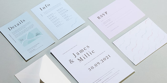
She picked matte Flyers for their beautiful, keep-worthy quality. “I love the quality of the paper, it made them feel really high end – something you want to keep.” She also added “I used all sorts of MOO products for my wedding. It was great knowing I could create a cohesive high-quality set of stationery.” As a MOO expert, Millie picked the right product for every purpose: Luxe Business Cards for place cards, Gold Foil Postcards for table names, square Cotton cards for sparkler cards, Round Stickers for the confetti bags, and finally, Original thank you cards.
Millie’s wedding didn’t just sparkle because of their stationery, though. Her favorite anecdote from the wedding was in fact a surprise – and was just as sparkly. “We had gone outside with all our guests to light sparklers (amazing AND scary). But then, as we were outside, this amazing display of fireworks went off. My husband James had surprised me and it was amazing; such a special moment!”
Lauren: natural beauty
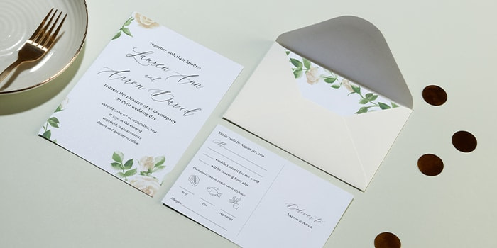
Lauren Ricciardi is a senior marketing manager in Boston. For her wedding, she used medium and standard size Luxe Postcards with a black seam. Lauren is not a designer, but she entrusted another (ex-)MOOster with the ideas – graphic designer Sarah Heingartner.
She wanted a simple, clean and elegant look that would reflect the aesthetic of their wedding. “Our wedding was at a mansion within a state park, so there was a lot of natural beauty, greenery and flowers. Since it was on a late summer’s night, we were outside for most of it, either in a small courtyard garden or under a tent with soft lighting and chandeliers hanging with greenery and flowers.”
“We wanted everything to feel soft, and romantic, so we chose a palette of primarily green and white/creams. This theme transcended our invitations, with floral prints and a refined font.” Plus, the luxurious feel of the cards perfectly complemented the muted elegance of the design.
She also went full MOO with their wedding stationery. “We gave out wedding favors with Postcards inside and a welcome message. We also used Rack Cards for our menus and MiniCards for our escort display which was a wall of bud vases with flowers and guests’ names attached via the MiniCards and string.”
Lauren’s favorite memory from the wedding? “I loved our first look before the ceremony. We did it privately on a little bridge away from the mansion and it was a special way to start the festivities and have a moment to soak it all in just us two.”
Rob: woodland wonders
Rob Wilson is our lead photographer in London. Lucky for us, he was pretty keen on photographing his own wedding invitations alongside his co-MOOsters’. He picked small Super Postcards and, like Millie, designed his own invites for the occasion.
With woodland as the theme of his wedding, Rob drew inspiration from the reception venue for the design. He worked with a color palette of pink, black, burgundy and reds’ to reflect it, and to top it all of with, designed a beautiful logo to combine his and his partner’s names. Could this be the ultimate wedding goal?
Like Millie and Lauren, Rob didn’t stop at beautiful double-sided Postcards. He used Flyers for the service, small Postcards for the woodland’s map, Round Stickers for wedding favors, Luxe Business Cards as place cards, and completed the stationery suite with thank you Postcards.
Rob’s thank you card has a nice story too – and might even give you ideas. “I had many photographers at the wedding, naturally, but one of the best bits was having a drone for the group photo that we used on the thank you Postcards for everyone.”
Charlotte: pretty in pink
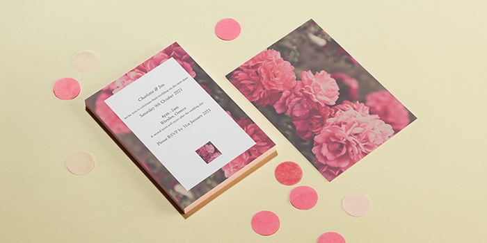
Charlotte Pelham is a people partner in London. She told us that the MOO templates actually came in handy when she began designing the cards for her wedding in Greece. “I love the MOO templates – and for someone who doesn’t like spending too long decision-making, these were perfect.”
Charlotte used the Millie & Mason wedding invitation design template on a small Luxe Postcard with a matching pink seam – her favorite color. “Whilst we hadn’t decided on a theme at that point of sending invites out, we knew that we wanted to get married in Greece and the pink flowers on this design reminded me of the beautiful bougainvillaea trees you see over there.”
“Funnily enough, our theme ended up having a completely different look and feel! Lemons, oranges and olive trees.” In Greece, the wedding stationery reflected this new, sunny theme. The couple used MiniCards for place cards,wedding favor labels, and medium Postcards for the menus and table plans. “All Luxe with yellow seams, of course.”
Luxe’s color seam became a staple of the wedding. “My favorite thing about Luxe is the look and feel. Everything about them oozes premium. Many of my guests complimented the quality and how eye-catching my table plans were.”
Like Millie, though, one of Charlotte’s most precious memories from the wedding was a surprise. “The best man and my bridesmaid collaborating on the best man’s song, changing all the lyrics of The Last Time by The Rolling Stones (my favorite band) to include my partner’s surname… ‘This could be the last time, maybe the last time we see Wise’. We couldn’t believe he’d managed to drag a guitar on the plane to Greece and keep it a secret for so long! It was absolutely unforgettable, as is the song which goes around our heads on many occasions.”
Make your wedding invitations feel extra special with Luxe and MOO’s full stationery range.
Keep in touch
Get design inspiration, business tips and special offers straight to your inbox with our MOOsletter, out every two weeks.

