18 creatives who use spot UV designs to shine
Here’s how our customers used spot UV gloss finishes to add some extra “wow” to their branding.
Here’s how our customers used spot UV gloss finishes to add some extra “wow” to their branding.
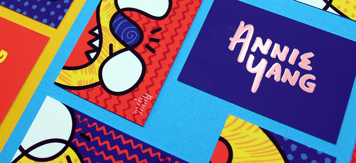
1) Annie Yang: bright and playful
Born and raised in New York City, graphic designer Annie Yang incorporates wit, colour and playfulness into her work, which she creates for non-profit organisations around the world. Her original spot UV business card designs reflect her bold and creative visual identity.
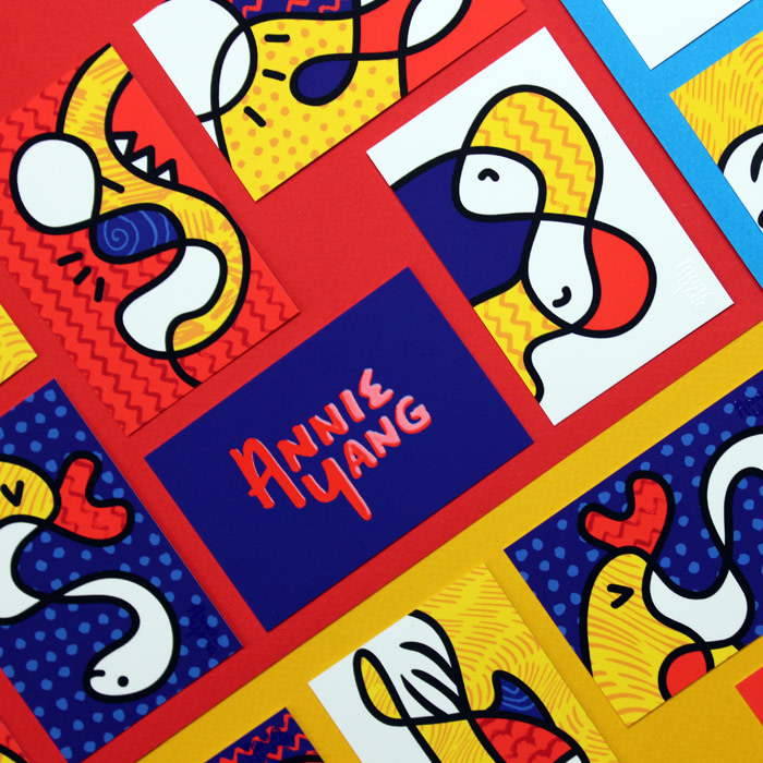
“To create my personal cards, I scribbled random black lines with strokes and colours – it was fun not knowing what the end result was going to be. Using Printfinity was great because it allowed me to add Spot UV Gloss on different areas of each card. I like how my logo catches the light, mimicking the flash of ink, and drawing people in to take a closer look.”
2) Adèle Leyris: the hidden shine
Adèle is a London-based illustrator, specialising in lifestyle and botanical compositions. Working primarily with watercolour, she creates beautifully naturalistic paintings that are full of stories and surprises – a theme that she has cleverly carried through to her business cards with a clever UV gloss coating.
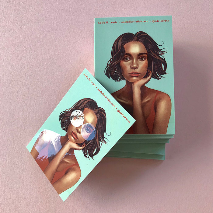
“I really wanted to play with the idea of layers by adding Spot Gloss to the matte surface of the Super paper stock. It doesn’t just add another dimension to the texture, it adds a surprise element to the story too. In this case, I added glasses and a transparent shirt to my character, and a flame to a match. I love seeing people smile and the excitement in their eyes as they discover the hidden shine!”
3) Phalen Reed: clever highlights
Minneapolis-based designer Phalen Reed mixes classic typography with bright palettes. Her attention-grabbing UV card designs were created as part of a rebrand, and all read: ‘tell me about your project’.
“I used Spot Gloss sparingly on both sides of my cards for a bigger impact on key details such as name, contact information and logo. Outlining my logo in the spot gloss on the back of the cards gave them that beautiful seal-like shine.”
4) Robert Hranitzky: embracing 3D
Designer Robert Hranitzky has an impressive client list, working with big brands, including Apple, Adobe, and BMW. From his Munich-based studio, he works on animated projects spanning film titles, trailers and live action. He created clever 3D business card designs as a nod to his activity.
“Large parts of my work involve 3D animation, so using Spot Gloss was a great way to translate the idea of another dimension into my branding. Adding shiny gloss to the smooth Soft Touch Business Card surface created a really inviting and tactile effect. Everyone rubs their fingers over the card instinctively to check it out!”
5) Ever Atelier: off the wall designs
Ever Atelier is an art studio based in Dallas, founded by friends, neighbours, artists, and now collaborative business partners, Sarah English and Ashley Leftwich. The creative duo have pooled their skills in fine art and interior design to create beautiful wallpapers. Their 3D business card designs give life to their creations with a tactile finish.
“The Raised Spot Gloss has a quality shine that gives a sense of passion and presence to our Square Business Cards. They feel special, and perfectly echo the surface designs we create in our wallcoverings.”
6) Sagrado Studio: bold and shiny
Husband-wife duo Carlos and Janet teamed their skills in brand strategy and graphic design to start their own business. They now run Sagrado Studio together in their home city of Madrid.
The location of their client, a Miami-based video production company, was the starting point for building the Think Twice brand identity and creating their colourful UV card design. “The gradient backgrounds reminded us of the bright colours of South Beach”, Carlos explains. “We chose Super Soft Touch Business Cards with Spot UV Gloss finish. The colour integrity is outstanding, and the result is shiny, bold, and confident.”
7) Lauren Kavanagh: subtle glow
Outside of her career working as a creative designer for a surface design company, Laura works on freelance lettering, illustrations and visual identities for independent local businesses in her home town of Chester, UK. She used the UV gloss coating to make her business card stand out in a subtle way.
“When creating my own visual identity, I wanted something that would stand out, so I made an illustration of myself working away. Spot Gloss was perfect for adding something a little different – it’s subtle, but shows that attention to detail. The texture feels lovely, and they always make people smile!”
8) Frankly: bright and friendly
Led by their ethos of creating “solutions that turn heads and touch hearts,” Frankly work with purpose-driven brands to create visual identities that better connect them with their customers.
“I wanted the 3D business card design to feel simple, bright and friendly,” says founder and creative director, Heather Mackey. “I designed my rounded corner business cards to feature a statement colour and Raised Spot Gloss for a subtly inviting, tactile touch. It’s little details like this that can really lift a design. Although small, they are noticed, and they do matter. A business card speaks for you long after you’ve left the room, so I’m proud to leave behind a design that looks – and feels – like quality.”
9) Vee Design: cards with personality
Vianna Palacios is a Puerto Rico-based graphic designer, specialising in branding for businesses. This passion for visual storytelling is clear from her own branding, where she uses pattern and texture to showcase her personality. Her spot UV designs are a perfect example of her bold and modern style.
“Business cards act as a direct representation of yourself and your image. As a designer, it was important that my cards show my personality and creativity. Raised Spot Gloss makes any design pop, so you’re walking around with a guaranteed conversation-starter. I think that’s why my clients absolutely love my cards!”
10) Tyler Pate: tactile designs
Tyler Pate is an illustrator and art director based in Charleston, SC. Working with his client, he communicated their initiative to get more people outside in nature through a refreshed brand identity, utilising UV gloss coating in a clever way.
“I combined the rugged textures you get from lino carvings, with the simple, clean badges you find in the Boy Scouts. The Super paper stock is a great weight and I’m a huge fan of spot gloss – it’s a hidden treat that brings the design to a whole new level of awesome!”
11) Azadeh Sahraeian: contemporary textures
Azadeh is an architect living in Maryland. Drawing her inspiration from the natural world, she moved her design medium from bricks and mortar to pen and paper, creating intricate drawings with a ‘living’ quality. Raised spot UV printing helped her give life to her designs.
“I chose Rounded Corners with Raised Spot Gloss to show the three dimensional nature of my artwork. I love the matte finish on my cards, and everyone is impressed by the quality and the design.”
12) Magenta&Green: sensorial calligraphy
Graphic designer Jo Drayton runs her own consulting and design studio, Magenta&Green, where she satisfies her passion for typography and print projects through calligraphy, murals, packaging and offset printing. Spot gloss coating helped her give a multisensory quality to her designs.
“As a designer, I want people to trust me with their brand, so my cards have to represent me. The Soft Touch finish gave me the right surface feel, and the Raised Spot Gloss draws attention to my wordmark, making people rub their thumb over the stock. We’ve become so digitally focused that we forget our work is there to be experienced.”
13) Mia Saine: fun, glossy details
Mia works as a freelance graphic designer and illustrator alongside her 9 to 5 graphic design job. Influenced by shapes, nature and colour, she uses her cheerful style to bring brands to life through creating visual identities. She used spot gloss varnish to highlight clever details in her designs.
“I love that my business cards express who I am – a fun, loving individual,” Mia tells us. “The contrast between the Spot Gloss shine and matte finish of the Super Business Card stock communicates excitement, and the soft touch surface changes my business card from being a piece of print, into an enjoyable personal experience. I love quality products – especially when they’re created to last.”
14) Jen Bennett: simple and memorable
Jen Bennett is the creative director of her co-founded agency, providing guidance to smaller businesses and entrepreneurs on how to tell their brand story.
“My cards were designed to look simple, fun and memorable – the spot gloss really adds an extra dimension to the simple colour-on-colour style. I printed on Super paper because the silky texture of the stock feels amazing. Clients always comment on how soft and smooth they are!”
15) Cheryl Oz: sexy business cards
Illustrator Cheryl Oz creates artwork for reproduction on gift wrap, greeting cards and art prints, as well as running her own Etsy shop where she sells her designs. She works across a range of mediums, but mainly paints in watercolour and gouache. She used UV gloss coating to add some extra “wow” to her cards.
“I recently designed a new portfolio website, so I wanted to design my business cards to represent my new look. I chose the Super paper stock for the super soft matte finish. I have a thing about texture, especially soft textures, so it seemed fitting to use this stock for my cards. Since my card design is very clean and simple, I wanted to use Raised Spot Gloss for a beautiful, wow factor on my logo. My initial reaction fresh out of the box was ‘Wow, these are sexy business cards — if cards can be sexy!”
16) Tom Gordon: dark and glossy
Tom is a freelance designer specialising in print and merchandise for the entertainment industry. His eclectic style varies from clean cut designs to dark, abstract artwork. His spot UV design plays with the contrast between the matte Soft Touch finish and the glossy, textured special finish.
“I’ve been using MOO for years, and am always impressed by the thickness and quality of the cards. I printed Super Business Cards with Raised Spot Gloss to create a striking black-on-black look that ties in well with the music-related design work I do. The reaction is always positive. Most people who see them insist on having one for themselves even if we’re already connected!”
17) Rainy Day Prosper: drops of light
After starting her career as an in-house graphic designer and photographer, Angela Prosper decided to open her own boutique design and photography agency in Seattle, where she works with small businesses to fine-tune their online aesthetic.
“When you’re a design consultant competing against so many others in a city, how do you stand out? I knew I needed a bit of magic and surprise to go along with any first impression, so I created Spot Gloss rain drops that only reveal themselves when they catch the light. That tactile difference of using gloss is like tasting an amazing dessert for the first time and just adds to the effect when I hand my card out.”
18) The Silent P: turning up the volume
The Silent P are a design and illustration studio, working mainly in the music industry. From album artwork, to business cards and band merchandise, they created a fresh new look for their musician clients, Bob Sinclair & The Big Deals.
“We designed the band logo for album releases and merch, but the band wanted a good clean business card to hand out at events. The Raised Spot UV Gloss effect was a perfect match to highlight the band logo and name.”
Print your spot UV designs to life on Spot Gloss or Raised Spot Gloss Business Cards.
Keep in touch
Get design inspiration, business tips and special offers straight to your inbox with our MOOsletter, out every two weeks.


