4 Postcard designs that send the right message
From wedding invites to flower inserts, we spoke to the MOO community about the many uses of a MOO Postcard.

Commonly, Postcards are used for casual correspondence, as a souvenir and to mark and share your adventures of travel. But did you know that you can use those creative formats for a whole host of things? They can become invitations, frame-worthy art, food and drink menus and much more.
But that’s not all either – explore a range of shapes, sizes and finishes, including Gold and Silver Foil, as demonstrated by a few of our favourite postcard design ideas from the MOO community.
Julia Walck: Cherish your wedding day forever
Julia Walck is a design director and collage artist based in Los Angeles. Julia had previously used MOO for Business Cards and Postcards for her own marketing and was always impressed with the quality. “I knew I could pair that quality with good design for a real wow moment.”

She shared “I try to infuse as much fun as possible into my work through conceptual thinking and bright colours paired with a vintage aesthetic.”
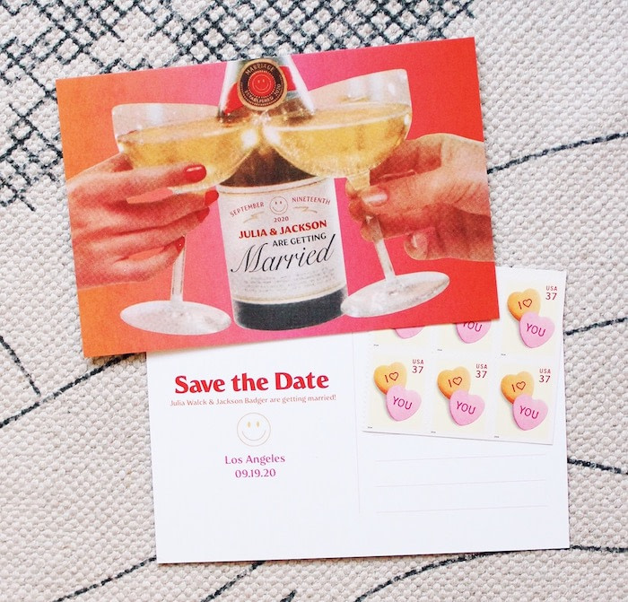
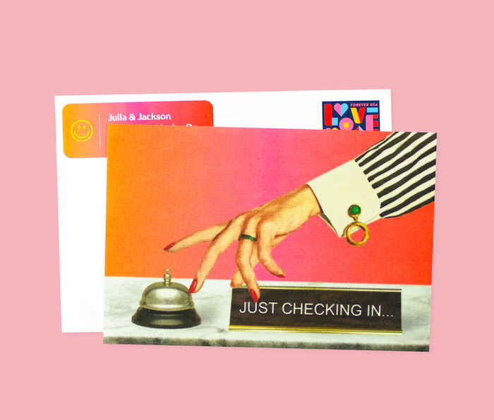
Julia also mentioned that she chose MOO for the sheer amount of options on offer. “The save the dates were 4×6 Original matte Postcards, the re-save the dates were 4×6 Super Soft Touch Postcards, the survey check-ins were 4×6 Super Soft Touch Postcards… It was at this moment I finally ordered some return address labels because I was tired of writing so much mail!

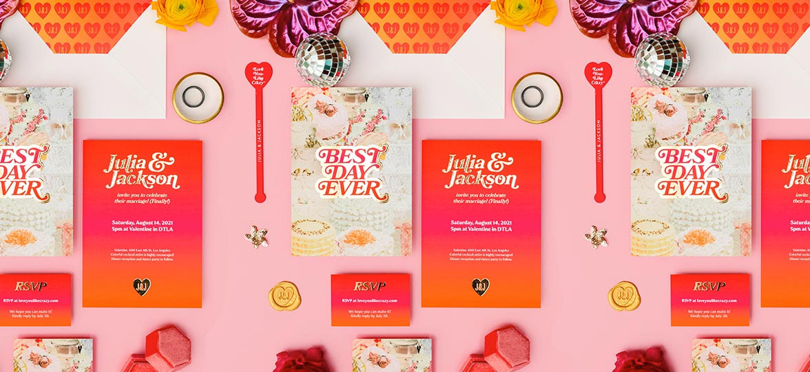
“And last but not least, the actual wedding invites: This is where I knew I wanted something extra special, so I sized up and added some weight and shine. We went with 5×7 Gold Foil Super medium Postcard design for the invites, and Gold Foil Business Cards for the RSVP cards.”
Each Postcard layout along the journey featured a vintage-collage spin blended with the wedding colour palette: yellow, orange, red and pink. The save-the-dates were a celebration that depicted a couple cheers-ing with the original wedding date and announcement. But after being rescheduled, the Postcards were sent once more and featured a ‘take 2’ clapper, to make light of the situation. (Julia lives in LA with her husband, a video editor – so this seemed fitting.)

The invitations are really where she let loose. “The gold foil felt like an announcement that the celebration was ON. It was exciting seeing it lighting up our names and monogram J+J heart logo alongside our gradient and info about the wedding.” That’s a cool postcard if we ever saw one.

What is Walck up to at the moment? “I recently designed some beer koozies that will be going up in my webshop, juliawalck.com, alongside other fun barware, art prints and accessories.”
For inspiration, Julia recommends the following: Jimmy Marble, Rachel Burke, Adam J. Kurtz, Michelle Norris, designlovefest and Dust-to-Digital.

Postcard Thrift: A very personalized thank you
Barbara lives in New York and works as a UX Researcher by day and professional thrifter on the weekends with her micro store, Postcard Thrift.
When it came to creating her beautiful Postcards, she opted for a glossy finish on one side and a matte finish on the other. “Since I write a personalized note with every order, I thought it was fitting to design a ‘Thank you Postcard’. MOO is great for my small business and I definitely took advantage of the anniversary sale discount.”

She also chose a checkerboard design, citing that it’s “really on-trend at the moment, and I wanted to pair a very relevant design with the vintage feel of my logo. Before deciding on a final design I posted a poll to my Instagram stories to let my customers help decide on the final project.”
We also asked Barbara what fun projects she has coming up that she’d like to share with us. “Currently, I’m thinking about designing custom poly mailers but looking for a more environmentally friendly option.”
Her advice for those making their first Postcard designs? “If you’re making a custom design, check then re-check the bleed area. Then after clicking confirm, check again while it’s still possible to edit!”

Krystal Zorzi: Positive vibes only
Krystal Zorzi is an illustrator in Toronto, Canada. She describes her work as “whimsical and fun stationery products inspired by a love for nostalgia, travel and architecture.”
When Krystal first started out as an illustrator, she spent a lot of her time researching print options for her work before finding MOO. “Durability and paper thickness are very important to me when designing Postcards, so my go-to on MOO is the standard 4×6 Postcards on Luxe paper.”

The cards she’s designed are part of her “Happy Go Lucky” series. The idea behind this collection was to promote connection during the pandemic when so many people experienced isolation and mental health issues. “I have these postcards available for sale through my Etsy shop and 20% of every purchase is donated to the Centre for Addiction and Mental Health (CAMH).”
Krystal also shared her design process with us. “I thought a lot about the feeling you have when you receive something unexpected in the mail from a close friend you haven’t seen in a while and the effect that something as simple as a postcard has on your day. With all of that in mind, I planned a design that was bright and cheerful and that included a positive message using the font I created specifically for this collection.”

Things are slowing down in Krystal’s studio at the moment as she’s expecting her first baby at the end of summer. (Congratulations!) However, the next project entails a collection of holiday Greeting Cards based on the Twelve Days of Christmas.
Her advice for those wanting to create eye-catching, modern postcard designs? “Put more time into the process work, and not just the final product. Don’t automatically go with the first design that comes to mind. Take the time to try out different layouts, colours, or ideas.
“I like to sketch out at least two or three thumbnails for each idea I have. Then, I might even make a story on Instagram to ask people which design they’re initially drawn to. Having a second set of eyes on my work has been so important in my process, as it helps me to step back and understand how my art is perceived by others.”
One of Krystal’s favourite accounts to follow on Instagram for inspiration lately is Niki Kingsmill. “She’s an incredibly talented watercolour painter and I’m constantly in awe of what she’s making.”

The Rose Petal: A blooming lovely touch
The Rose Petal is a full-service floral company with locations on the east and west side of the majestic Glacier National Park. Their work is featured in the Rocky Mountain Bride, Montana Bride, Montana Woman and more.
When it came to their beautiful Postcards, they worked with creative agency Tilt Made. “We like to rely on the experts to help ensure our brand is always looking its best. They helped us bring our brand to life and led us to MOO.”
The Rose Petal used MOO to add that extra touch of magic to their service. “We include them in our wedding deliveries with a personal message for our couples, or welcome a new business to the neighborhood.”

The Rose Petal shops are nestled in small, tight-knit communities in the Rocky Mountains. Owner Ashley Kavanagh wanted to demonstrate a cohesive, whimsical experience when customers receive their flowers. “Our brand is based on optimism for what’s possible for small businesses and small communities in Montana. That’s been especially important as we navigated the pandemic and changed dynamics in our communities.”
What’s coming up for The Rose Petal you ask? “We’re working with local art club students from Cut Bank High School to bring a mural concept to life with native flowers in our courtyard adjoining the shop.” (Nice work!)
Kavanagh’s advice for someone starting a new batch is honest and simple. “Trust the pros, invest in the customer experience, and have fun with your brand!”
As a brand, The Rose Petal finds inspiration in Montana Woman Magazine. “Montana Woman Magazine is an incredible gift to our state as a storyteller, inspiring brand, and creative force.” Another local gem for Montana.
Explore Postcards for yourself with MOO.
Keep in touch
Get design inspiration, business tips and special offers straight to your inbox with our MOOsletter, out every two weeks.


