The best features of MOO’s design templates
MOO designers walk us through all of the clever design features of our latest design templates.

Our Creative team walk us through the smart features of our latest design templates for our range of Business Cards.
At MOO, we have one mission — and that’s to provide great design for everyone. Whether that’s developing a truly unforgettable and tactile paper feel or fully customizable templates for our products — we make design easy and accessible so you can stand out and look your best.
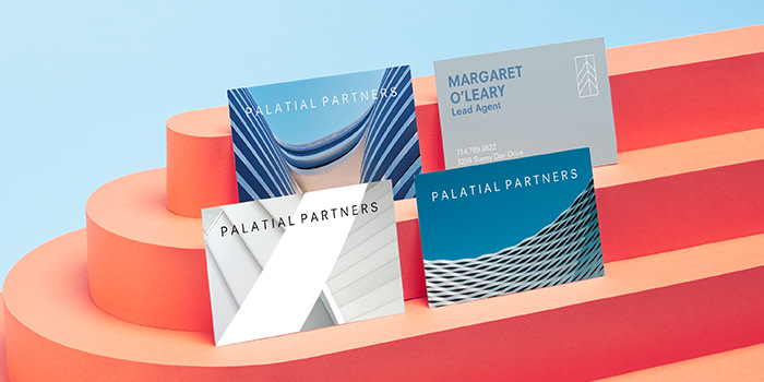
To help you create cards that are as unique as your brand, we’ve created 22 totally customizable Business Card design templates.

From adding your logo, to customizing color schemes, we’ve listened to what you (our creative customers) need from your cards and created templates to help you really get creative (without needing a graphic design degree).
Developing new features for design templates
So, how did these templates actually come to life? We spoke with two of our rockstar designers about all the amazing new details. First up, Head of Design, Millie Davies:
What was the goal with releasing these templates?
Templates are a really good way to inspire people as to what they could create and how they could promote their businesses to the best of their abilities. We looked at a range of different customer segments — from cake makers to designers to stylists.
Although many of the templates are aimed at specific business segments, they’re also entirely editable so you can change the logo, text, photo backgrounds. You really can turn these templates into whatever you need for your business and brand.
As a designer, how did you approach these template designs?
We tackled each template as its own branding exercise. We wanted to treat each design as if we were creating it for a client, imagining what their business was, what it was called and how their branding would look, showing off the best aspects of each business. For example, if you’re a photographer, you’re going to want a lot of options for photos in your template as well as slots for logos and text. We had to make sure we were delivering the best options for each industry’s needs.

Talk us through some of the features of these templates
Previously we’d tried to make the Business Card templates as eye-catching as possible. At times, that meant that the functionality of them was slightly hindered. This time around, we listened closely to what our customers wanted: the option for multiple lines of text and the ability to upload photos and logos. We made sure that these new templates were as flexible as possible so that our customers are able to customize them, making them right for their own business.
So you can add logos to these templates – how did make sure they were integrated within the templates?
Everyone wants to be able to upload logos onto their business cards. We’re making a conscious decision to ensure that, wherever possible, we include a large area that customers can adjust according to the size of their design. From a design perspective, we create fake logos to show customers where theirs can go.
How do you ensure the templates have a level of flexibility?
We worked closely with the Artwork team to make sure we included enough text boxes. The templates are built in another system called Pixel which is what customers see on the website, so we have to build them quite specifically. Partnering with the Artwork team allowed us to ensure the designs had the right level of customization that we were hoping for. They were able to guide us with our design decisions from a technical standpoint which was invaluable.
What do you take into consideration when developing fictional brands aimed to inspire people?
We often work with Product Marketing to make sure that the industries that we pick are ones our customers have searched for or are currently looking for — or even potentially things that we don’t have. When it comes to creating the actual job titles and names, we work closely with the Copy and Creative team to inject some fun and personality to each one.
What kind of testing did you do to make sure the template designs were scalable to multiple industries?
For each template, we made sure there were enough text slots for names, job titles, phone numbers, and website addresses. We also made sure the customer could upload an image or change the colors of their personalized assets.
Once the templates were created, we sent them to the Customer Service team to stress-test the design through a web page mock-up. They provided feedback on how the elements performed, like borders, text boxes or logo slots. The feedback from Customer Service is usually inspired by actual feedback they’re getting from customers on a regular basis.
Designing the Business Card templates
Branding design works best when you get to know the ins and outs of the client and the work that they do. But what about when the branding you are designing is for a fictional company? Well, that’s a different story. And who better to share the details on that process than our very own designer, Phil Bailey, who developed two new templates from an entirely blank slate.
‘Mottled Color’
This design actually developed from a website project to update the page for Luxe — our most premium paper. This project was a bit of an anomaly in that we created this design with the paper stock in mind first, rather than the customer profile. We wanted something that would reflect the premium nature of the product and show the quality of the stock, so we decided to go for a pared-down design.
The speckled creative is inspired by the popular terrazzo trend. Terrazzo is associated as a luxurious, contemporary material, so we wanted to translate that same feeling into the visual identity for our fictional creative agency, ‘Vibe’. We went with a clean typeface, but the template is simple enough that, if a customer wanted a more decorative script or serif font, it would still work really nicely – with our templates, we’ve really tried to ramp up the versatility to give customers as much control as possible.
As we were initially thinking product-first when it came to designing, we wanted to really highlight one of the cool features of our Luxe range – the colored seam. The seam comes in 8 colors, so we created a more muted version of each of the bright seam colors for the front and back of the cards, making the edges really pop.
‘Shape Shifters’
For this design, I created my own fictional customer profile based on the types of customers that we know print with us. This customer, Thomas Laursen, is a German product designer who works in his own studio in Munich. In my head, he’s a product designer; someone who makes really bold statement home furnishings and furniture, like sofas, and lamps.
I wanted to reflect this in his visual identity – using bold colors on geometric shapes to reflect his style. We chose a chunky sans-serif typeface to ensure it didn’t get lost on the busy background, but still feels understated and friendly. We went all lowercase as it’s a very popular trend to print this way – and with this being a modern contemporary business, it suited the customer to a tee.
Bring your ideas to life with our new Business Card templates.
Keep in touch
Get design inspiration, business tips and special offers straight to your inbox with our MOOsletter, out every two weeks.


