Monochrome branding with maximum impact
It isn’t just color that can turn heads – check out three businesses who use monochrome branding to prove less really is more.
Azadeh Sahraeian

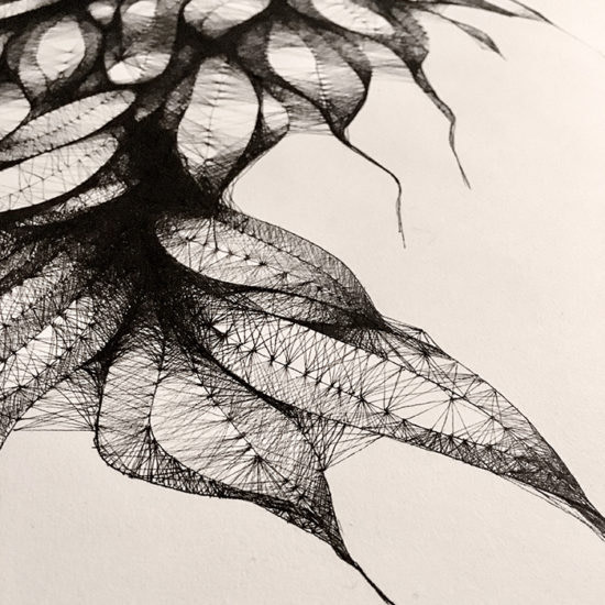
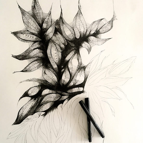
Azadeh is an Iranian-born architect living in North Bethesda, Maryland. After completing her MA in architecture, Azadeh went on to develop a unique approach to architectural design that draws inspiration from her desire to create ‘living things’. “Not biologically alive – I’m not Frankenstein!” Azadeh says, “but things that have a gradual quality of life.”
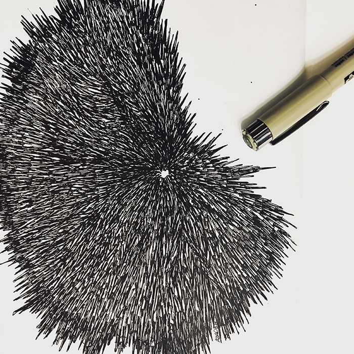
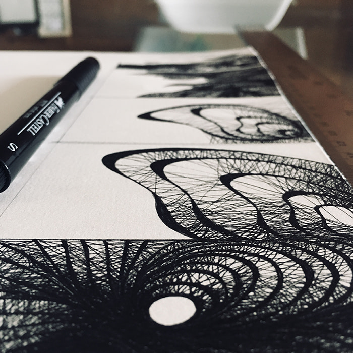
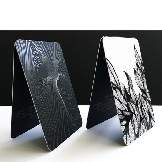
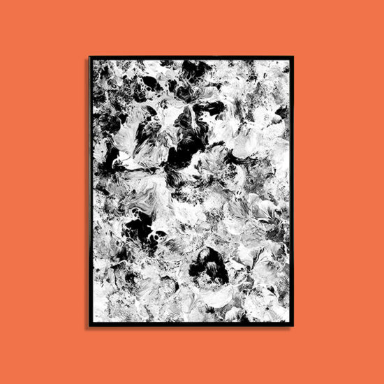
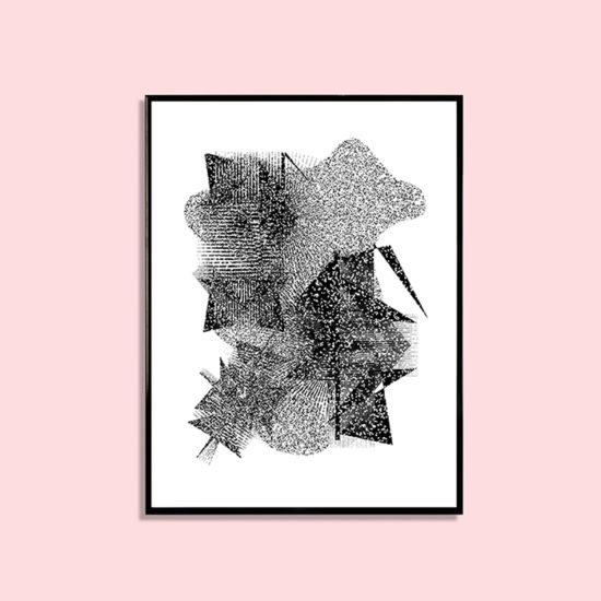
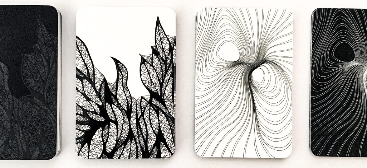
Azadeh transferred her passion for contemporary design from bricks and mortar to paper and ink in 2012 after deciding to experiment with a new medium. Inspired by the backdrop of natural patterns and forms on her daily walks through the woods, Azadeh developed intricately detailed drawings that would become the signature of her brand. “Simple lines with complex morphologies is how I describe my drawings,” explains Azadeh. “I like to emphasize on the formation rather than the form and shape. They’re organic yet abstract; unpredictable yet mathematical; natural yet unusual.”
When it came to designing Business Cards, Azadeh wanted to reflect her monochrome style. “I chose Rounded Corners with Raised Spot Gloss because I wanted to show the three dimensional nature of the original artworks. I love the matte finish on my cards and it seems that everyone is impressed by the quality and the design.”
Create a lasting impression with Raised Spot Gloss Business Cards
Kate Wainwright
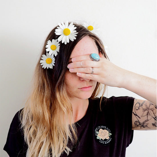
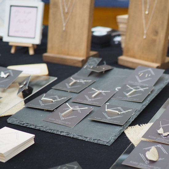
Working as a nurse by day, Kate Wainwright found her creative outlet in the form of metalworking to help her unwind after a stressful shift. After developing her hobby into a fully fledged side-hustle, she now designs and handcrafts jewelry in her workshop in West Sussex, UK.
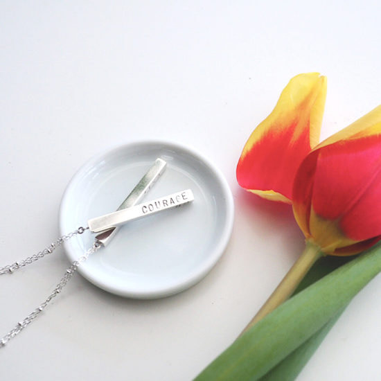
“My business has a strong ethos around ethical and sustainable products,” explains Kate. “I source recycled materials like silver and gold, and only use gemstones that have been ethically mined. I want to create designs that will last years, not just a season, so often I tend towards minimalistic styles that are versatile and easily wearable.” This passion for simple, yet impactful aesthetics is mirrored in Kate’s branding: “A monochrome branding style completely reflects my business; minimalistic and striking, but also lets the jewelry speak for itself.”
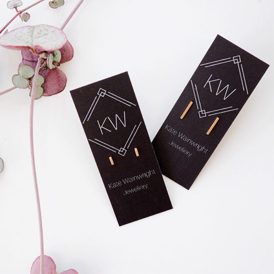
Kate uses Original paper with a matte finish not only for her business cards, but as a clever way to display her jewelry, too. “I love how versatile the MOO products are. I like to double up my Business Cards as backing cards for earrings and necklaces – the matte grey tones really let the metal shine.” In order to keep her branding cohesive and create a beautiful unboxing experience, she also uses Stickers to finish packaging and gift boxes. “I always get a positive reaction to my cards. At markets, other traders often ask where I print them and I’ve also had comments from customers about the quality – I’m really pleased!”
Make every order awesome with our range of Stickers, Postcards and Flyers.
Laura Asmus
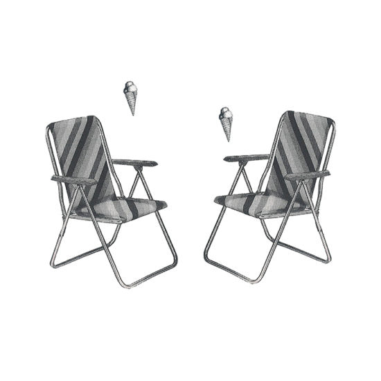
Laura Asmus is a graphic designer living in Hamburg, Germany. With four years of freelancing experience, Laura has brought her talents for type and visual identity to life on a range of creative projects – both professional and personal; from editorial designs for magazines and books, to the world of animation and illustration.
“My inspiration comes from everywhere, anytime. I try to keep an open mind and absorb everything I experience, whether that’s listening to music or even just talking to friends. The best thing about designing is the challenge of finding new ideas. I love making connections between emotional and functional concepts and communicating complex topics through simple, but authentic visuals.”
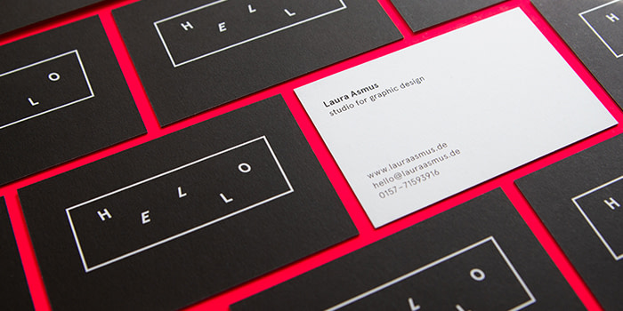
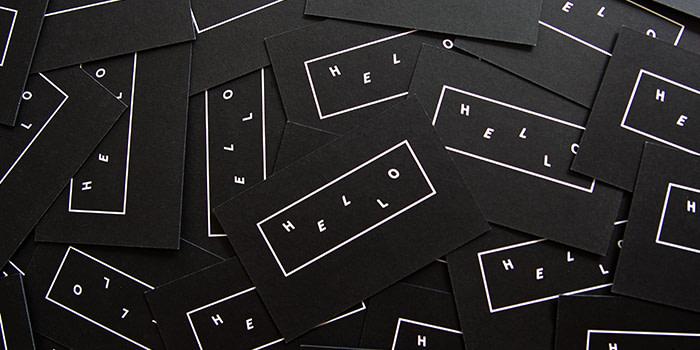
Laura’s Business Cards are a physical token of her love for simple aesthetics. “I designed a classic monochrome black and white design, coupled with timeless yet modern typography. ‘Hello’ is the first thing you say to someone – the beginning of a new story, an introduction to something new and exciting.” Laura chose Luxe paper for her cards to give her aesthetic an extra layer. “Giving my Business Cards to new people is always a fun and engaging experience!”
Make a statement with Luxe Business Cards
Keep in touch
Get design inspiration, business tips and special offers straight to your inbox with our MOOsletter, out every two weeks.
