How six brands are standing out with Silver Foil
It’s shiny. It’s eye-catching. And it can make your cards look amazing. Here’s how.

Everyone likes silver. Everything about it is just so…. shiny. But unless you’re a jeweler, it’s not a material you get to work with everyday. But Silver Foil lets you do just that: a special finish that makes a great contrast against the texture of paper. Here’s how six brands like to print with it.
The Logo Page

The Logo Page is a female-led design studio based in Liverpool, UK.
“We love working with foil and knew this printing technique would be the perfect finishing touch for our clients’ cards. The design was dedicated to my client’s late grandmother, so we wanted something that would work well with the cloud-inspired colour palette and really emphasizes the angel wings on the design. The way the light hits the foil is really beautiful and gives it that heavenly feel.”
Bright Spot Papier

Tania at Bright Spot Papier is a calligrapher, bookbinder and illustrator based in Prince Edward Island, Canada.
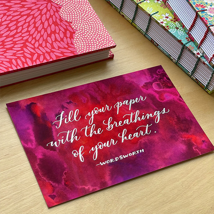
“I designed my Silver Foil Notecards specifically to write special notes of thanks to customers. If you’re working with [it] for the first time, I’d recommend two things. One, ensure that your lettering or text is not too fine or thin. You want to ensure that the line work is thick enough to stand out on your product. [And two], ensure that your background will complement the Silver Foil and not drown it out, since you really want the Silver Foil design to pop.”
Access Health

Access Health is a non-profit community health center based in Houston, Texas.
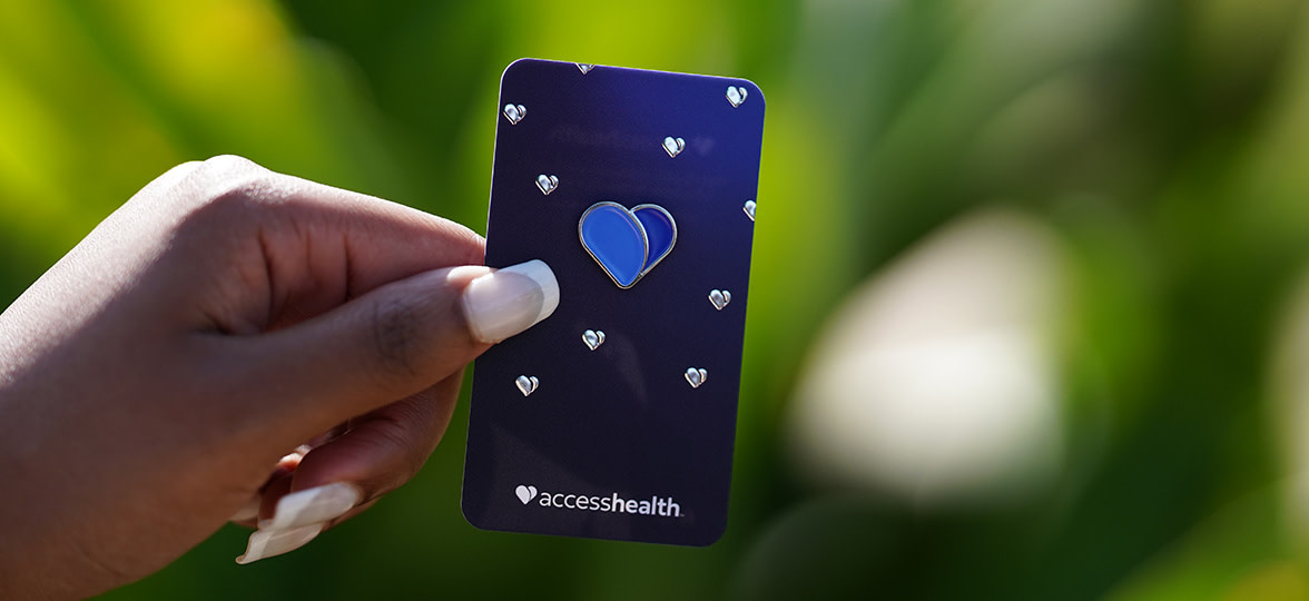
“What we love most about Silver Foil print is its ability to infuse our brand with a sense of vibrancy and excitement. We wanted to create a memorable experience by including an enamel pin of our new logo for everyone. To elevate the presentation, we designed a card to attach the pin to, incorporating Silver Foil elements. [It] not only enhanced the visual appeal of the pin cards but also harmoniously complemented the silver border around the heart of the pin.”
Kempton Studio

Fleur of Kempton Studio is a freelance graphic designer based in France.
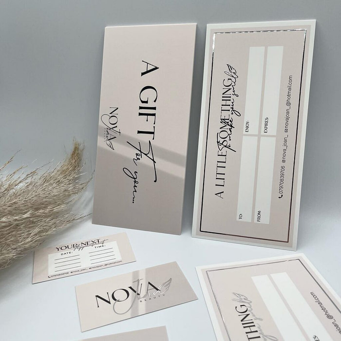
“My nail artist client had a very mystical visual identity and I wished to convey this with her Business Cards. We thought of the colors appearing under the moonlight very early on, so I knew that the logotype and logo needed to include silver for any printed products. The silver finish [reminds me] of the shiny polish on gel nails, so the whole identity was nicely tied together.”
Beth’s Branding Co.

Beth of Beth’s Branding Co. is a freelance designer based in Brentwood, UK.
“I love a foil finish on Business Cards. Gold is very popular but [Silver Foil] is definitely underrated! I don’t think anyone could be handed one of these and not mention how much they stand out from other florist’s business cards. [They are] a definite conversation starter and a great investment for any business.”
“[They are] a definite conversation starter and a great investment for any business.”
Sweet Pea Studio

Sweet Pea Studio is a creative design studio based in Milton Keynes, UK.
“Foil finishes add the extra ‘wow’ factor to any print. Especially in the industries that I work within, adding a special finish to my designs really takes it to the next level. Beauty is a super saturated industry, so standing out from the crowd is key. Adding Silver Foil to these designs gave a high quality, professional finish to the cards that made sure they were noticed. Our advice would be to carefully pick which elements of the design you want to foil. You don’t want to over do it, but you want it to be enough to really make an impact.”
Ready to try Silver Foil for yourself? Get started right here. (And prepare to stand out.)
Keep in touch
Get design inspiration, business tips and special offers straight to your inbox with our MOOsletter, out every two weeks.


