Why 9 out 10 rebrands are pointless
James Taylor, ex-JKR and Global Head of Design at Media Arts Labs on rebrands.

Rebranding is often seen as a quick fix- a new logo or typeface to solve all a brand’s problems. But without a deep strategic purpose, it’s just a paint job.
Many brands jump into rebranding to refresh their image, attract customers, or keep up with trends. Yet, as James Taylor, who previously worked at global creative agency JKR and is now the Global Head of Design at Media Arts Lab, points out, most of these efforts are useless. They gloss over real issues, resulting in nothing more than a superficial makeover.
We talked to James, the man behind one of the most successful rebrands of the last decade at Dunkin’, about the importance of thoughtful rebranding.
The trap of trend-driven design
One of the reasons so many rebrands fall flat is the tendency to chase design trends without a solid strategic foundation. With the rise of AI tools, it’s easy to create beautiful designs. This leads to many rebrands that look strikingly similar. “There’s an alarming sameness in rebranding today, with trends becoming almost ubiquitous,” James says.
The problem with trend-driven rebranding is that it lacks depth. A new logo or color scheme might look good, but if it doesn’t address the underlying business challenges or align with the brand’s core values, it won’t have a lasting impact. “What I’ve always emphasized is the importance of ensuring rebrands are strategic, rooted in a genuine business need,” James explains. Too often, though, rebrands are driven by vanity, or the simple desire for something new, rather than necessity.
“There’s an alarming sameness in rebranding today, with trends becoming almost ubiquitous.”
Agencies aren’t entirely off the hook either. “Sometimes, agencies push rebrands onto clients without asking the crucial question: why are we doing this? Without a clear ‘why,’ the work drifts toward trends because there’s nothing to ground the creative thinking,” James notes.
“It’s critical to ask whether a rebrand is truly necessary or if the same objectives could be achieved through more subtle, thoughtful means.”
The Dunkin’ rebrand: A case study in strategic rebranding

James’s work on the 2018 Dunkin’ rebrand stands as a testament to how a well-executed rebrand can make a substantial difference.
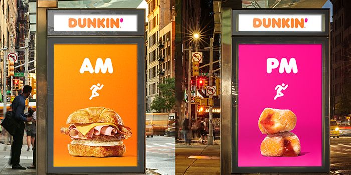
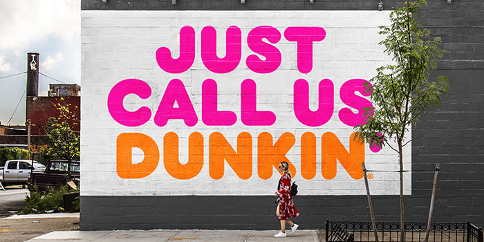
When Dunkin’ decided to drop “Donuts” from its name, it wasn’t just about updating the logo. The change was part of a broader strategy to reposition the brand as more than just a donut shop. “Most people remember the visual outcome—the logo, the images that went viral. But what many forget is that the rebrand was driven by a clear business case for change,” James recalls.
Unlike many rebrands that are reactionary, Dunkin’ was already a thriving company. There was no immediate crisis, but a need to evolve. The rebrand underscored Dunkin’s position as the second-largest coffee seller in the U.S., something many customers were unaware of. It positioned Dunkin’ as an energetic, on-the-go brand that fits seamlessly into daily routines.
The dangers of ignoring a brand’s legacy

Ignoring or undermining a brand’s legacy can alienate loyal customers. James emphasizes the importance of respecting a brand’s history, especially when it has a strong emotional connection with its customers.
During the Dunkin’ rebrand, there was significant concern about how the change would be received, particularly in the Northeast where Dunkin’ has a deep-rooted presence. “Dunkin’ Donuts had been an institution for 50 years. Customers in the Northeast were fiercely proud and protective of the brand. The company had to approach this with great care—it was a decision they pondered for a decade,” James reveals.
“Our ambition is always to honor legacy brands and find the optimal expression of their identity. My philosophy is that when you pick up a revered brand like Dunkin’, your goal should be to put it down in a better place than where you found it.”
5 rebranding lessons from Dunkin’

1. Without a clear purpose, a rebrand will fail
A rebrand should be more than just a desire for change. It should address a specific business need, and amplify other key commercial objectives. Dunkin’s rebrand wasn’t just about updating its look, it was a strategic move to future-proof the brand.
2. Avoid trend overload
Trend-driven rebrands often look good in the short term but fail to resonate with customers in the long run. Dunkin’ avoided this trap by focusing on a timeless and strategic brand identity.
3. Stay true to your brand’s core
A brand should remain faithful to the essence of what made it successful in the first place. Dunkin’ kept its core offerings, including donuts, even as it expanded its identity. Straying too far from your brand’s roots can alienate loyal customers and weaken your brand’s identity.
4. Execute flawlessly
Even the best strategy can be undone by poor execution. Consistent messaging, careful management of the rollout, and attention to detail are critical for a rebrand’s success.
5. Evolve, don’t erase
Too often ego leads to changing everything. Dunkin’s rebrand was about evolving not erasing. It respected the brand’s legacy while adapting to new market needs. Rebranding shouldn’t mean discarding what works; it should be about building on it to stay relevant and growing with your audience.

So what does this all mean? Rebranding might seem like the obvious solution to your brand’s challenges, but it comes with significant risks. Make sure you follow these principles and don’t forget, if you find yourself thinking rebranding might be the answer, check that it’s not your ego talking.
James Taylor has over twenty years of experience in the design industry, with a career that spans from boutique studios to large-scale creative agencies. At JKR, he was instrumental in the Dunkin’ rebrand and is currently the Global Head of Design at Media Arts Lab, a creative agency dedicated to Apple. Also participates in numerous industry jury panels and his work has been recognized at Cannes, D&AD, One Show, ADC, Dieline, and more.
Keep in touch
Get design inspiration, business tips and special offers straight to your inbox with our MOOsletter, out every two weeks.


