Brands made of matter, matter
Uncovering the value of tangible brand experiences with Andy Whitlock.
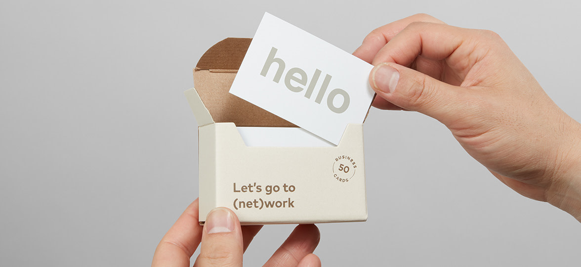
We recently spoke to Andy Whitlock – Founder of ‘The Human Half’ – a strategic brand consultancy. At MOO, we really value people who are good at what they do. As an expert in his field, Andy has kindly shared some of his 20 years of expertise with our community (that’s you guys).
Read on for Andy’s take on the importance of physical, memorable, and sometimes sniffable brand experiences.
It goes without saying that the arch-enemy of brand building is obscurity. If you have a brand, then you want it to be seen, known – maybe even loved! We have a swathe of phrases that speak to this desire: “cut through”, “earn attention”, and the dreaded “make it pop”, which are all (except for maybe the last one) noble quests. We naturally want our brands to have some presence in our audience’s lives. And it would be perfectly reasonable to think that your brand needs to be present in people’s brains before it earns a presence in their life. But actually the opposite is often true.

“Brands aren’t logos, taglines and color schemes, they’re impressions and ideas in people’s heads”.
Brands, you see, are intangible. Brands aren’t logos, taglines and color schemes, they’re impressions and ideas in people’s heads — so your brand is what people think about your company. And yes, this is incredibly annoying, because it’s very hard and very expensive to build impressions and ideas in other people’s heads. This is what makes ‘branding’ so brilliant – it’s our most direct route to tangibility. It’s designing and making things people can actually see and touch. Making it pop (sorry) is one thing, but making it haptic is another.
As a strategic brand consultant, whose deliverables are often conceptual and language-based, I always get most excited by physical manifestations of brands. One of the experiences I hold dearest is when I helped architects, Hawkins\Brown to define their brand positioning. We ended up making an actual physical handbook called ‘The Philosopher and the Flamingo’, which the directors keep in their actual top desk drawers, presumably next to other actual objects like staplers and Sharpies.
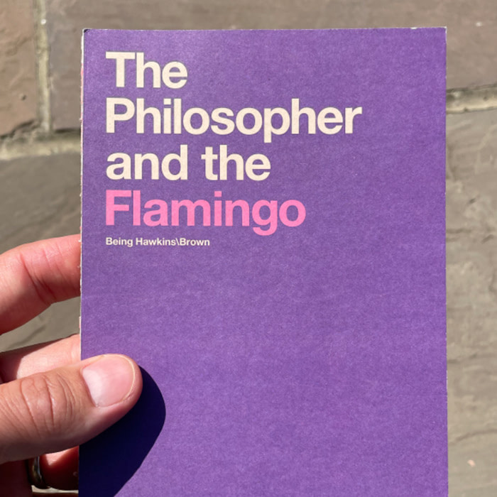
Even better, said handbook contains ideas that are, as I type, influencing actual design decisions on actual buildings. (My heart’s all a flutter just thinking about it). But buildings aside, there’s no denying what a step-change it is to go from branded digital assets to actual objects that are resting in people’s hands and printed with ink you can actually smell. That might sound old-school, but it’s possibly more relevant than ever.
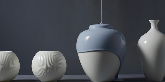
In recent years I’ve found myself getting especially drawn to branding jobs that manage to achieve or evoke palpable physicality. Branding studio, SomeOne did a lovely piece of work refreshing Wedgewood’s brand. It features gorgeous videos of gloopy, dripping paint and photography of paint powder that you can practically smell.
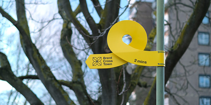
Fieldwork Facility created some absolutely delightful real-world signage for Brent Cross council; bright yellow arrows that twist and curl playfully.
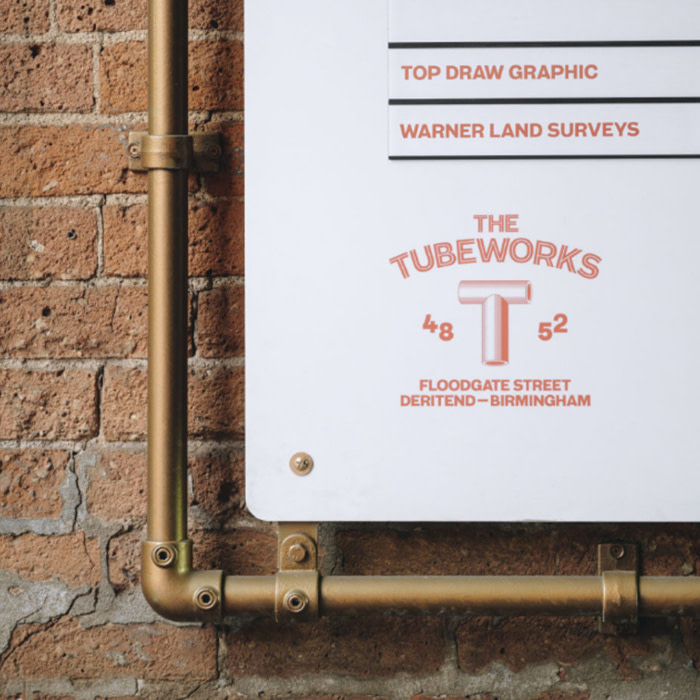
On the theme of signs, Common Curiosity fashioned signage for a venue called Tubeworks out of, you guessed it, tubes. I wonder how many hands have idly fondled those pipes as people walk past.
Although there’s been a recent resurgence in this passion of mine, I suppose it also goes back twenty years to the days that I worked on press kits for the likes of Nike, when we would send materials to the media in metal film tins and bespoke shoeboxes to make the information inside less likely to be discarded.
But whether it’s tubes, twisty arrows, dripping paint or something else, what these examples all share is an intoxicating physicality. Their brands might remain intangible, but these companies are doing a great job of elbowing their way into people’s senses, be it touch, smell, or even taste. Actually, taste is a neat segue into another example. Downstairs, in my kitchen I still have a wooden spoon that came in a Gousto box a couple of years ago. It’s still there. I see it all the time. I pick it up and use it. It‘s made of WOOD. Take that, intangibility. The more digital our world gets (I sound like my dad), the more I think we crave physical things made of actual atoms. I still find it magical watching a 3D printer.
The brilliant thing is that any brand can do this. It can be as simple as a notebook or as daring as an eccentric signpost. Getting your brand in people’s hands (or noses, or mouths) is an amazing stepping stone to getting it into their minds.
This is the bit where I say something about MOO and you think, hmmm so all this was an advertorial. A bit. Not really. I worked with MOO in 2023; helped them with some stuff and they asked me if I would write aa post. The reason I said yes is because I love MOO – always have. (In fact – true story, I used the MOO brand handbook as a reference when we created the Hawkins\Brown one.) MOO has always made branding fun and gorgeous and they’re building out a great portfolio of pretty cool products. So my advice is to take a peek; maybe even order something so you can stroke its edges or give it a good sniff. Then imagine your clients doing the same.
“Pixels are cool, but atoms rock”.
Pixels are cool, but atoms rock. So my advice is: don’t leave your brand on screens and hope people don’t close the tab you worked hard to make them open-—get into the room they’re in. With a nice journal, notepad or maybe a water bottle. My advice about what to put in the bottle? Well, why not make it pop.
Andy Whitlock is founder of strategic brand consultancy, The Human Half.
Keep in touch
Get design inspiration, business tips and special offers straight to your inbox with our MOOsletter, out every two weeks.


