How to create a consistent brand your customers will love
The importance of consistent branding, online and off, with help from our partner Squarespace.

So, you’ve created a well-designed, well-considered Business Card, Flyer, or leaflet for your brand? Now you’re going to want to send people to an equally well-designed website.
MOO x Squarespace
That’s why we’ve teamed up with the website building and ecommerce experts at Squarespace. While MOO helps you stand out and brand brilliantly in real life, Squarespace makes it easy to build a brand and sell online – with website templates for every purpose, ecommerce tools, designer fonts and more. Between us, we make quite a team.
From “check this out” to checkout
Your online and offline experiences should be completely aligned. They’re two parts of a smooth, consistent customer journey. Online to offline. Paper to platform. Awareness through to consideration and (hopefully) purchase.
From consistent design, through to the quality of paper and customer experience – every aspect helps build a positive perception of your brand. It also means people instantly recognize your brand, and their trust in what you do grows. But if any one element feels “off” – whether it’s your social media posts or your packaging – it can quickly undermine your message.
So if your “thing” is delivering a premium experience, you’ll want that to be reflected everywhere – from what you say, and how you look, to the paper stock you use and how your website showcases what you do.
Think of it like this. Your MOO Business Card might showcase the core aspects of your brand design. There’s your logo, brand colors, typeface and layout choices. But there’s also the aesthetic and material decisions that say just as much about you – rounded corners to showcase a friendly brand personality, perhaps.

In this case, let’s say you opted for our Luxe Business Cards. The four layers of double thick card can quickly show that you’re a quality, premium brand. And the neon pop of colour in the middle conveys a bold attitude. Yup, you mean business.
With a Squarespace website, you can quickly reflect these same brand values in your online presence – with dozens of easy-to-customize designer templates, plus built-in user experience and ecommerce tools. For example, you can use that same neon colour from your business cards to highlight focus points in your website design and choose a font to communicate your bold brand.
Your brand guidelines will do a lot of work in defining how you are perceived, but the actual browsing and purchasing experience plays a huge part too. A seamless, straightforward shopping experience makes your business seem professional and reliable. For example, a Squarespace website can offer clear navigation bars and product categories so visitors can find what they need. Users can also integrate with trusted payment processors, including one-click payment or pay-as-you-go tools, that make checkout simpler. The quality, premium business you projected on your cards, perfectly matched by an equally thoughtful online journey.
That’s just one example of countless ways that our offline and online experiences merge these days. But whether you’re creating a huge omnichannel retail experience, or just want to promote your small business, consistency and quality are always key.

Some tips to consider
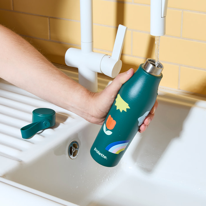
Whether you’re designing your website or a branded Water Bottle, here are a few things to think about…
- Your logo should clearly be visible on marketing materials and your website. The header section and navigation bar is usually best, as your customers will see it on every page.
- A limited colour palette can help strengthen your identity – inverting these can be a simple way to create variety in print and online.
- Use similar, if not identical, fonts – so it feels like your messages come from one brand. Choose a typeface that communicates your tone of voice. Adding different weights is a good way to create texture and hierarchy within your design.
- To make sure information stands out on your print materials, put key messaging at the top, then follow on with details and a clear call to action.
- When creating your website, prioritize user experience. That’s everything from how well the page works on mobile, to accessibility – and make sure your visitors can quickly find what they’re looking for. Websites built with Squarespace have a responsive design, so they’ll resize to fit any device screen.

Most of all, before people can care about your brand, they need to know that YOU care about it. And that starts with how you choose to bring it to life.
Keep your brand brilliantly consistent with fresh marketing materials and the latest website building tools from Squarespace.
Keep in touch
Get design inspiration, business tips and special offers straight to your inbox with our MOOsletter, out every two weeks.


