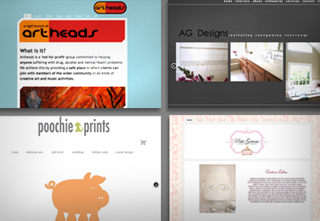
A 10-step website
« Parcourir toutes les astucesA new business needs a fully functional website – but if you’re just starting out, how do you make a great one without busting your budget?
Luckily, there are a lot of free and easy website builders that have revolutionised the process and even made it – dare we say – enjoyable? Have a look at these 10 simple steps to getting a professional website up and running.
1. Ask yourself...
- What do I want my website to do?
- Who do I want to visit my website?
- What should I name my website?
- What do I want to say in my website?
2. Pick the perfect domain name
This is critical; it’s how your customers and the search engines will find you.
- Make sure it really represents your business. If the same name is available as the name of your business, that’s ideal.
- It should be short, descriptive and easy to remember.
- Work out if you want a .com, .biz, or .org (if you’re a non-profit) site.
Of course, these are just a starting point – we’ve got loads more helpful tips for choosing the perfect url!
3. Look around for inspiration
What’s your favourite website – and why do you like it? Often, the greatest work is spawned from respectful imitation, so do some surfing and pick out a few sites that look the way you’d like yours to look, considering things like design, colour scheme, and layout. Don’t copy – just get inspired!
4. Keep it easy on the eye
It’s a well worn cliché, but less is always more - overly long pages of content can be off-putting.
- Break copy down into separate sections to minimize individual pages.
- Use short, precise words in your navigation links (eg. About us, Services).
- Important navigation links should remain constant on every page and organised in order of importance.
5. Find your font
Of course you want to be memorable, but don’t be fooled into thinking a fancy font is the way to do it!
- Stick to reliable fonts like Arial, Helvetica, Georgia or Verdana and you won’t go wrong.
- For text and heading styles, stick to one or two typefaces and two or three type sizes and colours.
- For ease of use, keep link colours in line with the page colours.
- Don’t use all-caps text for anything other than a heading – nobody likes to be yelled at!
6. Image is everything
A good quality image can make a website look instantly professional (and of course, the reverse is also true).
- 10 to 20k images on a page is more than plenty.
- All image files should be low resolution (72dpi). As a rule of thumb use GIF format for computer-generated graphics such as simple logos, buttons or animations, and JPEG format for photographs or scanned material.
- Reduce the image dimensions of your file before saving it for Web. Try Fotolia or iStockphoto for cost-effective stock imagery.
7. Slow and steady won’t win the race
Loading speed is key to getting repeat visitors (and in our experience, anything over 15 seconds is too slow).
- Avoid unwieldy images, videos, audio and other large files. Most editors like Photoshop or Picnik offer optimisation tools to reduce image file size.
- If you’re confused, give this online image optimiser a try.
- Not sure how slow is too slow? You can always test your site’s download speed and make adjustments.
8. Check your work
You can have the best looking website in the world, but if you’ve got spelling and grammar errors, nobody will take you seriously. Proofread everything, then get a trusted friend or colleague to go over it again.
9. Don’t play hide and seek
To get visitors to your site, you need to let them know you’re there! Make sure your site is search engine optimised (SEO). Think about keywords and ensure they’re included in your website copy, meta-tags and messaging.
10. And finally....promote yourself online
There's lots of options, including Google AdWords, a “pay-per-click” advertising program. Social networking is also a great, inexpensive way to get the word out, and post links to your new website. You can also write a blog, and articles that link back to your site.
Need to build a website but don’t know where to start? Have a look at Yola – they offer free website building plus loads of advice on how to build the best website for your business.
Nouveau chez MOO ?
MOO rend la vie un peu moins virtuelle. Nous aidons nos clients à imprimer des Cartes de Visite, des Cartes Postales et des Autocollants pour leur permettre de partager des informations concernant leurs activités
Imprimer, c'est facile. Et on adore ça.
Voir nos produits


