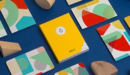
These cards provide a handy guide for patrons who aren’t down with the coffee lingo, explaining exactly what all those classic espresso names really mean – from size of the drink to amount of milk. The design is clean and simple so it won’t detract from the informational message.
À propos du designer
An Englishman in Boston, MOO Middleweight Designer Adam Dudd recently hopped across the pond from MOO HQ in London to help grow MOO's design team in the US. Prior to MOO, Adam spent his time crafting beautiful pieces of communication for the Tate, and his design style is bold, simple and witty. When he's not mouse-in-hand he's most likely trying to decipher baseball statistics or sampling one of Uncle Sam's many craft beers.


