Nailing your niche and rebranding your visual identity
Nailing your niche is easier said than done. We chatted to graphic designer Ronnie Alley, about why he decided to rebrand his business to attract his ideal client.

Philadelphia-based designer Ronnie Alley gave his personal branding an overhaul. Here’s how the refresh built a totally new client base and attracted the projects he always wanted.
No matter what industry you’re in, there are other solopreneurs who work within the same field. That’s why understanding your personal brand – and being able to communicate it successfully – can be key to standing out as a designer.
Of course, nailing your niche is easier said than done. We chatted to graphic designer Ronnie Alley, about why he decided to rebrand his business to attract his ideal client.
Back to the drawing board
Ronnie’s old brand was filled with bright pops of color. While this aesthetic matched his personality, he felt that it was stylistically limiting when bringing in new work. “Your visual identity has to be both representative of who you are as a designer and the type of projects you’re willing to work towards,” Ronnie told MOO. “I knew that I wanted my new design system to be a large departure from my previous one,” Ronnie explains. “It didn’t speak to who I am as a designer today.”
With that in mind, Ronnie began his quest for a new look. For him, the process begins with pencil sketches of logos for a more organic discovery process. “I always start with the logo because it allows for the rest of the story of the system to be built off it,” Ronnie said.
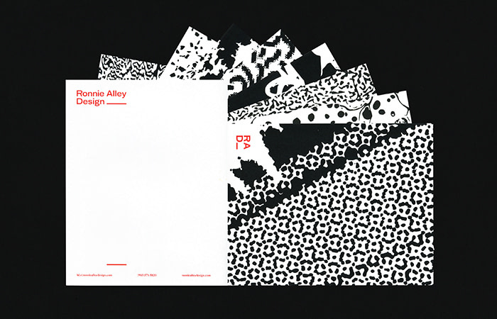
Over the course of five months, he brainstormed seven different versions of his business card. “I knew that I was finally finished once I had exhausted all of the possible combinations I could think of for type, color, and layout,” Ronnie tells us. “I’m the kind of designer who throws it all out there and sees which pieces resonate most with the brand.”
Eye-grabbing patterns and bold typography
Ronnie wanted his new branding to be bold and attention-grabbing – or in Ronnie’s words – “ almost abrasive.” He paired heavy patterns with no-nonsense typography to create head-turning contrast.
Ronnie’s bold new look plays to his strategy of expanding his client base. “That’s important to my business because I see my identity as an advertisement for the type of work that I would like to be hired for,” Ronnie said.
So far, Ronnie has had a really positive response to his new branding. “Even though it gives off a significantly different vibe from my last design, people are still very receptive to it,” Ronnie explains. Folks often comment on its visual pop, which he loves. After all, any way to stand out as a freelancer in the design field is more than welcome.
It’s all in the details
Ever the designer, Ronnie paid attention to every detail of his paper products—from brand consistency down to the paper stock. First of all, he made sure that his Business Cards had a tactile quality. “Business Cards are meant to be handed out,” Ronnie said. “I wanted something that had a nice feel. That’s why I chose MOO’s Cotton cards made from 100% recycled t-shirts.”
For cover letters and invoices, Ronnie designed some branded Letterheads to create a more personal connection with his clients. “I feel like there’s so much more impact on receiving something in the mail as opposed to text or email,” Ronnie explains. “It shows that the person went through the effort of putting something together for you—and the Letterheads allow me to do that.”
All of these print materials work together to give new clients a sense of what Ronnie Alley Designs is all about. “My visual identity has to be representative of who I am as a designer,” Ronnie said. “And I think that my new stationery–– with their variety and patterns–– help me stand out.”
Thinking about doing some rebranding yourself? Start with Business Cards and Letterheads
Keep in touch
Get design inspiration, business tips and special offers straight to your inbox with our MOOsletter, out every two weeks.


