The MOO Color Challenge: Zipeng Zhu
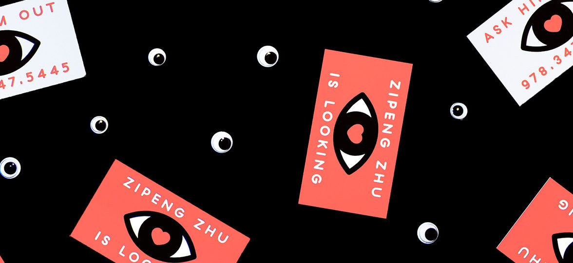
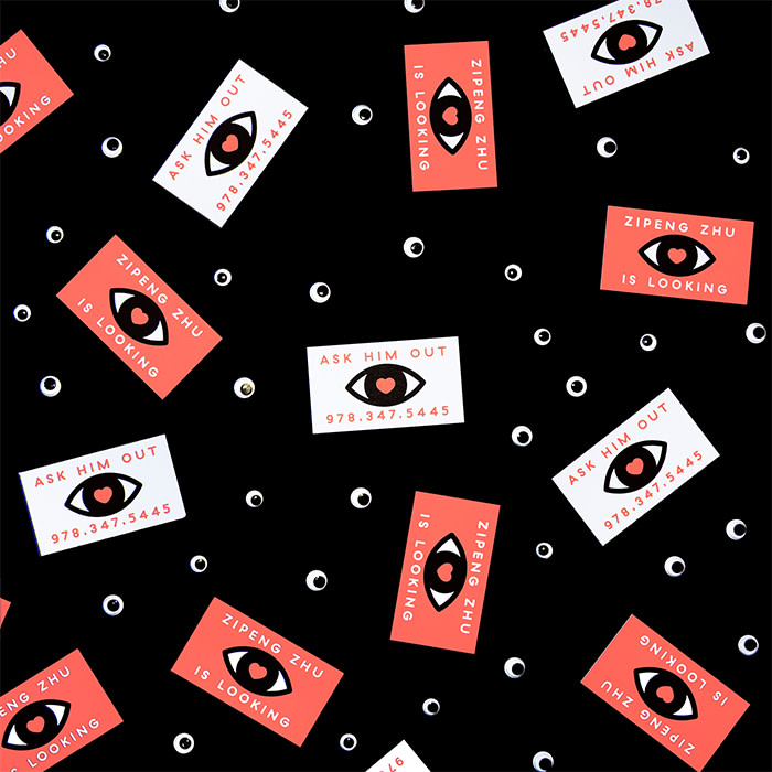
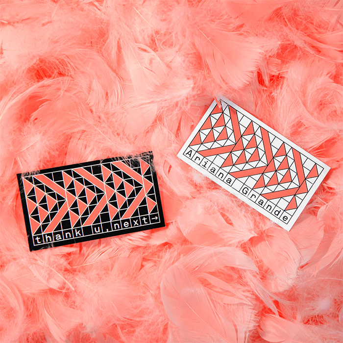
Zipeng Zhu takes on the challenge of using the Pantone Color of the Year 2019, Living Coral in a unique set of Business Card designs.

Three artists, chosen for their distinctive approach to using color, were given 48 hours to incorporate Living Coral, the Pantone Color of the Year 2019, into an eye-catching design. Here, we spoke with artist and designer, Zipeng Zhu, on how he took on our challenge to use the color in his work.

In life as well as in his work, color appears in everything Zipeng Zhu touches. An art director, illustrator and animator, his graphic designs feature bold colors in every configuration: polka dots, rainbow stripes, optical illusions and typography that pops.
Based in New York City, Zipeng’s mission is to “make every day a razzle-dazzle musical,” which he achieves through his work for an eclectic portfolio of clients, including The Jewish Museum, Adidas and Fête de la Musique.

With such a passion for color, Zipeng was ideally suited for the MOO Color Challenge. Zipeng’s final Business Card designs blend a lively array of white and black, contrasted against Pantone Living Coral, and matched with a meaningful—and memorable—messages.
So how did this eclectic artist tackle the MOO Color Challenge brief and what’s his process for choosing the vibrant palettes found in his work?
How did your distinctive style evolve?
I like things to be bold and eye-catching, so I often like to mix trippy patterns with bright colors to create a cohesive look.
My first passion was Manga – all I wanted to do was to draw comics, until I learned Photoshop and realized I’m not a great illustrator. I’m also a huge Keith Haring fan, and he’s been a big influence on me.
I like to twist things everyone’s familiar with – I see it almost like a visual pun. Humor is very, very important to me. If I can’t even entertain myself, I doubt my work can entertain anyone else.
How did your studio, Dazzle, come about?
I worked at [creative agency] Sagmeister & Walsh until three years ago, when I left to pursue my own studio, Dazzle. The decision was simple: I’d learned so much from the founders, Stefan and Jessica, and was ready to give myself a shot – to make the initial and final calls.
Having my own studio is very different from working for someone else. The beauty is that you’re in full control, but that also happens to be the challenge. You get to do whatever you want, but you also have to take on all the responsibilities.
What’s your creative process, and how do you go about bringing color into your work?
My general process is to communicate as much as possible, so I know exactly what clients are looking for and what they need help with.
Meanwhile, my brainstorm sessions are usually very organic. I constantly think about ideas and let them run in my head while I move on to do other stuff – I often get an idea while I’m walking on the streets of NYC.
I narrow down the color possibilities for each piece by using my gut. Weirdly, I never think about color too much. Usually, when I start a new project, I know exactly what color I’m going to use. It’s almost like I can see all the colors and combinations in my head without trying.
How did you approach the MOO Color Challenge?
I was shocked the choice this year wasn’t yellow, although coral is an accurate color for 2019. I’ve worked with very similar colors before, but not this exact Pantone swatch.
My approach to color always comes very naturally to me. I went through as many iterations as I could get out of my head. Then, once every single possibility was out, I looked through all of them and picked my favorite.
My advice to those working with a set color scheme like this would be to feel the color, if you can. If you can’t, try to either compliment or contrast the color with different ratios and proportions.
Get inspired by the diverse approaches of the artists taking on the MOO Color Challenge.
Keep in touch
Get design inspiration, business tips and special offers straight to your inbox with our MOOsletter, out every two weeks.


