The MOO Color Challenge: Hattie Stewart
We caught up with Hattie to find out how she approached using Living Coral in her dynamic designs.

Three artists, chosen for their distinctive approach to using color, were given 48 hours to incorporate Living Coral, the Pantone Color of the Year 2019, into eye-catching designs. We spoke with illustrator and artist, Hattie Stewart, about how she took on our challenge to use the color in her work.
Illustrator and artist Hattie Stewart’s portfolio is a riot of color: a lively cartoon world with an edgy undercurrent, filled with winking daisies, bulging typography and wide-eyed love hearts.

Merging her work with music, contemporary art and fashion, Hattie’s work has adorned shop windows, sweatshirts, magazines and protest placards. But she’s perhaps best known for her ‘doodlebomb’ project – taking iconic magazine covers, from Vogue to Playboy, and disrupting them with her distinctive designs.
The project has helped her to gain 75k Instagram followers, as well as solo exhibitions of her work and commissions from global clients including Apple and MAC Cosmetics. She’s also created a sticker book to aid aspiring doodlebombers.
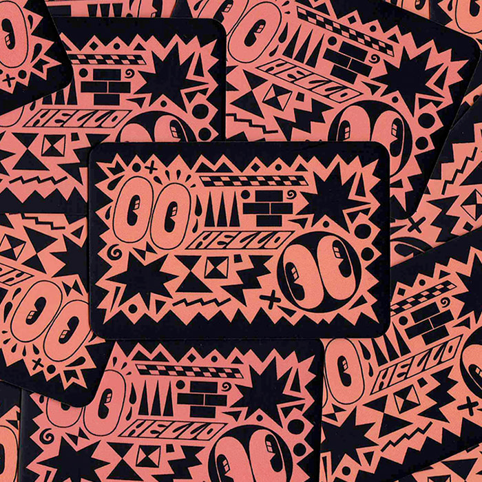
We caught up with Hattie to find out how she approached using Living Coral in her dynamic Postcards and Business Cards, and why she thinks keeping art personal is the key to success.

Tell us about your background – how did you get into the art world?
I grew up in Essex, England, and have drawn ever since I was little. I was lucky to be able to continue to do so – although I think my obsessive nature wouldn’t have had it any other way. My career grew over time, with a lot of hard work and a few lucky breaks.
I started out making ‘zines, and doing little jobs here and there for friends. While I was studying, my sister was working at Luella as a designer, and she brought me on board to do a few illustrations for some t-shirts.
That opportunity enabled me to build a number of working relationships with other designers through word of mouth, including Henry Holland.
How did you develop your distinctive style?
I’m constantly changing my ideas, although the visual core of my work is more or less the same. Illustrating has always been the thing that gives me my sense of calm and purpose.
Over the years, I’ve experimented with many different creative avenues, including photography and fashion. But I’ve always come back to doodling and drawing – they’ve always underpinned my creativity.
As my work’s developed and my confidence has grown, I’ve been able to take my drawing style into new territory – it’s been applied to photography, and I’ve worked within fashion.
I never set out to create a style – it happened organically, over time. Whenever I look back at old sketchbooks, you can see the development. I’m intrigued to see what my work will look like in 20 or 30 years – I hope it’s completely different, and that’s what makes it exciting for me. You just have to keep drawing.
How did you get your work noticed by bigger audiences and brands?
Things really blossomed when I began the doodlebomb project, which came about when photobombing became a phenomenon. People seem to really enjoy it – I think if you love or hate the person on the cover of a magazine, or the magazine itself, the project can be appreciated in some form, as it alters reality.
Being on the cusp of the social media boom, it was the perfect way to create more opportunities. Brands needed additional content, and my work played perfectly into that.
It’s these explorations – these personal projects – that bring in the work you want to make. If it’s not out there already, you can create something to fill a space and make your own little corner of the world.
“Creating work that’s your own, alongside commercial work, keeps you sane.”
What advice do you have for new artists trying to define their style?
Every failure teaches you how get better next time. It might take a while to get over the pain to see the strength, but that’s OK. I try to repeat this mantra to myself: ‘Don’t get mad, get drawing.’ It’s a reminder that even when things aren’t working in your favor, all you have to do is carry on.
Keep drawing. Keep painting. Keep writing. Keep practicing. That way, when an opportunity comes along, you’ll be able to not just get your foot in the door, but kick it down. Don’t worry about defining your style. It’ll happen, and you won’t even know it.
How did you approach the MOO color challenge?
I tend to stick mostly with primary colors and red tones, which is why the MOO Color Challenge was such a pleasure to work on!
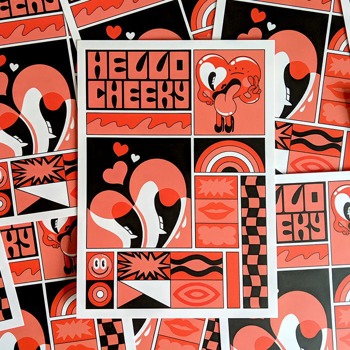
I love Living Coral, so I was thrilled this color was chosen. I knew I wanted to create something involving my characters, along with the comic book/grid style I’ve been focused on recently. Plus my ‘Hello Cheeky’ tagline works perfectly with the color theme.
I don’t brainstorm as a rule – I tend to know what I want to do once I’ve read the brief. I kept the use of the color very much in line with the work I create personally, so it was a fairly fluid process.
I love the coral with black, and as my work involves a lot of black linework, they went together perfectly. I kept it really simple – I just wanted to create a visually engaging illustration.
Do you have any tips for working with a set color scheme?
It really depends on what type of artist you are. You can look at the historical, political, psychological or anthropological background of a color to link its characteristics to what the project itself entails.
Alternatively, it could just work with current themes in your personal work. Experiment with color in your own time and in your sketchbook. The more you play, the more questions you’ll be able to answer.
Get inspired by the diverse approaches of the artists taking on the MOO Color Challenge.
Keep in touch
Get design inspiration, business tips and special offers straight to your inbox with our MOOsletter, out every two weeks.


