Elizabeth Inkim: “go the extra mile, it’s never crowded”
Elizabeth tells us about the importance of reciprocity, and why you should embrace your uniqueness.
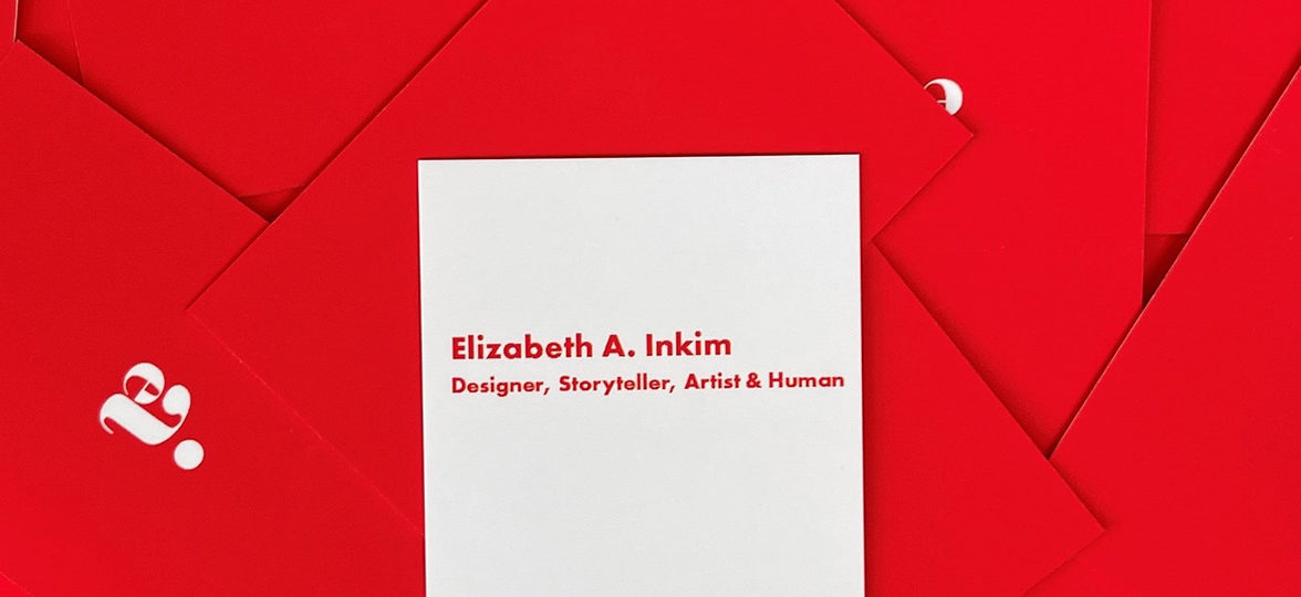
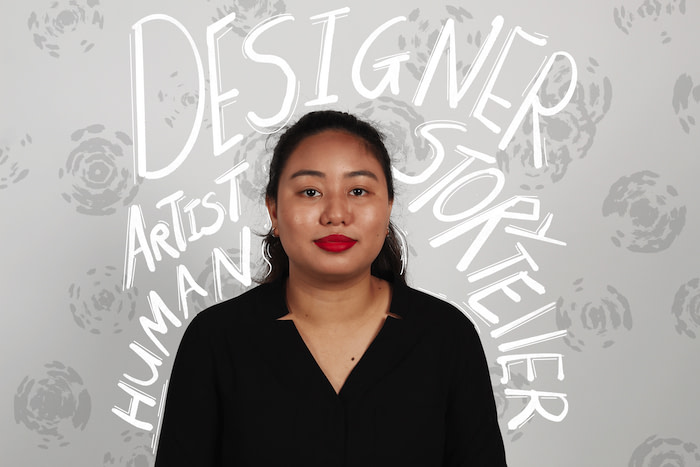
There are many ways to tell a story – and Elizabeth A. Inkim knows exactly that. The Trinidadian creative defines herself as a “designer, storyteller, artist and human;” a winning recipe for creativity and innovation.
With her daring designs and inquisitive mind, she explores the many ways to connect with an audience and convey messages in a powerful way. That’s how she caught the attention of Cambridge University with her ‘Affirmational Exchange’ project. It’s also the reason she’s investigating how design can improve the reading experience of people with dyslexia.
We spoke to Elizabeth about the evolution of her style, the role of reciprocity in innovation, and why you should embrace your uniqueness.
Tell us a bit more about yourself. Where does your passion for design come from?
I have a long history in fine art. I had my first art lesson at age seven, and I’ve been painting with watercolours since I was nine years old. In my downtime, if I am not working on my own design projects, I am either drawing, painting, writing short stories, reading, or watching something.
While everyone’s path to becoming a graphic designer is different, my journey began in secondary school, when I designed a logo for my secondary school teacher. At the time I didn’t even know what a graphic designer was, I assumed that people who designed logos, websites, and packaging, were artists – and to an extent, we all are.
However, there is one key difference. In the same way that engineering can be viewed as applied math, graphic design is applied art. Design has to work and communicate a message, while art has the freedom of being non-objective. While I will always love working with traditional art mediums (watercolour and pen being my weapons of choice) the challenge of designing something within certain set parameters is fun for me.
“My passion for design comes from my innate desire to make things: digitally, physically, and narratively”
My passion for design comes from my innate desire to make things: digitally, physically, and narratively. For the most part, it comes from the fact that there are no wrong answers; only favourable and not favourable outcomes.
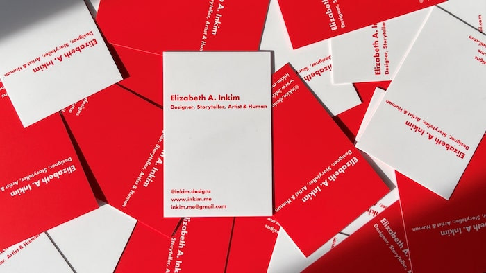
You define yourself as a ‘designer, storyteller, artist and human’. How are they all intertwined?
To make a long story short, I am a jack of many trades, but out of some act of rebellion or cosmic confusion, my passions and joy are born out of my greatest weaknesses.
Like most designers, I am deeply in love with the chaos of creation, but at the same time, I am drawn to grid patterns, rules, and structure. As a traditionally taught artist, I enjoy the process of sketching, getting my hands dirty, and making something from nothing, but my ADHD makes staying in one place and doing one thing challenging at best.
I am also obsessed with stories―movies, books, graphic novels, television shows, I love them, all―but I’m dyslexic, so I listen to books via audiobooks, and I write short stories.
So, on paper, none of these things make sense, but together they have shaped me and are part of my identity. Human is the crossroads at which my other three “titles” collide, as well as a reminder to others and myself that at the end of the day, I am still a person trying to do my best – I am only human.
How would you describe your style?
I think a person’s style is something they spend a lifetime cultivating. My style is ever-changing, always morphing into something new. Your style is like a fingerprint, it remains the same whether you know it or not. In three words, I would describe my style as imaginative, daring, and radiant.
“Your style is like a fingerprint, it remains the same whether you know it or not”

You’re currently based in Cambridge, UK. Being originally from Trinidad, do you feel interacting with a different culture affected your practice?
Shockingly, it hasn’t had as much of an impact on my creative practice as I anticipated. Trinidad and Tobago is a rich melting pot of cultures, religions, spices, and art, and the twin-island republic that I call home has a diverse culture, with Spanish, French, British, Indian, African, Syrian, Lebanese, Chinese, and South American roots.
So, for the majority of my life, I’ve been exposed to various art styles, methodologies, and work styles. The biggest change I’ve noticed is that design on this side of the pond is more simplistic and minimal, and Trinidad has a very maximalist approach, with bright colours, loud typography, and vibrant photography. In Trinidad, more is more, while in the United Kingdom, less is more.
Can you tell us more about your work for The Cambridge Festival?
The Cambridge Festival is managed and hosted by Cambridge University’s Public Engagement team. It is an annual event that hosts multidisciplinary exchanges for those who are passionate about sharing the world-changing research which takes place in Cambridge.
Master’s students at the Cambridge School of Visual and Performing Arts were given the opportunity to create a way to document the festival. This could be through photographs, videos, illustrations, or any other visually impactful means. Cambridge University doesn’t have this kind of program so they love to create opportunities to collaborate with visual communicators to make their research appealing and accessible.

Originally, I pitched three ideas: a hashtag-shaped sculpture (imagine a 3D hashtag made of plywood, painted with chalkboard paint where people could write on it in silver and gold sharpie), a polling wall where people would place a sticker on a mural wall to record their response to the prompt), and an affirmational exchange wall (write something positive and put it into one of the envelopes on the wall, and take a positive note from a different envelope).
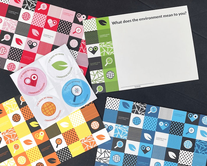
The ‘Affirmational Exchange’ was chosen and adapted to become the “Cambridge Festival Comment Wall”. People would respond to one of four prompts about the Cambridge Festival―society, discovery, environment, and health: the core themes of the festival. When patrons of the festival left their comments on a card, they were also given a sticker of their choice.
“Digital design is here to stay, but print will never die”
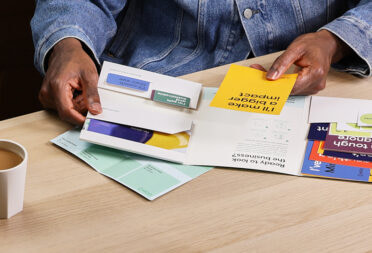
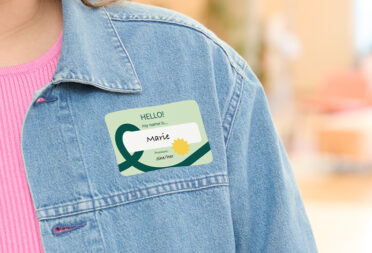
There’s nothing like the tactile feel of print. Digital design is here to stay, but print will never die. For the final print we used MOO’s Original Postcards with a matte finish and Small Round Stickers. Both the festival organisers and I were absolutely in love with the outstanding print quality. Everyone who visited the comment wall was delightfully surprised by their free sticker. I still sometimes see the stickers around town, on people’s laptops, notebooks, or water bottles – this is by far one of the coolest things I’ve ever experienced as a designer.
What roles do positivity and reciprocity play in progress and innovation?
An integral role. I’m very lucky to be doing what I love, and most days I revel in the joy of it all. Maintaining a positive outlook on life can be very challenging at times, but I believe that practicing gratitude can make all the difference.
It’s important to recognise that no successful person has reached where they are today by themselves. There are always people behind the scenes, people who have supported, mentored, and helped them out along the way.
“Giving back and helping others […] is essential to generate progress and innovation”
This is why giving back and helping others, even when it might be inconvenient, is essential to generate progress and innovation. We are not alone; we are part of a community. To progress and advance in life, you need to work towards something that is bigger than yourself. Be grateful for the little things, be open to receiving guidance, and, when the opportunity comes, reciprocate what you have been given.

How can design help convey such important messages to people and make a mark?
Design, and specifically commercial graphic design, can be a very transactional thing. You get the brief, then ideate, design, and revise until you get a final design. After that, on to the next project.
For design to convey meaningful messages that leave lasting impressions on their intended audience, the design team must do their research. They need to learn about the audience and psychographics of the people they want to appeal to and design media that reflects that community authentically.
What’s your favourite part of working on a project?
The ideation and visualisation stage of the design process is by far my favourite part of the process. At that point, when no one else has seen it, the designs can be anything.
Before you get feedback from the client, it’s yours, the minute the client sees it, it becomes theirs. It might sound crazy, but the high of creating and researching is like no other.

Who would be your dream client as a designer?
My favourite projects to work on often involve dramatic typography, bold brand identities, and stunning print design. One of my current goals and bucket list items is to one day work at design agencies like Pentagram, Landor, Here Design, Wolff Olins, or Pearlfisher.
On my design wish list, my top three dream clients would be a coffee or tea brand, a candle company, and an ice cream brand.
Any projects coming up you’d like to share?
The project that I am most excited to share also happens to be the capstone project for my MA, entitled “Design and Dyslexia: How Form Informs.”
Grounded in research, and explored through design, my project seeks to inform people about dyslexia and how design can improve the dyslexic reading experience.
You can see my work in London at the Espacio Gallery on September 12-18 and follow my Instagram or join my newsletter for updates on my upcoming projects.
If you had one piece of advice for young creatives looking to stand out, what would it be?
Go the extra mile, it’s never crowded. As saturated as the creative industry is, no one will ever be able to think, create, or be like you.
“Go the extra mile, it’s never crowded”
Every individual is a one of one, so be the best version of yourself you can be and do more than what is required of you because it will show your character, competencies, passion, and your talent. All these things will make you stand out and it won’t be long till others take notice.
Learn more about Elizabeth here and create your next project with Postcards and Stickers.
Keep in touch
Get design inspiration, business tips and special offers straight to your inbox with our MOOsletter, out every two weeks.

