5 Business Cards that make us want to curve those corners
Discover 5 examples of rounded corner Business Cards – and why they chose to curve those corners.
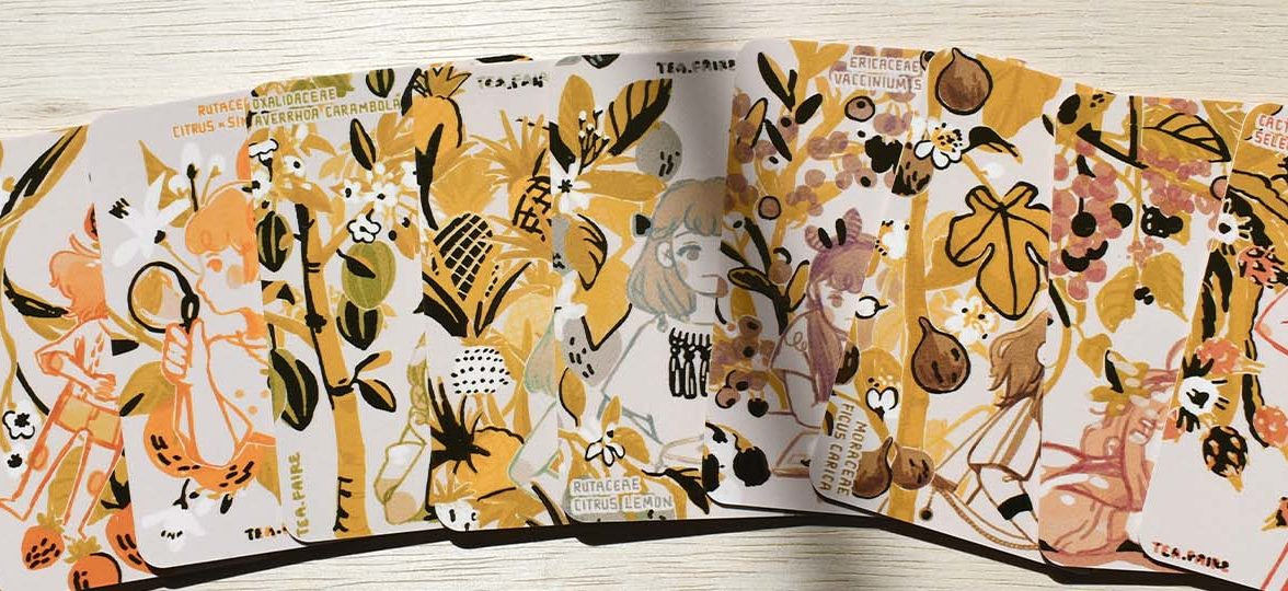
There’s a new shape in town. One with smooth, curvier corners. Here just to prove that you too, can go against the traditional rectangular shape with four sharp corners, while all the time – upholding the same potential.
Whether they hold pin badges, jewellery, display examples of your artwork, or simply state your contact details here are 5 of our favourite examples of rounded corner Business Cards. Find out exactly why each brand chose to curve their cards and discover the kind of inspiration you need to show off your skills, your products…whatever takes your fancy!
Tea Faire: Safety comes first
Elaine is the illustrator behind tea.faire. Based in the beautiful Pacific Northwest, she works as a full-time engineer while managing her Instagram account and shop on the side. Art has always been an integral part of her identity.
Elaine’s choice of rounded corner Business Card transpired from a practical need. She wanted to protect the corners from fraying and bending easily. “I’ve witnessed plenty of business cards tattered, the corners missing from being shoved into pockets of bags because of how disposable they are, so I’m adamant about preventing and minimizing damage if I can through design and material selection”.
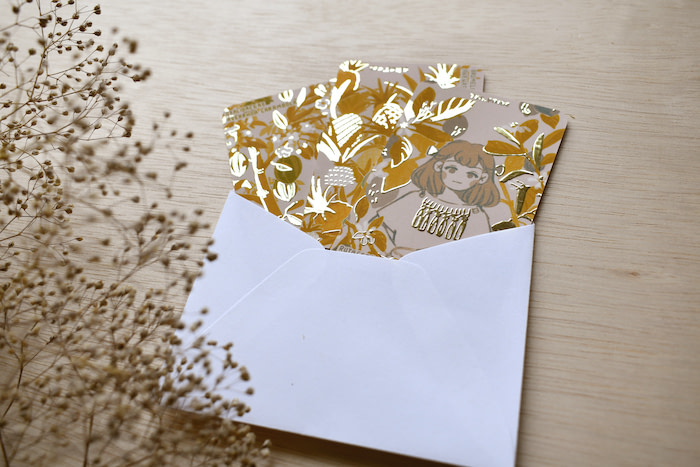
When it came to the details, the illustrator opted for a Soft Touch effect with gold foiling. She was immediately drawn to the combination of both finishes when she ordered the Business Card sample pack. “I wanted my cards to be as memorable as possible so that customers would be more inclined to retain rather than toss them. Here was the perfect solution to the material requirements.”
She adds “The foil is prominent enough to add a subtle tactile element to the cards as it does visually. The gold of the foil itself also complements the minimalist colour palettes of the cards.”
View this post on Instagram
Her choice of Business Cards as a MOO product came down to its versatility. “I designed these cards to be multi-functional: they are business cards, thank you cards, miniature art prints, and educational info-cards balanced across two surfaces”.
“I received so much love for them and interest in collecting them that they officially launched as miniature art prints in my shop in the form of mystery grab bags. Customers were free to choose how many to receive and I would package that amount in unique card designs.”
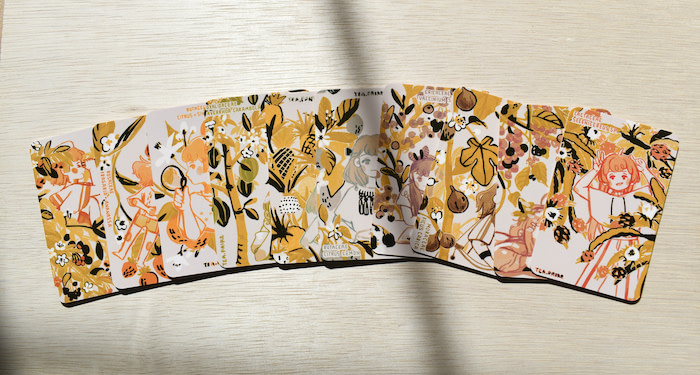
Her advice to someone creating their Business Cards? “Don’t be afraid to start small. Although this particular series of mine spanned ten designs, I started out creating a batch of four. Also, even though they are called ‘business cards’, don’t let that limit what you use for them. And finally, Printfinity is your best friend for small minimum order quantities, so take advantage of it!”
Favourite accounts to follow:
“I’ve been a long-time fan of @maruti_bitamin even before joining Instagram. Her artworks are so incredibly detailed and diverse in subject matter and colour schemes.”
Whitney Luu: Peachy design
Whitney Luu is a graphic designer and lettering artist based in Vancouver. She has an online shop consisting of colourful greeting cards, enamel pins and stickers.
When it came to the design, she specifically chose rounded corner Business Cards for their softer appeal which reflected the nature and aesthetic of her business. She explains that it brought “a friendly and charming feel to the peach pins. It suited the roundedness of the design as well.” Additionally “using the 16pt original matte cards because they were sturdy enough, and the matte finish made the shiny enamel pins stand out more.”
When it came to Whitney’s inspiration for the cards, she admits – this came from the fruit too! “Because I had been looking at different kinds of fruit, thinking about fruit, tweaking and staring at the peach designs for so long, I considered the plumpness of peaches as inspiration for the cards. The rounded corners, the matte finish, the yellow and orange palette, simple rounded front – all of which made framing the pin really make the tiny peach feel right at home.”
The design process came down to a trial and error approach for the most part. She describes sketching out some ideas before jumping straight into Adobe Illustrator to explore them. “I usually start in black and white, so I don’t have to worry about colours yet. I then design different versions and try things out to see what works. At this point, I usually take a break or sleep on it, so I have a fresh mind and eyes to continue, which sometimes may result in more new design ideas. After refining, I realized one design that I’m happy with and will start playing with colours, different paper stocks, and finishes.”
She advises others to take their time when designing. “I used to rush through the design process, giving in to the pressure of thinking that I HAD to finish it by whatever date and never really taking the time to enjoy the process. But, if you spend more time exploring different iterations of your design while resting a bit in between – maybe look at some inspiration – there’s a possibility you could come up with something even better than what you had already planned.”
Favourite accounts to follow:
There are several different accounts that I follow for inspiration, so I have a hard time choosing a favourite. For print-related things, @moo of course, @thedieline, and @bestofpackaging. For everything design-related, @goodtype, @designbrew, @dribbble, and all of the talented creators, designers, illustrators, artists, etc., that I follow on Instagram!
Lucy Jenn: A charming appeal
Lucy Jenn is a freelance graphic design and illustrator based in London. She’s been a freelancer for just under three years now, works on a multitude of projects from print to branding, and is particularly drawn to colours and decorative flourishes.
Whether she’s choosing her own designs or recommending them to clients – Lucy always picks rounded corner Business Cards and has been doing so for years now. “I feel it makes the designs look more complete and considered, plus the rounded shape complements my design style well as I often use rounded shapes and swooping lines! There’s also quite a playful and nostalgic feel to the rounded corners, it reminds me of playing cards from my childhood – Pokemon or Uno.”
“They can also be quite practical, when you have a standard pointed corner, it can curl, split or wear over time. I find that rounded corners are the more streamlined and durable options – and great for slipping into your wallet!”
When it came to her client, Ella Chandler Studio’s cards, they discussed it being a keepsake to add to customer orders that would display contact details and act as a budget-friendly addition to the customer experience. Moreover, she opted for a Gold Foil finish. “I knew I wanted to feature one of Ella’s fringed lampshade designs on the card, so this was a great excuse to use a special finish to give the illusion of light and sparkle emitting from the lamp.”
“Ella’s product offering speaks for itself. Beautiful colour and texture combined to create a cool 70s feel. Ella wanted me to channel nature and a folky vibe into her branding – making sure to showcase her love of bold colour, tassel and fringe!”
When it came to the design process, Lucy made use of MOO’s Printfinity to try out a few variations and create a range of colourful lamp illustrations. “At this stage, we had already finalized Ella’s overall branding, so it was just a case of translating it into a Business Card. I mocked up the cards with the Gold Foil finish digitally to better communicate my idea to Ella and she was totally on board!”
Favourite accounts to follow:
“There’s too many to list! Of course, I have to shout out @ellachandlerstudio for inspiring these particular cards, I’m also really enjoying the work of @gise.la.co at the moment – lots of wonderful colours and types to inspire you!”
Meagan Maurer: Say no more to frayed edges
Meagan Maurer is based in Asheville. “[I originally moved there to learn art therapy in a local hospital, but segwayed into helping companies create personalised brand design. ‘I am a people pleaser by nature, so it feels as if this field was made for me as a creative.”
Meagan’s choice of Business Cards came down to the practicality and look of the design. “I have a pet peeve for seeing straight edge business cards with folded edges, and two that the consumer along with myself tend to be more attracted to something slightly different yet familiar. I also chose a matte finish and thicker card for the same reasons – people will be holding this product and it is important that it feels good and inviting.”
Meagan also works at a brewery, which has become a solid place for her to connect with possible business partners. “My goal with these cards was to create something that pops and catches the eye. I feel as though I’ve achieved something.’ Her inspiration behind the print was kept simple yet personal – it ‘came from a tattoo on a friend of mine that I absolutely loved.”
When it comes to the concept, Meagan believes in trusting in the process, to best represent you. “Before any graphic design, I start with a sketch which I then fine-tune. At that point, I vectorize it into something that I am happy with. I debated for a long time on what my final card would end up looking like but I found that for those that have a tendency to try and create products versus letting their creativity always flow, like me, I would suggest just sketching your favourite thing to draw or whatever makes you happy in life. Run with it. It’s the best way to represent you.”
Favourite accounts to follow:
“My favourite Instagram account to follow is @noelle.k.miller. She is a friend of mine, but also an insanely talented painter. Her ability to tap into her own unique creativity is very impressive. It’s something I aspire to do in my own line of work on the daily.”
Pause Anywhere: A smooth sensory practice
Juanita, is the mind behind Pause Anywhere – a mindfulness company based between LA, California and Costa Rica. She is an artist, activist, entrepreneur and cool mom of three.
Juanita creates MiniCards for Pause Anywhere as a way of offering miniature moments of mindfulness, guidance, and practices in an unobtrusive and convenient way. “These cards are tangible, they take us off of our screens and place us into our bodies in the present moment. Whether you need affirming words, grounding meditations or physical guidance, they’re an incredible tool during overwhelming and activating times.”
When picking out the shape of the cards, she trialled a few to consider the feel of each shape. “What it ultimately came down to was the seamless experience of the rounded edges. Part of the goal for Pause Cards is to create a smooth sensory practice and the rounded cards being circular in nature give way for a continuous and calming vibe.”
“My desire to create a multi-sensory experience with Pause Anywhere is why the type of paper is also uber important. Pause’s cards are printed on Soft Touch paper and one card in each deck has a Raised Spot Gloss design, which offers the user an opportunity to ground and connect with their body in real-time.” Juanita relied on Printfinity to create a variety of designs card designs. It allows the creator to print up to 50 different designs on the back of every card.
Her inspiration behind the cards – a journey of healing – was what really cemented the design. “The idea for Pause Anywhere came to me about a week after giving birth to my daughter. We’d been in quarantine for six weeks, I had two babies under two, I was stuck in a one-bedroom apartment with four people and two pets with nowhere to go and no one to see. I’d lost my community and was experiencing the deep anguish of isolation in just a matter of weeks and then George Floyd was murdered publicly for the whole world to witness.”
“It all felt like too much. I was a mixed bag of feelings, anger, grief, joy, confusion, feeling both powerful and powerless. I had small people who depended on me for survival and so I leaned deeply into my healthy survival methods of meditation, breathwork and writing to get me through that time, and the following two years.”
“My advice to anyone about to create their first order with MOO would be to take advantage of Printfinity so that you can experiment with a variety of looks and slogans without having to order 100 of just one thing. You can use Printfinity to showcase the full scope of your brand and to see what lands within various demographics of your audience.”
Favourite accounts to follow:
“Oh my goodness, I have so many! I love Instagram for the creative and collaborative space it can be. I really like@raise.the.vibe.tribe,@alaiyo, @jaiyajohn, and @chakrazulucrystals. I also really enjoy following #hashtagmoo to see what other creatives are making out here.”
Ready to round your own corners? Design your own perfect Business Card right here.
Keep in touch
Get design inspiration, business tips and special offers straight to your inbox with our MOOsletter, out every two weeks.


