Super Business Cards to suit your style
Looking for a paper that’ll help you stand out from the crowd? These customers found Super the way to give themselves a certain special something.
MOO’s Super paper is totally customizable – with Soft Touch or High Gloss finishes plus the option to add Spot Gloss or Gold Foil for that added shimmer-factor – you can create Business Cards that are as unique as you.
To bring you some inspiration, here are 3 graphic designers who chose Super to show themselves off – with the stories behind their businesses and stunning designs.
The Roark Co
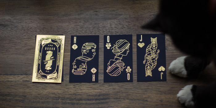
When we saw Adam and Meri-Lynn’s cards, we totally swooned – and not just because they feature the couple’s cat (who, by the way, is named Sirius Black). Their stunning use of Gold Foil is totally attention-grabbing – which is, of course, the effect they were going for. Adam tells us: ‘People really enjoy picking from the whole deck. It feels like we’re about to do a magic trick.”

This husband-and-wife design duo, working under the name The Roark Co, specialise in graphic design and crafts respectively, with some photography thrown in for good measure. As they put it: “Storytelling is what we obsess over. Our goal is to interpret moments as they happen; to actively tell a story, not pose one.”
“We love our cards because we feel that they are a tangible representation of our brand. They’re elegant and classy but still playful and slightly rebellious. In our line of work, print is still very much alive and if your business cards don’t make a statement it can be that much more difficult to stand out from a hundred other small branding companies. Clients want to see how we can take a brand from concept to application. Business cards are a small but powerful way of showcasing that.”
Get your own attention-grabbing Gold Foil Business Cards
Phalen Reed
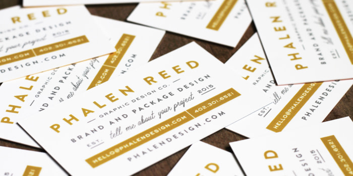
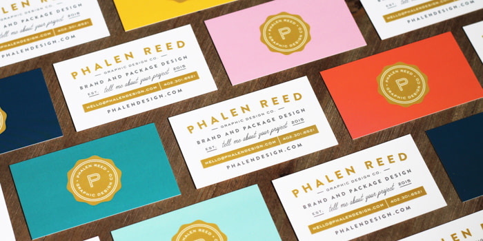
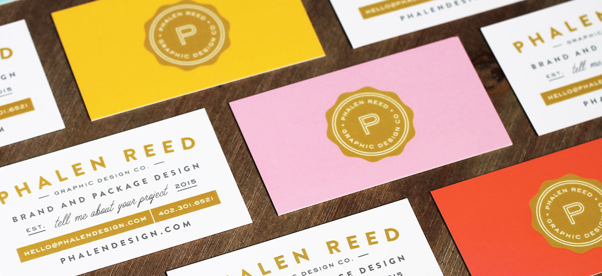
We love the way Minneapolis-based designer Phalen Reed blends old-school classic typography with a bright palette and some seriously awesome icon sets too. We were so proud she chose us to show off the best of her new redesign – and we love the idea of having a call to action on your business cards too – they all read ‘tell me about your project’.
She said: “People know me best for my clean approach to design with bold color palettes and playful type combinations. I knew these were characteristics that needed to be incorporated into my new brand, especially my business cards, to attract like-minded clients. After all, it is the first, lasting impression!”
“I never leave the house without my business cards. They accompany me to meetings, interviews and all social events. As a freelance designer, you never know where your next client could turn up, so best to be prepared. I actually handed out a business card when walking my dogs around the neighborhood this past summer. The Spot Gloss finish is the way to go. I used it sparingly on both sides of my cards for a bigger impact on key details such as name, contact information and logo. Outlining my logo in the spot gloss on the back of the cards gave them that beautiful seal-like shine.”
Make a lasting impression with Spot Gloss Business Cards
Bureau of Betterment
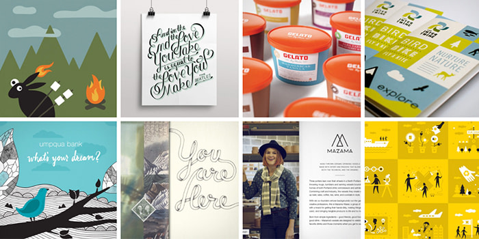
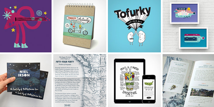
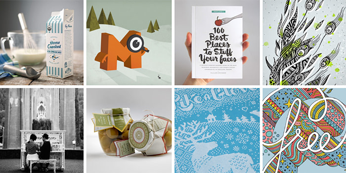
Mette Hornung Rankin has been running her design and illustration company, Bureau of Betterment for the last 7 years. She’s always had a passion for design – after graduating with a degree in print management, she went on to work in both design studios and branding agencies before deciding to go solo. Mette loves to work on both large and small projects, from corporate branding and packaging to design and illustration for books.
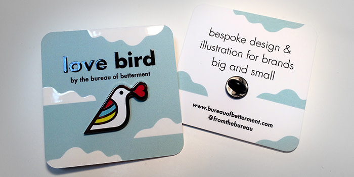
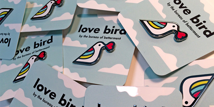
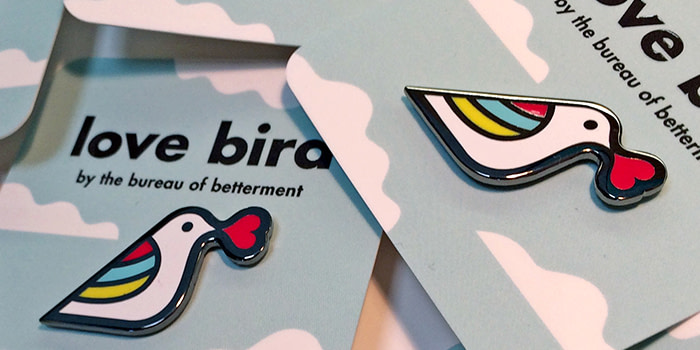
Mette gets her inspiration “from the smallest of details in everyday life”. She likes to create “happy mini-worlds that are somewhat naive and fantastical with an underlying adult point of view”. Her Love Bird pin was created as a side project for a Design Week Portland event. “Pin makers from around the world donated their pins for a group art show, with all proceeds going to support arts education. I had a pin collection when I was a kid and really wanted to take inspiration from my favorite – a white unicorn head with a multi-colored mane – giving it a modern update.”
“My cards were originally designed as a backer for my pin but they also act as an alternative business card that I hand out too – it really surprises people and they always say, “I can keep this?!”. I chose raised spot gloss, square Business Cards with rounded corners because it matched the tactility of the pin. The spot gloss on the white clouds shines in unison with the white enamel and the quality of the black shiny type matches the polished nickel border. The cards were an affordable way for me to take my presentation up a notch, giving me a great giveaway piece.”
Take your brand up a notch with Square Business Cards
Keep in touch
Get design inspiration, business tips and special offers straight to your inbox with our MOOsletter, out every two weeks.

