12 creatives who stand out with square business card designs

If you’re looking to stand out in style, these square business card designs are well worth a look.
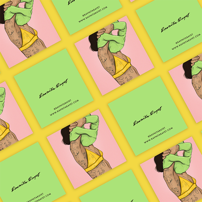
Ravnita Rayet
Ravnita is a UK-based illustrator, animator and graphic designer. Inspired by video games, traveling and art galleries, she turned her passion for illustration into a full-time job. She recently opened a creative agency, Wah Wah Lab, which helps build brand identities for businesses. Her square business card designs are basically miniature works of art.
“I wanted my cards to reflect my designs, so I had a bunch of my illustrations printed on Cotton Square Business Cards – not only do they look and feel insane, but they’re saving trees! The stock captures all the tiny details while keeping the colours vibrant. Plus, they’re uncoated, so I can scribble extra details on them if I need to!”
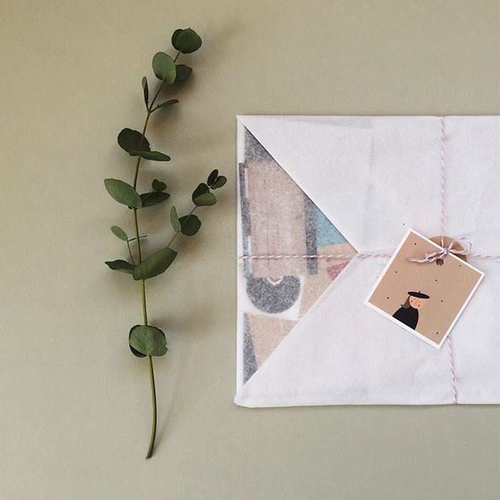
gulligull
Ellie-May Collins launched gulligull as an illustration project to bring original, fun artwork to the walls of nurseries, daycares, and playrooms for children. After a positive reaction online to her charming designs, she launched her own store selling the artwork as prints, adorned with endearing characters inspired by vintage toys.
“I’m passionate about sustainability, so I was thrilled to be able to print on Cotton Business Cards. The square shape really elevates the design; it’s a little different and more playful than traditional business cards. I even use them as ‘gift tags’ on my packaging, with a hole punched through the top, and since they’re uncoated, I can address them to customers in pen or pencil, adding a little personal touch.“
Paper Moon Collective
Before launching her own shop, Kaleigh Mathurin worked in a French bakery alongside studying for her culinary degree. She’s now turned her hand from icing to illustration, creating colourful cards, pins, tees and mugs stamped with empowering typography and graphics.
“The ‘Doing My Damn Best’ card started out as a design for a mental health project. Each month, I create a new design in the hopes of helping others feel less alone. I chose Square Business Cards because I felt like the shape allowed me to have more freedom and space to design. I also really wanted something that felt fresh, fun and more like a mini-print rather than a business card.”
C F Illustrative
Inspired by her childhood love of painting and her mother’s love of plants, Chanel creates paintings and stationery featuring leafy motifs in watercolour, gouache and ink. Her beautiful square business card designs showcase her work.
“My card designs are made from digitised elements of a watercolour study I did of indoor house plants. I fell in love with the uniqueness of Square Business Cards compared to conventional ones and thought it’d be a great way to stand out. The crispness of the printing and the vibrant colours are exactly what I’d hoped for.”
Winterlich Design
Craig Winterlich is a graphic designer based in Dublin, Ireland, working primarily in branding, packaging, advertising and logo design.
“I wanted to stand out against traditional business cards, so I went for Square with Raised Spot Gloss. The design is simple, clean and intelligent, but still makes a statement. Everyone loves the cards; the Super Soft Touch texture, the paper weight and the raised, glossy finish. They always ask where I got them from and if I can design theirs, too!”
IDZN
Dominic Skeete is a self-taught designer and the owner of Barbados-based studio IDZN, which specialises in creating brand identities for businesses. Dominic used Square Business cards to complement the logo he created for a local restaurant.
“Baobab Kitchen’s branding is designed in a square format, so we wanted to carry that through in their cards. I usually go for Super Soft Touch Business Cards, and tend to carry a few that I’ve printed before for my initial meetings with new clients. It always amazes me when they stop mid-conversation and say, ‘This is nice! What type of card is this?’ The silky texture gets them every time.”
The Time to Write
Rebecca Backer launched her bespoke content creation company after juggling freelance work alongside her 9 to 5 in marketing. For her, communicating consistency and creativity were the focus of her playful branding. Her square business card design illustrates this creative process.
“The brush stroke, which has been part of my logo since day one, reminds me of the whimsical and imperfect sides to writing and creating, which I never want to forget. The square shape offers a pop of surprise, and Printfinity allows me to print a variety of colours. It’s such a fun and pretty touch!”
Freckled Fuchsia
Rhode Island-based studio Freckled Fuchsia was founded by designers Chandlyr Jackson and Tyler Nelson. Their quirky Greeting Cards and hand-stamped goods feature playful characters that were developed “with the authentic, empathic human in mind.”
“Creating an identity is damn hard, but it’s important to develop your visual brand language, as well as your messaging and voice. Consistency plays a huge part in having a recognisable style in a sea of other cards and prints. If you want to grow a loyal following, it’s important to communicate what you stand for, and stick with it.”
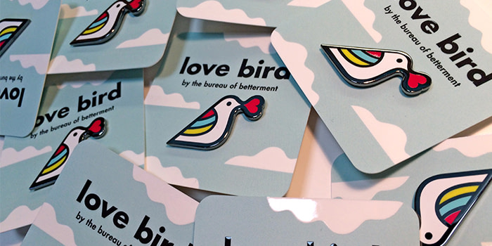
Bureau of Betterment
Portland-based designer Mette Hornung Rankin works across a range of creative projects, from corporate branding and packaging to design and illustration. Her personal work is “inspired by the smallest details of everyday life.” Here’s how she applied this idea to her square business cards:
“My cards were originally designed as backers for my pins, but they also double as a business card that I can hand out too – it really surprises people and they always say, ‘I can keep this?!’ The Raised Spot Gloss perfectly matches the tactile feel of the pin.”
Dozy Rose
Roza Hamta creates playful stories in her work, often featuring pastel palettes and geometric shapes. She chose Square Business Cards to complement the composition of her designs.
“The reaction to my cards on social media has been wonderful, with people describing them as ‘pocket size works of art’. They’re one of my most shared pieces of work and have attracted lots of new followers. I love the eco-conscious choice to use MOO’s Cotton paper, made from recycled t shirt off-cuts.”
Sarah Hiers Design
Boston-based studio Sarah Hiers Design aims to bring happiness, colour and originality to people’s homes through custom artwork. After starting with a pet-portrait in 2017, she has since drawn over 70 different animals, with each one created from smaller shapes and colours that bring their unique personalities to life – and a smile to her customers’ face.
“Using Printfinity, I created 50 different designs featuring my most popular drawings, showcased on the front of the cards. This allowed me to display the breadth of my design work, which was a huge deal for me because I create for everywhere; from nurseries to bars and everywhere in between. I chose Square Business Cards so that mine would stand out in a pile of others”
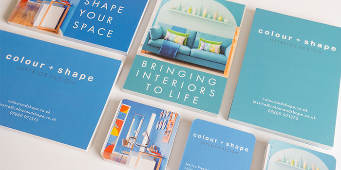
colour + shape
After working as a textile designer, Jessica Preston launched her UK-based interior design studio with the vision to create striking and inspiring spaces. To give clients a taste of her styling skills, she printed images of her projects across her printed marketing suite, including beautiful square business card designs.
“I wanted the design of my business cards and postcards to include some eye-catching images of my work, as well as my contact details. I love the square shape with rounded corners – they’re different to the usual card you’d expect.”
Belinda Carter Art
After working part-time in an insurance company, Belinda swapped crunching numbers for mixing palettes and pursued a career as an artist. When it came to starting her own business, Belinda wanted the feel of a professional art business, but with an extra “wow factor.”
“I love that my business stationery truly reflects my art and that I can package my artwork in a professional way. My bright, glossy Square Business Cards make a great talking point whenever I hand them out.”
Feeling inspired? Stand out from the crowd with Square Business Cards.
October 2022 update: This article references the way we used to make Cotton Business Cards. We now use a different process.
Keep in touch
Get design inspiration, business tips and special offers straight to your inbox with our MOOsletter, out every two weeks.
