Sprouting love (and prints) with Daddy’s Plants and MOO
MOO designed a suite of custom print materials for the blossoming Buffalo-based plant shop.

Sometimes, great matches sprout in unlikely places. And sometimes, they start on YouTube. When MOO graphic designer Matthew Dagless discovered his favourite YouTubers had opened a plant shop in Buffalo, it was (brand) love at first sight. Especially one called Daddy’s Plants.
With a witty sense of humour and a colourful identity, the young plant shop was the perfect fit for MOO. So he introduced us – and we decided to treat them to a suite of custom print materials to celebrate their blossoming business.
Who’s Daddy’s Plants?
Coming from backgrounds that had nothing to do with greenery, husbands Pat and Billy opened their Buffalo-based plant shop in 2018. The idea of starting a business together wasn’t new, but they were yet to have that lightbulb moment.
“Our passion for plants kept growing and eventually, the idea just clicked.” With that 180° career change, the duo set off to grow their brand from the ground up. They swiftly came up with the perfect name: Daddy’s Plants. “It’s a bit of a riff on the concept of a ‘plant parent’, a nod to Billy’s father’s former career as a horticultural inspector for the state of New York, and a bit of a wink to queer culture, too. Who doesn’t love a Daddy?”
Being a couple in life and business isn’t always easy, but it was definitely the right decision for Pat and Billy. Pat works on the business and operations, while Billy takes care of the creative side of things. A winning combination of skills to make their business flourish AND spend more time together. “At the end of the day, it’s very rewarding to see what we have been able to create together.”
Plants (your way)
Pat and Billy wanted to create a welcoming space for plant “newbies” – and it transpired into their communications. “We are plant hobbyists turned professionals, not botanists or scientists. We avoid telling people the ‘right’ or ‘wrong’ ways to enjoy their plants and products. Instead, we encourage them to try things out and see what works for them in their space.
“We avoid telling people the ‘right’ or ‘wrong’ ways to enjoy their plants”
“Our customers teach us a lot, too, and we really love that sense of community that is created because of it. Hearing that a customer’s plant is thriving years later is a real highlight.”
Meeting the MOO team
Here at MOO, we thought Daddy’s Plants deserved a little treat to help their brand shine even brighter. We thought we’d boost their shop experience with some fun, helpful cards and Stickers to gift to customers and to decorate the store with.
We asked our lovely design team to come up with a complete suite of print materials. And so graphic designers Holly Goodall, Cammie Niles, and Michela Tedesco got on the case.
“They are loud and proud”
For the team, it’s the boldness of Daddy’s Plants branding that really makes them stand out. On reflection, Cammie believed it to be a testament to the brand’s quality and originality. “Currently in the design world, people are afraid to use colour in a bold way. People will use orange as an accent colour with a lot of grey, white and black. So, subconsciously, we’re told that the only way we can obtain a clean and modern look is to keep it as minimum as it can get.
“But Daddy’s Plants proves you don’t need that. Daddy’s Plants doesn’t read as a childish brand, but as professionals that know what they are doing. They are loud and proud.” Michela also notes that the brand doesn’t fall into easy design choices – it’s not as simple as placing the colour green everywhere. Instead, they chose to be bold and authentic – which makes all the difference. “There’s no mistaking their brand for anyone else’s.”
Plus, for Holly, the name is a great bonus. “The fact that they chose to include Daddy into a brand name is iconic!”
Daddy’s Plants on paper
Needless to say, the team was very inspired by the brand’s colourful identity. “Everyone has had such great ideas from the beginning! We took inspiration from bold, playful artists and designers – particularly Henri Matisse and Linnea Andersson – and incorporated these motifs with Daddy’s Plants brand assets to create a bold brand collateral,” explains Holly.
Relevance was also a crucial point for them. Cammie played the detective to create the most useful materials for the store. “I’ve been to a ton of plant shops and they’re not all beginner-friendly. I called up a lot of friends and asked “What would you want to see in a plant shop?”
Making the shopping experience count
Holly, Cammie, and Michela developed an ecosystem of prints to elevate Daddy’s Plants’ customer experience and gifting while expressing their bold identity – starting with Stickers.
A brand that sticks
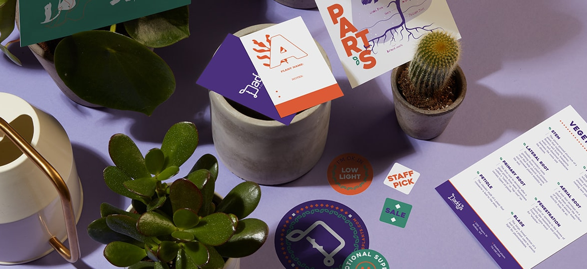
The team worked on a series of large, fun Stickers to treat customers to and turn them into brand advocates in one fell swoop. With logos, fun messages, and plant puns, the various designs reflect the colourful personality of the brand.
“The purpose of these products is to reflect the fun, bold vibe of Daddy’s Plants through products that enhance the customer experience. We wanted to incorporate playful plant-related puns and imagery into stickers for customers to use on their own plant pots or for general use,” explains Holly.

Pretty versatile Postcards
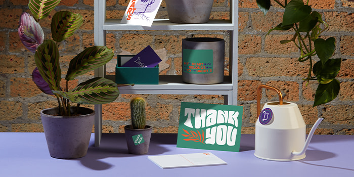
They also worked on a series of Postcards to both inform and delight customers. The team started with a series of lovely plant designs on mailing Postcards, and colourful thank you cards that Pat and Billy could gift to customers with their purchase.
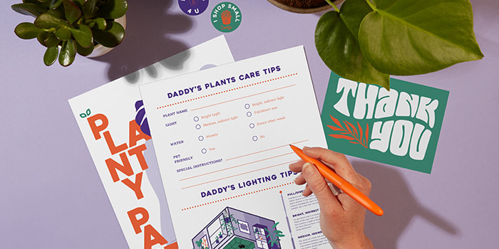
They also created care cards with Daddy’s Plants’ witty tone of voice to help shoppers better understand both the lingo and what their plants need. Michela adds: “Daddy’s Plants gets a wide range of customers, from casual shoppers to extreme plant geeks, so we wanted to have some fun takeaways for those who want to know anything and everything about plants! The diagram and vocabulary sheet is perfect for the folks who want to get up-close and personal with their new plant pals, and learn the lingo you might need to provide the best care.”
“They’re perfect for the folks who want to get up-close and personal with their new plant pals”
Finally, the team used cards to create signage for the shop. From “cacti” to “tropical”, “low light” to “pet-friendly”, these colourful Postcards help shoppers find the best fit for them.

Flowery notes
Holly designed beautiful Notecards for customers gifting Daddy’s Plants green beauties to their plant-loving friends and relatives. “I combined an abstract leaf artwork with fun colours and block shapes to create a fun piece to pin on a wall.” They fit into beautiful kraft Envelopes that evoke plant soil and nature.
Planting the seeds for growth
The design services team also created a collection of business collaterals to support the brand in their day-to-day work and help them expand into new territories.
Labeling is caring
With StickerBooks, Round Stickers, and Rectangular Stickers, Pat and Billy are all set with the full MOO range. large Rectangular Stickers are used for packaging, while small round ones are used to label plants – from low light to high maintenance. “We wanted the customer to have more confidence in plant care. Most of us have once received a plant and been like ‘oh no, how do I take care of this thing?’ Now the customers have some help to get started,” explains Cammie.
“Now the customers have some help to get started”
When it comes to the mini Stickers from StickerBooks, the team used them to indicate promotions and discounts and identify staff picks. For Cammie, it’s a great way to catch shoppers’ attention when they’re wandering around the store. “I really wanted to push the limits on how they would use the stickers in the shop – either as getting the employees to geek out about their favourite plant or even to just elevate their packing.”
This way, please
The team used large Flyers for signage and merch pricing. Pat and Billy sell some highly desirable merchandise in their shop, including comfy hoodies, tote bags and planters. Cammie created a branded poster to catch their eye and make the price list as attractive as the merch itself.
Keeping in touch with Daddy
Michela made sure customers would keep the relationship going with Daddy’s Plants with a big QR code Postcard linking to their social media accounts at the counter. “Daddy’s Plants also have a strong social media presence, so we wanted to be sure they have places in their shop to direct their customers to join them online as well.”
Even plants need introductions
MOO Business Cards are nothing if not versatile. Holly used them as plantable labels. “It was so fun to create Business Cards that would actually be placed into the soil, giving information about the plant and any specific care needs.”

A winning team
The designs Holly, Cammie and Michela created for Pat and Billy were a big hit. And that’s also because the two loveliest teams were working together (if we may say so ourselves).
“Getting to meet the Daddy’s Plants was my favourite part of the project. While we love all of our customers, it’s rare that we get to meet them face-to-face (or screen-to-screen in this case). Meeting Billy and Pat and hearing about their passion for plants really made the process come alive,” says Michela.
For Cammie, getting to meet the team was also a highlight. “It was really exciting to show our work and get real-time feedback. To see their faces light up with the designs and ideas we had really reminded me of why I love design.”
“The entire process has been a wonderful collaboration”
And Pat agrees. “Working with the team at MOO has been such a delight. The entire process has been a wonderful collaboration. They really took the time to listen to our needs and understand our brand and point of view. Plus they made some really great suggestions and recommendations on how we can use the MOO print products in ways that we may not have thought about before.”
“They’re really going to bring the Daddy’s Plants brand to life in a greater way for our customers. The products are not only bright and fun but also provide a lot of useful info for our customers to feel confident about purchasing and caring for plants. Plus, the new items will bring a wonderful seasonal look to the shop for Pride and beyond.”
When asked about their favourite product, Pat and Billy go back to the core mission of the brand. “It’s hard to pick a single item, but the Postcards with care and lighting tips are so handy (and beautiful!) It’s such a useful way for us to give quick instructions to our customers in a way that is visually appealing and easy to understand. Everyone can use a little care reminder now and then!”
Proudly display your colours with design services
Like what you see? Enjoy the expertise of our design services and unlock new products by subscribing to a business plan. Fill out the form below and a friendly account manager will get in touch.
Keep in touch
Get design inspiration, business tips and special offers straight to your inbox with our MOOsletter, out every two weeks.


