7 ways to make a brand statement with modern Postcards
Say hello to modern postcards – guaranteed to add sparkle to your customers’ mailboxes.

If Postcards still conjure up images of sending snail mail from vacation, then you need to meet the modern postcard. No longer a holiday relic, they’re a game-changing business tool. With a customer response rate of 5.7%, Postcards are the most effective form of direct mail marketing around.
Thanks to their ability to directly target customers, postcard marketing can help your business thrive. Our client Calm uses Postcards to support their mental health work by distributing well-being discounts and codes at events. A spokesperson for Calms says, “Postcards are a great means of directly engaging with customers.”
Whether you want to send invites, sell specific products, or just say thank you, there are so many ways to use Postcards.
So… how do you go about creating a statement postcard for your business? We’ve asked our MOO Marketing Team the top 7 things to consider when designing a modern postcard.
1. Colour
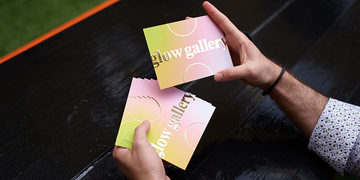
Your Postcard needs to be instantly recognizable from the moment it plonks into your customer’s mailbox. So, staying on-brand is key. Before you set your designers loose, consider how the postcard’s colours will complement your existing branding. If you do introduce any new palettes, make sure you’ve achieved colour harmony by choosing complimentary shades. It’s also worth considering colour psychology and how you can use different colours to stir up emotions in your customers.

2. Typography
Feature your brand typeface on your Postcard. Or, if you don’t have one, choose a font that reflects your brand personality. If you’re a creative business, you might opt for a fun, handwritten script, or if you’re a corporate company, you might stick with a classic serif type. Typography should be legible and have a clear messaging hierarchy. New to designing with type? Check out our handy blog here to get you started.
3. Sizing
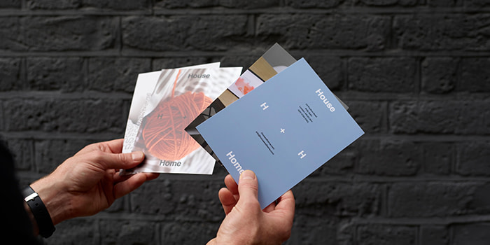
We’re all used to traditional rectangular Postcards. But why not play around with sizing for a fresh modern postcard? At MOO, we offer seven Postcard sizes so you can add some serious personality to your mailing. When selecting a size, consider your country’s postal regulations, costs, and what will work best from a visual perspective. Check out our super-useful Postcard sizing guide right here.

4. Papers
The medium is the message, so choose a paper that reflects your brand values. If you’re looking for more sustainable options then MOO Eco is a great choice. Or, if customer experience is top-of-mind, you might prefer a more luxurious option such as MOO Luxe.
Think about how you’re going to distribute your Postcards. If you’re handing them out at events or trade shows, MOO Super is the perfect ultra-durable, non-bendy option. (Find out more about our MOO papers in our ultimate paper guide.)
5. Special finishes
Here’s where you can bring some oomph to your modern postcard designs. Gold and Silver Foil finishes add that razzle-dazzle factor, making your Postcards impossible to ignore whether they’re in your customers’ mailbox or at a networking event. And with a gorgeous metallic finish, your brand will literally shine. If you need any extra help in getting your artwork set up correctly for foiling, you can use our guide here.

6. Envelopes
Envelopes aren’t something you usually associate with Postcards, but modern postcards are breaking tradition. Envelopes offer more design possibilities and add another layer to the customer experience. Opening an envelope to reveal a premium branded Postcard feels more like an exclusive and personalized invitation than a mass marketing tactic. At MOO, we offer a range of different Envelope colours, and patterned inserts – the perfect way to make your opening statement.
7. Messaging and call to action
Your Postcard might look phenomenal. Your customers might immediately pin it to their office noticeboard because they love the design. But your Postcard is there to do a job, and it needs to clearly communicate what your customers should do next. Sign up for an event? Shop the sale? Scan a QR code? Use a discount voucher? Make sure the call to action is clear and simple. Less is sometimes more.

Ready to create modern postcards for your next campaign?
With a MOO Business Plan, our customers receive more brand control, pro design support, dedicated account management, and more. You’ll also save on everything you order (including Postcards) – all the time. Fill in this form, and one of our team will be in touch shortly to help.
Keep in touch
Get design inspiration, business tips and special offers straight to your inbox with our MOOsletter, out every two weeks.


