Luxe: a royal inspiration
It all started with an invitation – and we asked our CEO Richard Moross to tell you the rest.

We told you how Luxe was made, but not how it was born. It’s about time we let you in on the origins of our fanciest paper yet. It all started with an invitation – we asked our CEO Richard Moross to tell you the rest.
A high-end inspiration
Richard Moross is the original printhead at MOO. It shouldn’t come as a surprise, then, that our story begins in a printing company. “In the early 2010s, I visited a longstanding and very traditional printer here in London. They were the proud owners of a Royal Warrant and had been making stationery for the Royal family for many years, in addition to some very high-end invitations to parties for the rich and famous.”
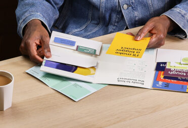
Everything they made was beautiful, but it was the colour seam that caught his attention the most. “They shared some samples with me and I was blown away. Not only was the quality incredible, but I was also taken by some invites that were extra thick, with a seam of colour running through them.” With their various colours, the seams really made the cards stand out.
And so the inspiration for Luxe was born.

Premium’s premium
Richard was impressed with the level of craftsmanship that came into making these premium invites. To achieve such a high level of quality as a traditional printer requires skills and method.
“Stationery of this sort is done using a technique called triplexing, which involves bonding three sheets of paper together. You have the outer two layers, which are traditionally white, with a coloured paper sandwiched in between. The better the papers you use the higher the quality, along with the process and precision of the papermaking process.”
Using an artisanal process like this one doesn’t come without challenges, though. “This super luxury stationery would have been made in a very traditional and handmade way, which usually also comes with a very premium price.”
Luxury for everyone
Here at MOO, we think great design should be available for everyone. That’s why Richard and the team set to work on a process that would make such beautiful cards accessible to those less accustomed to crowns and red carpets. In other words, “let them print Luxe”.
First, he got in touch with Mohawk Fine Papers to find the best paper (more about our love story here). “We needed an artisanal outer paper, something luxurious and timeless. We settled on Superfine for its provenance and quality.”
The trickiest part came with the assembling. “We needed to find a way to construct the ‘sandwich’ effect, using our more modern digital printing techniques. The challenge is the gauge of the final product – it can’t be run through a modern press as it’s too thick. So, in order to make the product printable the outer sheets needed to be printed separately, then combined later.”

After careful research and a whole lot of experimentation, our product design team cracked the case. “The innovation came in the form of a converting technology that allowed us to add a pressure-sensitive glue to the papers, and to print them first, then combine them.”
And voilà: extra-thick, eight colour seams, all beautifully wrapped up in beautifully textured paper.
Richard was overwhelmed by the positive response to Luxe. “My favourite part has been watching the uptake of the product and the comments from customers, who love it.”
But don’t take our word for it – try it for yourself. Get your hands on Luxe here.
Keep in touch
Get design inspiration, business tips and special offers straight to your inbox with our MOOsletter, out every two weeks.


