How to make a flyer that stands out

Whether you’re a first-time flyer designer or an old hand looking to improve your skills, we’ve got you covered. Here’s how to create a flyer with eye-catching looks and a compelling message.
So you’ve decided to promote your business by distributing flyers. Awesome choice! Flyers are an amazingly versatile form of marketing that can help you reach a wide audience in a short space of time.
Whether you hand them out in person, include them in your product packaging or have them handy at your premises, a well-designed flyer is a major promotional asset. But what does a good flyer look like?
What makes a good flyer?
The best flyers have two essential ingredients:
- Copy that convinces and converts
- An appealing design that grabs attention
In this article we’ll run you through everything you need to get both these elements 100% nailed so you can start spreading the word with flyers.
Copy that converts
When it comes to writing copy for your flyers, here are the golden rules…
- Never waste words
Every word on your flyer needs to be there for a reason. Unlike a book or magazine, a flyer only gets a fleeting chance to make an impression. If your audience doesn’t connect with its message in that brief window of attention, it’s game over. So make sure every word matters and cut out any non-essential content before you send the final version off to the printer.
. - Put the most important stuff in your heading
Whether it’s “free lunch!”, “cool new store” or “restaurant opening”, the key message of your flyer should be stated in the most visible part of the copy – that big, bright attention-grabbing heading. Don’t think beginning-middle-end, and don’t build up to a big finish. Remember that short attention span and put your main message in big bold text at the front and center of your flyer.
. - Speak your reader’s language
Who is the target audience of your flyer? Young people, tech savvy professional nerds, those with English as a second language? Understanding who you’re talking to will help you to pick the right vocabulary to connect with your audience. It will also help you to…
. - Highlight benefits your audience cares about
What’s more compelling – “4 inches across, 1oz weight, ” or “feather-light and pocket sized?” The first statement gives the product’s features, the second is its benefits. And it’s benefits that get people interested.
. - Use bullets, lists and bold text
Copy is easier to read and digest if it’s written in an accessible way. Just look at this list – how easy would it be to absorb the information if it was all one long paragraph? Use bullet points, columns and bold text headings to break up your content and list key information such as price points, dates and times or product features.
. - Include a call to action (CTA)
A CTA is the part of your copy that spurs the reader into action. It tells them what to do next, whether that’s visiting your website, picking up the phone or booking tickets to your event. The CTA should be short and focused – pick a single action for the reader to take rather than including multiple suggestions, otherwise things can get confusing and the message loses its impact.
. - Tell them how to get in touch
Your flyer is a bit like a message in a bottle from your business. Unlike a website or social profile, it isn’t connected to anything, so you need to make it as easy as possible for people to find you and stay in touch. Add your street address (if you have one), URL, social profiles, and maybe a QR code for smartphone users to scan – especially handy if your flyer includes a discount or deal they can claim.
Design that dazzles
Here’s our cribsheet for creating a design that looks great, enhances your brand and amplifies your flyer’s message.
- Explore the color wheel
When you’re choosing a palette of colors for your flyer, it can really help to have a reference point for which colors go together, especially if you haven’t yet established your brand colors. A color wheel can help you achieve bold contrast and avoid any cringe-worthy clashes.
. - Pick a mix of fonts
Decorative fonts can add flair and style to your creative flyer design. They’re great for large headings because they’re bold and attention-grabbing. But body copy in smaller point sizes needs to be legible and clear, and in this part of the flyer, decorative fonts can create a cluttered reading experience. Mix your decorative headings with a plainer font lower down, such as a sans-serif or modern style, to get the best of both worlds.
. - Use space to make an impact
Sometimes empty space can be as effective as filling a flyer with design and excitement. White space or a plain background can create more emphasis for the content you do include. It ramps up the contrast and acts as a frame for your message and imagery.
. - Think top-down, left-to-right
For English and most other Western languages, we read things from left to right, starting at the top. Use this to your advantage by structuring your flyer design with the heading at the top and any smaller copy further down the page. Your CTA can appear further down or in the lower right corner, as it will come into play once the reader has absorbed the headline and main message.
. - Be smart with scale and distance
Your flyer needs to tempt people from a distance so they’ll pick it up. It also needs to keep their attention when it’s being read at arms-length. Cater to both these viewing distances by putting key messages in large fonts and high-contrast colors. The same goes for your hero images – they need to be recognizable and effective from a distance, but contain enough detail to add value close-up too.
Too long, didn’t read?
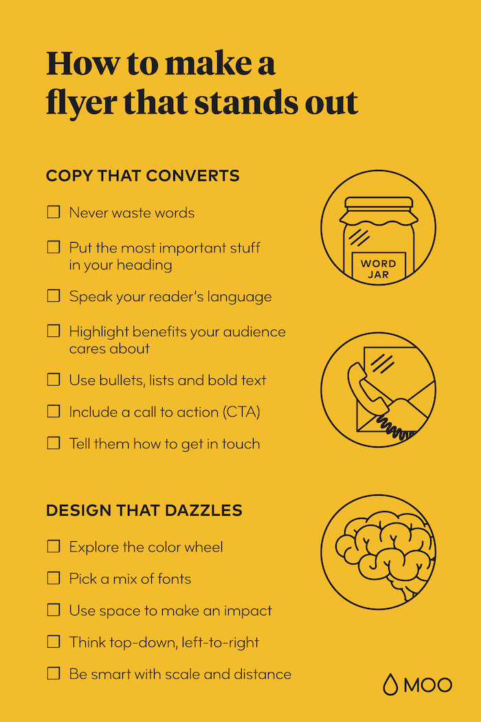
Fear not: this handy checklist will help you create a Flyer everyone will remember.
Browse a wide range of MOO flyer templates to gain inspiration for your project, or customize them into one-of-a-kind designs with your own logo and images.
Designing your flyer from scratch? Check out our guide to flyer sizes and dimensions.
Keep in touch
Get design inspiration, business tips and special offers straight to your inbox with our MOOsletter, out every two weeks.


