Business Cards worth their weight in gold
We spoke to members of the MOO community about why they chose Gold Foil Business Cards.

There’s nothing quite like a bit of Gold (or Silver) Foil to brighten up your Business Cards. While it’s crucial for them to contain key information, they don’t have to have that ‘businessy’ feel about them.
Network with confidence and add that ‘wow’ moment by adding a sleek and shiny finish. And while you consider just how to brighten up your cards, we’ve selected a couple of gold-medal winners from our MOO community to inspire you.
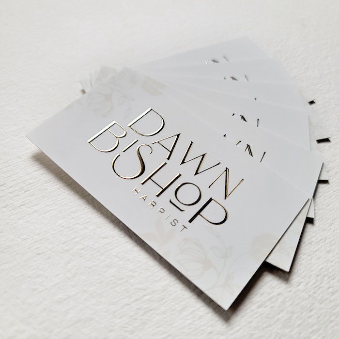
Jolene Choi: An Art Nouveau aesthetic
Jolene Choi is a graphic designer working in Chicago. She has an affinity for negative space, curvilinear lines, elegant typography and art history.
Her inspiration came from heirloom harps. Built in the 1910s, the harp features gilded detail on the crown column, and the base reflects the sinuous lines of the Art Nouveau era. Jolene shared that ‘the fact that artisans crafted this stunning period piece at Lyon and Healy in downtown Chicago provided depth and history to the branding.” She used this as a catalyst for her client’s logo before finally landing on the hand-lettered Gold Foil piece, which iterated the glamour of the era while infusing contemporary elements.

Apart from the MOO Business Cards she designed, Jolene’s favourite shiny thing is an etched plate she inherited from her grandmother. “The etched flower design on the plate emulates the highly-stylised Art Nouveau design from the Glasgow School of Art. It harmonises glamour and negative space perfectly”.
Jolene plans to continue to work with local small business owners to develop and refine their branding. Additionally, outside of her client base, she’s keen to expand her passion projects which include hand-lettering and surface pattern designs.
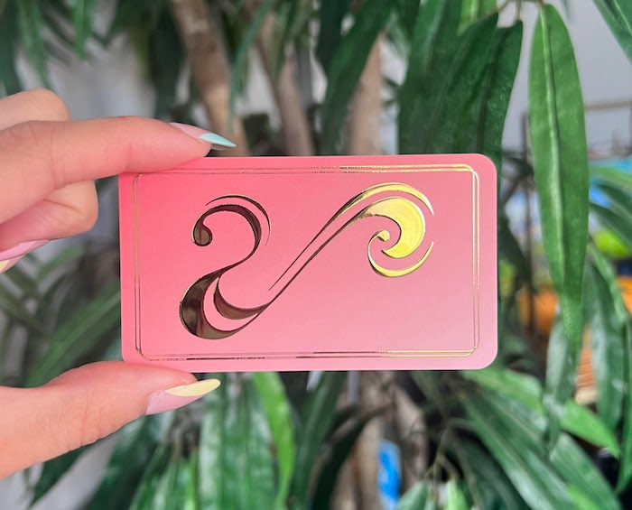
Mar Luciana: Riding on the crest of a wave
Luciana Mujica-Martorell is the freelance creative behind Mar Luciana. “I am particularly drawn to projects that involve print – books, posters, murals – basically anything and everything that tangibly and artistically shapes our surroundings and lived experiences. As a creative, I value a commitment to authenticity and social/cultural awareness, and I aspire to do work that is meaningful, impactful and hopefully, helpful to others.”

When it came to the design process, Luciana chose to insert the short version with her second last name, Martorell. It also means ‘ocean’ in Spanish. Luciana explains that she loves the idea of belonging to the sea because it’s “a strong force of nature uniting all.” This is why you’ll also notice that the logo is in the shape of an ocean wave.

She chose Gold Foil cards because they added a unique and beautiful movement to the printed design. “The gentle shifts in gold tone when you move the card around lends itself well to the motion of a wave.”
Next on her list? It’s still in the early stages, but a dear friend of hers is an incredible singer who’s about to release her first single in Japan this year and she may be designing the cover art. She added “I am incredibly excited for her, and this project. Regardless of what my next project ends up being, however, I sure hope to have MOO print it!”
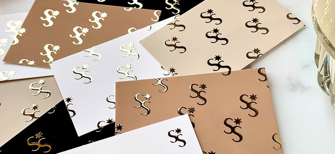
Spark Studio: A magical touch
Karolina is the founder of Spark Studio. She creates unique designs for unique businesses. “It is both my passion and mission to create bespoke branding that expresses exactly what the business of my client is and simply makes each business spark, in their own inimitable way.”
While designing the cards, she aimed to show the magic, spark and possibilities. A foil design was an essential element to reach my goal.
Her favourite shiny thing? “My engagement ring. It’s not all about the shine only – but about our emotional connection with the object! And my Business Cards are my little ‘baby’, representing my beloved business. I literally can’t stop staring at them.”
Karolina is still working on a few client projects with Spark Studio. However, the next one for her studio is going to be Thank You cards. “I literally can’t wait to have them in my hands and share even more spark and magic with my dear clients!”
Forever Ink: A natural glow
Izzy is a brand designer from South Wales. She works with passionate business owners wanted to create the brand of their dreams. Izzy offers a range of services from bespoke branding to print design and package design through her business, Forever Ink.
When it came to the design of her client, Megan-Sian Photography, she was inspired by her natural, light and bright style. “She regularly does shoots in lush wildflower meadows so I really wanted her branding to showcase this aesthetic. I paired an earthy sage tone with soft cotton for a delicate balance.”
She adds “I wanted Megan’s print materials to feel premium and have an extra special touch when promoting her photography services and I knew that MOO’s Gold Foil finish would be perfect for this. I always recommend it as I love the raised finish and find it so effective on designs, especially when the foil catches the light and creates a really luxurious look.”
Her favourite shiny thing, (apart from MOO’s Gold Foil of course), would be the sea. “I love it when the sun catches the ripples in the sea and it looks super shiny and glittery.
Her next project is working on branding for a holiday home on a farm in Somerset. “I am so grateful for the variety of businesses I have had the opportunity to brand as there is always something new to push my creative thinking!”
Explore Gold Foil for yourself with MOO.
Keep in touch
Get design inspiration, business tips and special offers straight to your inbox with our MOOsletter, out every two weeks.


