Proudly presented: the psychology of visual merchandising
Learn more about visual merchandising with our top tips to stand out.

Vision is our most dominant sense. After all, eyes are the window to the soul. That’s why creative visual merchandising is so important to create that connection and stand out in the eyes of potential customers.
Find out how playing with space and colours can help you make a difference with these visual merchandising tips.
What’s visual merchandising?
Visual merchandising is a retail practice aimed at optimising the way products and services are presented to potential customers. It’s all about creating an attractive and engaging atmosphere to attract shoppers and drive sales.
Visual merchandising in retail uses tools like colours, lighting, displays, layout, and other elements to draw attention to particular products and areas of a retail space. The experience starts outside with signage and window displays, and continues inside the store.
Nothing should be left to chance when it comes to creating a unique customer experience – whether you have your own shop or you’re managing a market stall.

Display the right way
Here are some key principles and visual merchandising tips to show your products in the best light.
Full-colour experience
Colour theory plays a big role when it comes to visual merchandising. Firstly, because your choice of palette will influence the perception of your brand and products. While a sunny yellow is associated with positivity, blue can evoke calm and tranquillity, and reds can denote excitement and passion. You can use these mental associations to trigger an emotional response in potential customers, help them better understand your product and mission, or, on the contrary, surprise them.
The way you combine colours will also help you draw shoppers’ eyes to key areas of your window, shop or stall. For example, bright colours tend to be energising and attract the eye. Putting them everywhere will create a very exciting environment, but customers might struggle to focus. You can use contrasts and complementary colours to make some products or messaging stand out – with bright colours on a monochromatic, darker background, and vice versa.
Read our guide to colour theory to learn more about the psychology behind brand colours, and how to combine them for creative visual merchandising.

The magic of empty space
‘Tidy room, tidy mind’ doesn’t only apply to your house. A space free of clutter is said to help reduce stress and improve focus. Just like in graphic design, negative space can be an invaluable tool to bring out key elements.
Applying this principle to your store is a great way to drive the attention to a specific point and avoid sensory overload. Your space shouldn’t make shoppers feel overwhelmed. Give them the space they need to make the right decision. They’ll feel more relaxed, and more open to the story you have to tell.
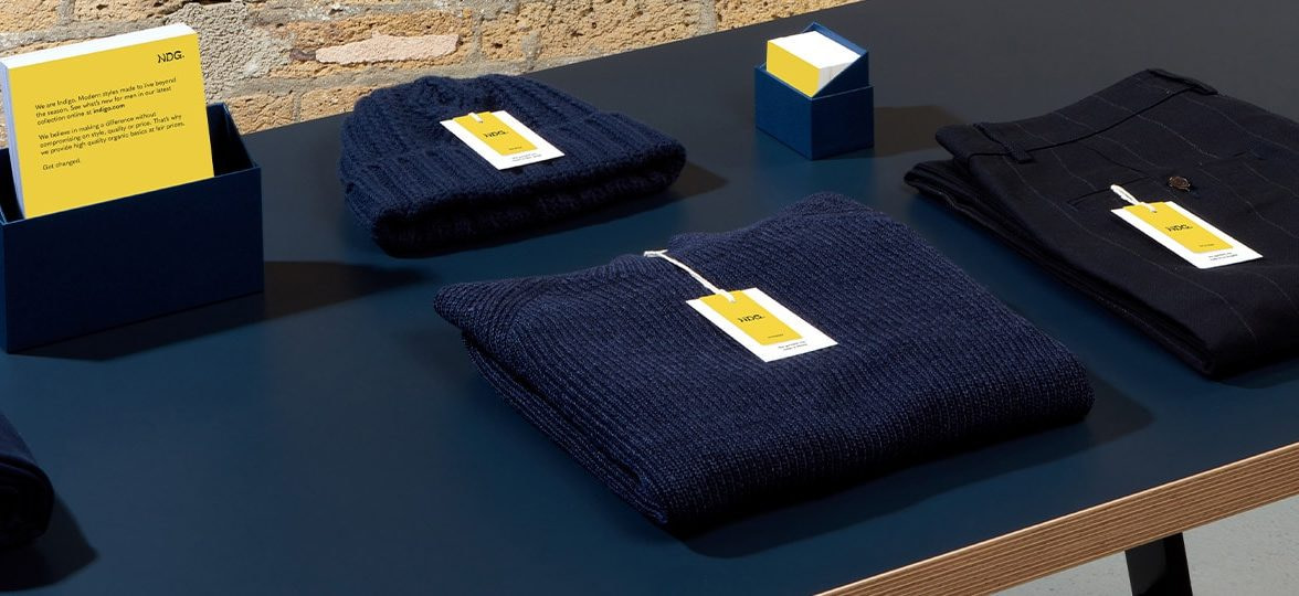
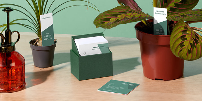
Looking for visual merchandising tips to keep your space uncluttered? Use Display Boxes to keep your print materials tidy in style.
Understanding hierarchy
If you want your customers to follow you, you need to know where you’re going. Take some time to think about the shopper’s journey. You need to be very clear about what you need from them, from the moment they spot your store or stall. The first few steps should be fairly easy; you want them to come in, or stop by.
Your space should be designed with that story in mind
The next steps depend on the complexity of your offering. Is there a particular product or service you want to highlight? Do potential customers need to understand your mission before checking out your products, or do they speak for themselves? If you’re creating an innovative new product, or your prices are higher because it’s handmade or sustainably produced, you’ll want to make sure customers have all the information they need before their eyes land on it.
Your space should be designed with that story in mind. It’s important to trace a clear path for shoppers to follow so they immediately understand where you want to take them. Hierarchising the different elements that compose your space will help you design an optimised experience.
Let there be light
You can’t highlight without light. The way you design your lighting experience will have a big impact on the way your space and products are perceived by shoppers.
You’ll need to adjust the lighting to create the right atmosphere. Some studies suggest that bright light can drive stronger emotions, while low light keeps them more balanced. In this sense, brighter lights could trigger more impulsive decisions – like purchase. In the same way, the saturation of this light could amplify emotions.
According to a recent study led by Monash University, natural light has a positive impact on the mood. A soft, warm lighting can also convey a sense of calm and comfort, while colder lights are perceived as brighter and can boost energy levels. You can also use colourful lights for a more extravagant atmosphere, but be careful not to affect shoppers’ perception of your product colours and details. The atmosphere shouldn’t upstage your products.
Choose your lighting carefully, and adjust it to make your key products and messaging pop. Take natural light into consideration when designing the experience, and make sure you’re not hiding important elements into the shade.
Digital touch
Visual merchandising in retail hasn’t escaped new technologies. Including digital elements in your physical store can be a way to enrich it and personalise the customer experience without crowding the space.
You can use screens to include videos and show products in use in your latest campaigns. You can also let customers browse through your online store, to find what they’re looking for in a few clicks and promote your digital presence. It’s also a great way to check what’s in stock without waiting for a shop assistant to be available when the store is busy.
If you want to promote your digital presence without spending all your budget on high-tech solutions, you can simply add QR codes in key areas of your shop or stall such as the hang tags, Business Cards and in-store signage.
Ready to create a space shoppers won’t want to leave? Get your in-store marketing materials ready and display them in style with our new Display Boxes.
Keep in touch
Get design inspiration, business tips and special offers straight to your inbox with our MOOsletter, out every two weeks.


