Box Clever: Packaging Just Went Plus

Phil Thomas, MOO’s Product Designer talks us through the design process involved in creating the packaging for our new NFC-enabled products, Business Cards+.
Packaging at MOO has always been an integral part of the products we sell. As we discussed in a recent webinar on packaging, we always aim to surprise and delight with everything we do, and our Business Cards+ are no different. However, these NFC embedded cards have something extraordinary about them, something we’ve never done before, and we felt the packaging needed to reflect that.
We loved the idea of exploring an 80’s vision of the future.
From the very start we loved the idea of exploring an 80’s vision of the future. There are many iconic films from this time like Back to the Future, Tron and Blade Runner, all of which had fun predicting how our culture would develop. The prop and set design in these films focused on strong angular shapes with flashes of bright neon colours. These combined together gave the films a really forward-thinking feel at the time. We generated some MOOd boards (sorry) by taking inspiration from this, as we pulled tighter images of interesting shapes, colours, textures and patterns we found, that could help dictate the look and feel of the packaging.

From this we set about sketching out some very quick concepts – one or two minutes per sketch – exploring areas such as shape and proportion. One of the best design tips I was taught is to empty your brain onto the page without being precious about how it looks. This really frees you up and allows you to explore many ideas in a short time. Later you can take these sketches and develop them further. It’s always important to do iterations of your sketches, taking parts of your designs you like and pulling them together with other sketches. This really helps to figure out what works and what doesn’t.
After a few rounds of sketching and evaluations, we chose some ideas we wanted to explore using physical mock-ups. This is the first time you really get a sense of the size and proportion of the design. We often start with thin paper, as it’s a fantastic material to work with to get instant results. Again iterations of each design are important, before you move on to more detailed prototypes that involve colours and textures.
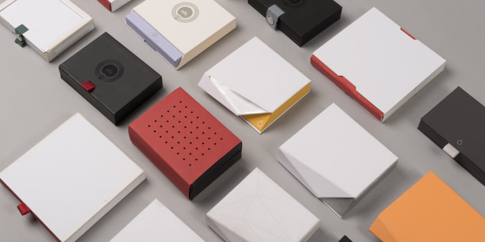
In the background we also decided to explore some clever opening mechanisms that would raise the cards out of the pack, reflecting the feeling of magic that’s hidden inside the business cards. Taking inspiration from pop-up origami and spring loaded release mechanisms, we had great fun building prototypes – ranging from the subtle, to the absurd. The above photo is just a small selection of the many models we built.
We reviewed them all as a team and decided on one final design.
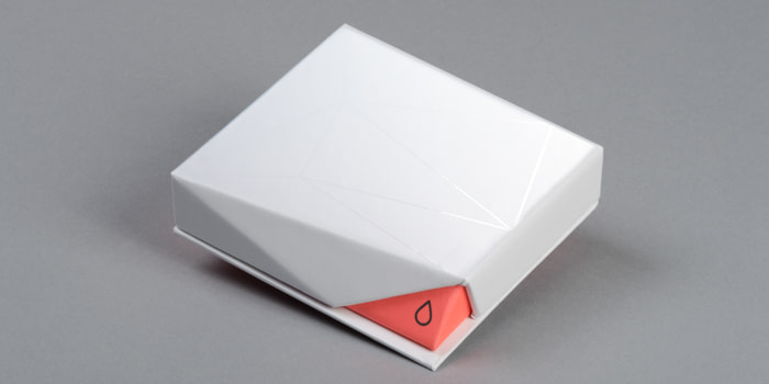
This design had an instant wow factor to it, with its sharp angular faces that include an element of surprise, when you find it’s made entirely from paper and cardboard. Added to the top of the box are subtle spot UV lines that at certain angles catch the light; a reminder of the circuitry that’s hidden away inside the cards. The flash of neon colour in the cut off corner instantly draws your attention, which combined with our logo hints at an electronic “power” button. It invites the user to “activate” the box by placing their thumb here to get purchase and open it.
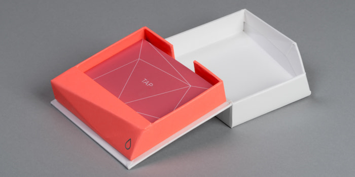
On the inside we wanted the packaging to take more of a backseat, let the customer flaunt their fancy new cards. So we included a simple mechanism that raised the pack up at an angle to act as a small podium. This warmly invites any passer-by to take a card. And of course our packaging wouldn’t be complete without a hidden message on the box somewhere, but we’ll leave it up to you to find out what it is…
Keep in touch
Get design inspiration, business tips and special offers straight to your inbox with our MOOsletter, out every two weeks.
