Tom Maryniak: reinventing wallpaper with woodcut
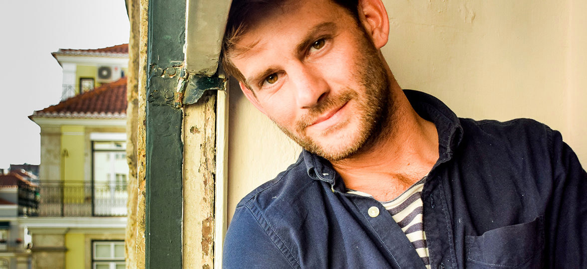
Currently on an artists’ residency in Lisbon, we talk to Tom Maryniak about the woodcut designs that turn wallpaper into an art form.

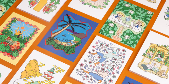
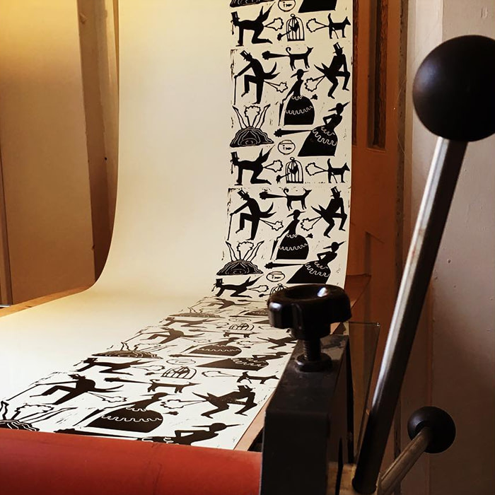
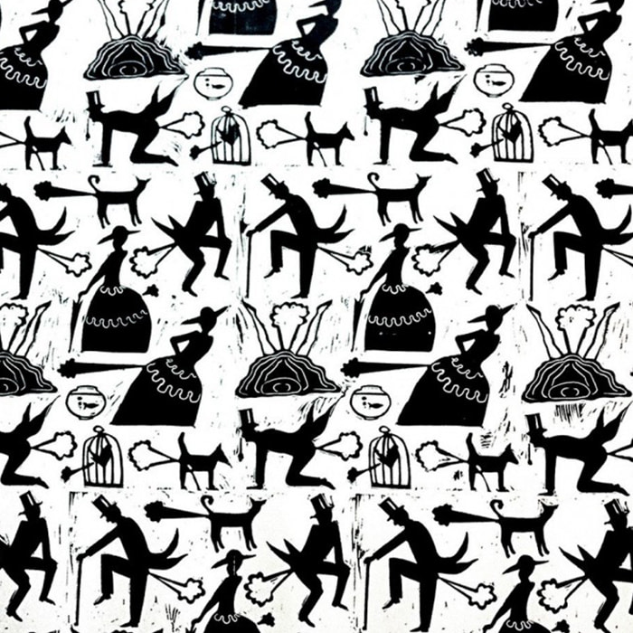
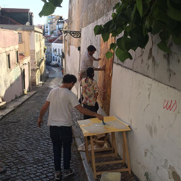
With designs including ‘Let Them Eat Steak,’ and ‘Farting Victorians’ and ‘Grecian Porn,’ Tom Maryniak’s unique bespoke wallpaper prints can be found in homes, restaurants and bars across the world. Often deliberately provoking, they aim to reframe how we view wallpaper.

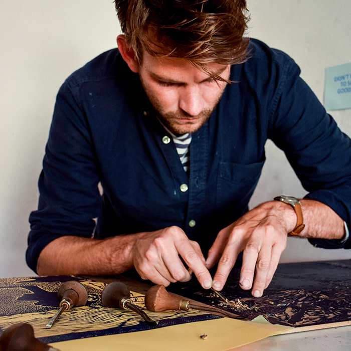
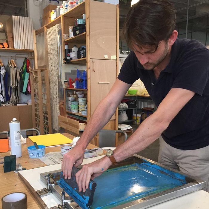
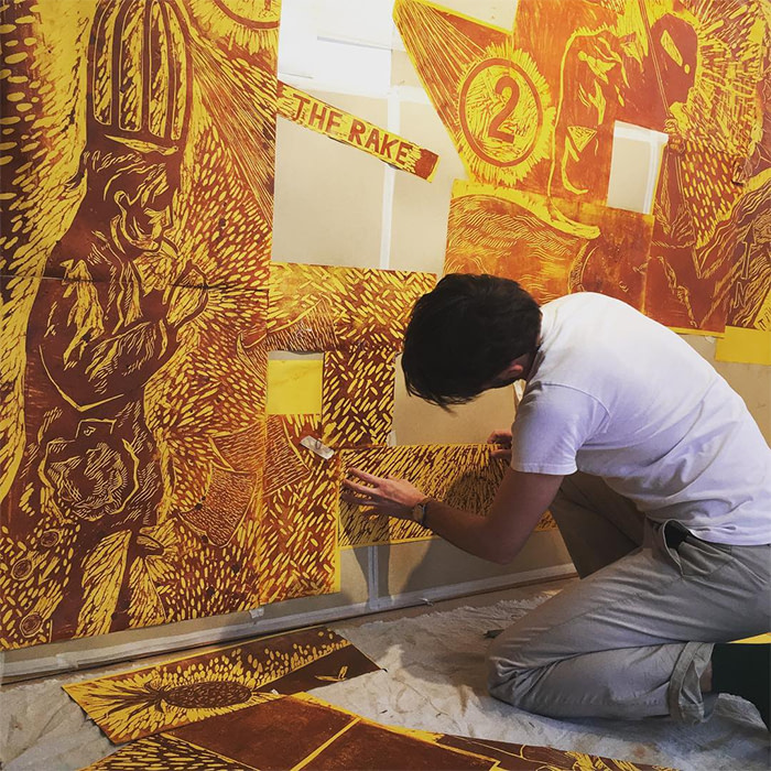
Based in Lisbon, where he’s in residence at Zaratan, Tom’s preferred medium of woodblock printing involves a painstaking cutting process, and the ability to visualize his striking designs in reverse.
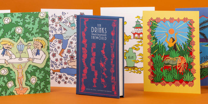
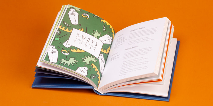
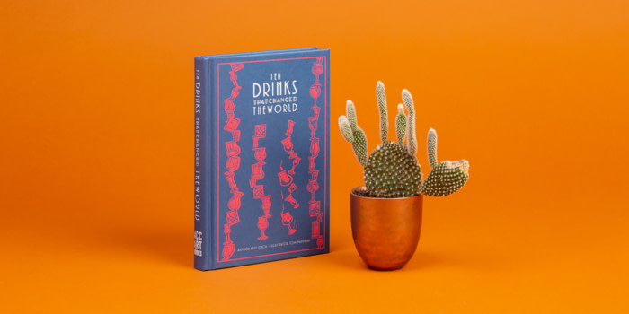
With the book cover for Ten Drinks That Changed the World recently added to his portfolio, MOO caught up with Tom to talk about embracing mistakes, the joy of shocking an audience, and how he landed his residency.
How did you become interested in design, and what drew you to woodblock printing in particular?
I came to design through my art. I’m often surrounded by art I feel indifferent towards, so I’ve always tried in my own work (and, in more recent years, in my wallpaper designs) to create something that stands out.
One of the simplest and most primitive ways of doing this is to shock people, so my wallpapers were a mergence of this – a piece of provocative imagery.
Your designs are full of atmosphere – where do you look for inspiration?
I’ve always loved theatre and storytelling, and often want to distil elements of these into my images. I think about bringing as much narrative as possible into a piece, and often hinge that narrative on a moment just before or after something dramatic has happened.
Woodblock prints initially drew me because they’re so bold and monochromatic. The contrast between the white paper and the deposits of black ink have so much aesthetic drama in them.
I think my influences within the medium of woodblock itself originated from the German expressionists, but inspiration comes from everywhere from history and literature to photography and dinner.
What’s the physical process you go through to create a piece of work?
Relief printmaking, like lino or woodblock, isn’t a very instinctual process. You’re working on an image that only comes to life when you ink it up then print something which will appear on the paper in the reverse.
Words have to be cut out backwards, and making a black line isn’t as simple as drawing one with a pen. I’m forever wrestling with how much to cut away from the block and when to stop, because the answers will only come at the last possible moment. It’s like playing roulette.
I do tend to worry less now though, embracing mistakes and enjoying the outcome without expectation. When it comes to art, concrete expectation is always a fairly disastrous tactic.
What sparked your decision to focus on wallpaper design?
My intention was always to try and do something new with wallpaper. I’ve always said I wanted to have people appreciate wallpaper as they might a piece of fine art, rather than see it as something that complements their drapes.
I’ve invited all sort of reactions to my wallpapers, both positive and negative, which is great – any reaction is preferable to none at all. There’s a restaurant in London [Hixster Bankside] whose bathrooms I wallpapered, and which I’d consider my masterpiece.
Every time I go in, the manager chastises me for all the complaints she has to deal with. The design is called ‘Grecian Porn’, inspired by the figure paintings on ancient Greek vases.
What’s your process when working on collaborative projects?
I’ll always ensure we strike up some sort of rapport before we move onto a professional collaboration. I think it’s important to get an idea of how people work and to build up a degree of transparency and trust before taking the leap into a project.
I begin with a lot of sketching – the main creative process happens for me when I visualize that passage in a book, or distil the lyrics which will form the basis of an album cover.
Then we’ll look at the work together, and perhaps juggle the composition around. I think I work like an illustrator in that sense, taking a concept or words literally and translating them into a visual accompaniment.
You’re currently on an artists’ residency at Zaratan. What advice would you give to designers seeking to secure a place on a similar scheme?
Artists’ residencies are amazing opportunities if you want to shake up your work, but you need to do your homework. I spent weeks working on my Zaratan application.
Ensuring your artist’s statement is tight, and that your images are clear, seems obvious – but these people are poring over hundreds of applications a week, so even if your art is a masterpiece, a sloppy application could mean failure.
What’s your studio space like?
I spend my life in my studio. It’s a third-floor atelier, north-facing with lots of sunlight pouring in. The building’s right in the center of Lisbon, and still has all its original Azulejos tiles and windows. It’s a dream. I’ve done little to the space apart from whitewashing, bringing in a few printing presses and the occasional bunch of flowers.
What are you currently working on – and what’s next?
The holidays are always hectic, so I’m spinning a few different plates right now. I run print workshops at the weekends in the studio with another printmaker, with the aim of giving people an introduction to the relief-printing process and pattern making.
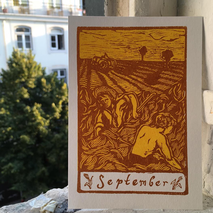
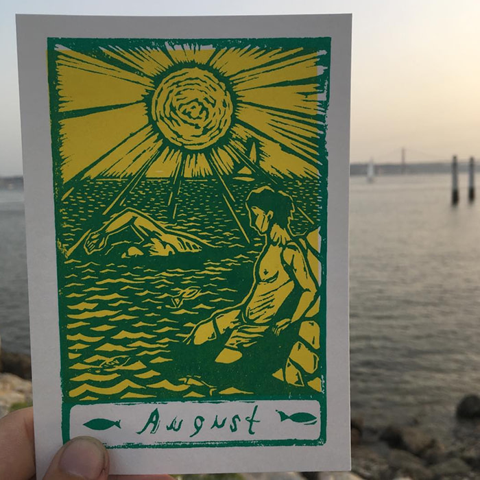
I have my own monthly Postcard project, which involves me sending a hand-printed postcard out to subscribers at the start of each month, as well as a few other commissions.
I’m also currently talking with a publishing house about a big project commencing in spring 2019. It’s a good job I like my studio!
Looking for more inspiration? Find out how Erin Aniker explores home and identity through design
Keep in touch
Get design inspiration, business tips and special offers straight to your inbox with our MOOsletter, out every two weeks.
