Layers of sound: Jordan Braithwaite on creating collages to music
Album cover and poster designer Jordan Braithwaite chats to MOO about the artists who inspire him and the process behind his striking style.
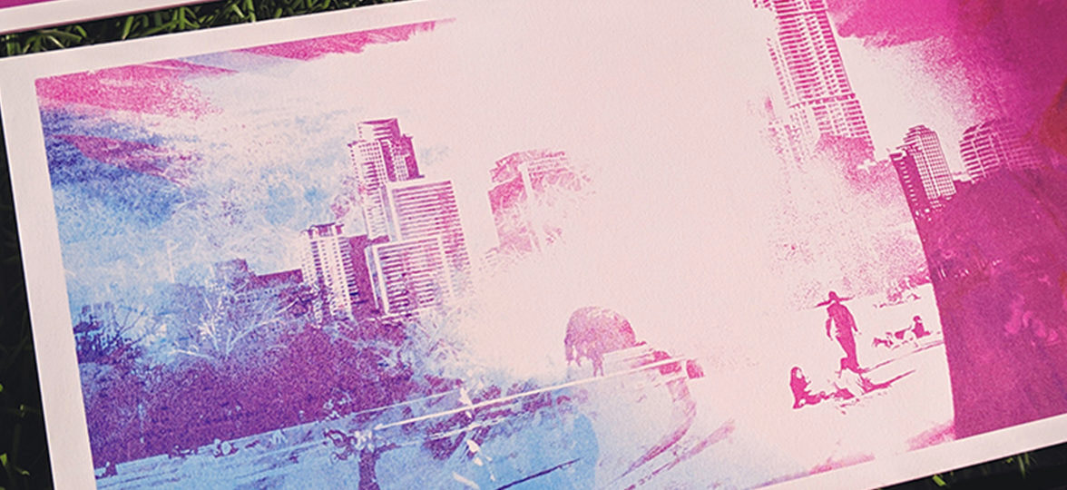
To celebrate our partnership with AIGA at SXSW in Austin, Texas, MOO asked three artists to design a postcard that reflects their unique interpretation of the city. We spoke with graphic designer Jordan Braithwaite about his approach to our challenge, how to evolve an internship into a full-time role, and the music that inspires him.
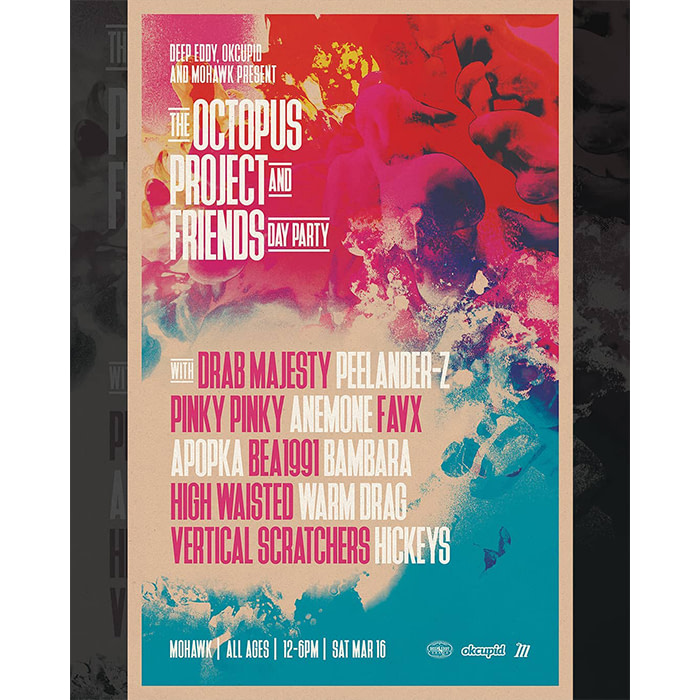
Graphic designer Jordan Braithwaite works for design agency Studio Dzo alongside his personal projects, producing colorful work that layers elements such as photography, typography and maps to produce his distinctive album and festival artwork and posters.
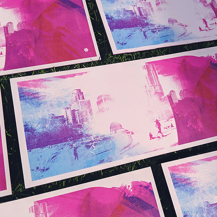
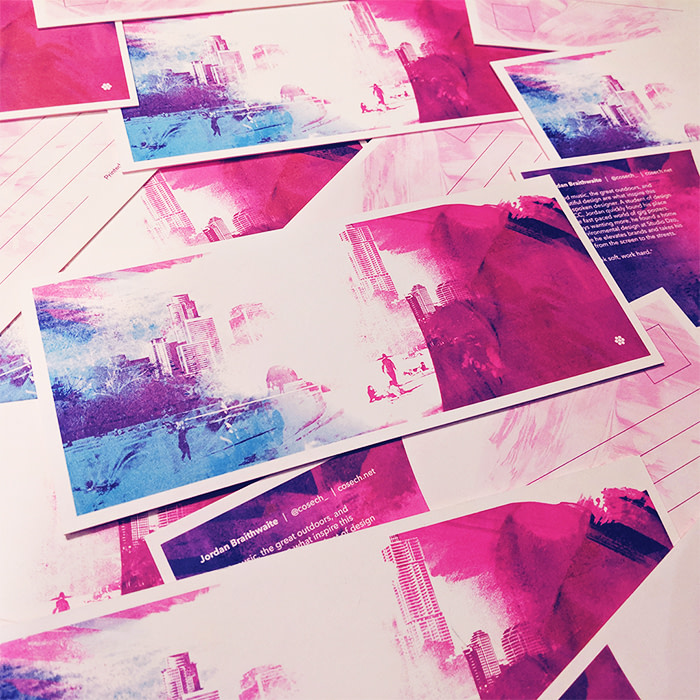
Also known as Cosech, Jordan used the MOO challenge to produce a dreamlike Austin landscape that incorporates his signature style and love of the outdoors.
MOO spoke to Jordan about the artists who inspire him, the physical process behind his striking style, and his hands-on approach to the Austin-inspired Postcard brief.

Tell us how you got into design.
I was introduced to Photoshop in middle school, and instantly became hooked. I spent a lot of time playing around and seeing what you could do with it, discovering techniques that created interesting textures and colors, and essentially stumbling upon my current style.
From there, I became fascinated with the possibilities of art and design, which made it an easy career choice. I found my stride in Austin Community College’s design program, and it’s been a whirlwind ever since.

What was your career path from graduation to your current role?
I wanted to cut my teeth in the industry, so I applied for as many internships as I could – even if you’re unsuccessful, interviews are great learning opportunities. My first internship was at Margin Walker – a local music booking company – and my main task was to grind out gig posters as fast as possible, which I excelled at.
I gained skills and tools to take to my next internship at Mohawk, a music venue in downtown Austin, and at the same time was given the opportunity to intern at Studio Dzo. The grind continued through these two internships (and my day job as a pizza-shop manager) until Studio Dzo offered me a full-time job.
Where have you found inspiration?
My biggest influence is Scott Hansen, who’s known as Tycho as a musician and songwriter, and as ISO50 for his photographic and design work. Both are near-perfect to me.
Design-wise, Leif Podhajsky, Michael Cina, and Andy Gilmore are some of my main inspirations, and musicians and bands such as Boards of Canada, Bonobo and Four Tet have all affected my design aesthetic to some degree.
Listening to music is a key part of my process – when I’m working on posters or album covers for bands, I tend to loop their music so I can get their vibe into my head, and hopefully be able to translate that visually.
What’s the process behind approaching a brief?
When a client comes to me, I’ll send back a creative brief asking for the scope of the project, the budget, examples of things they like and don’t like. I ask questions that help narrow down exactly what they’re asking for.
I usually have an end goal in mind, but through my method of layering photography and blending modes and effects, I usually end up taking a multitude of paths before I settle on a final result. It ends up being quite messy, but I’ve been able to create some really cool effects that I haven’t been able to recreate with any other process.
What’s been your favorite project to date?
The cover design for Blushing’s single, The Truth/Sunshine. My process lends itself perfectly to their lush vibe, so it’s easy for me to match their aesthetic.
I’m currently creating the artwork for their next full-length LP, and I’m really excited about how it’s coming together. I get to dive into a dreamy world of pinks, blues and lush textures, and it’s hard to leave once I’m there. They’re all great human beings, so I love making cool stuff for them.
What does Texas mean to you?
There’s a certain quality to Texas that makes you feel at home – more so than I’ve felt in other states. It’s not afraid of being proud.
Austin’s vibe in particular is one of the biggest contributing factors to my style – the creative atmosphere allows a lot of freedom to express yourself.
How did you approach the brief to design your Austin-inspired Postcards?
I knew from the beginning that I wanted to use one of my favorite elements of Austin in my Postcard: the outdoors. I wanted to include either the skyline or Zilker Park, and combine them with other elements to create a dreamy landscape scene. The colors are representative of the general vibe I feel in Austin – vibrant and exciting, but also very soothing and welcoming.
The background is a combination of a few images – one being the dance floor of a concert venue, which I’ve used for texture, and another being a photo I took of people enjoying the weather at Zilker Park. I snagged a few great photos, and brought them into Photoshop, then focused on creating the right balance of color and texture to complement them.
It took a while, but I’m thrilled with how it came out. I hope to evoke a sense of wonderment and hopefulness with my Postcard, as I get that feeling every day riding the train through Austin.
Do you think SXSW is a good place for designers to network?
There are a ton of opportunities for designers to get work and find new connections, and it also allows you to gather inspiration from the various events going on. Plus there are so many shows happening, and they all need posters!
Find out how graphic designer, Natalie Luz chose to depict Austin in her Postcards, and how she stays connected with nature.
Keep in touch
Get design inspiration, business tips and special offers straight to your inbox with our MOOsletter, out every two weeks.
