‘Create a self portrait using Pantone’s Color of the Year 2020’: The winners
The Pantone Color of the Year announcement is always a hotly-anticipated date in the design calendar. To celebrate this year’s color, we decided to set our community a very special challenge… enter #MOObriefs.
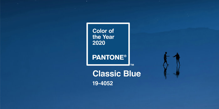
What is Pantone Color of the year 2020?
Every year, the experts over at Pantone Color Institute choose a shade they feel will best reflect the year ahead. This is based on various things – from fashion design and interior trends to current affairs and world news. The chosen hue is intended to represent a snapshot of the world.
This year, the Pantone Color Institute has selected Classic Blue. A timeless and enduring blue hue: elegant, calm and peaceful.
Here’s Executive Director at the Pantone Color Institute, Leatrice Eiseman, on why Classic Blue is the one for 2020:
We are living in a time that requires trust and faith. A boundless blue evocative of the vast and infinite evening sky, Classic Blue encourages us to look beyond the obvious to expand our thinking; challenging us to think more deeply, increase our perspective and open the flow of communication.”
What is #MOObriefs?
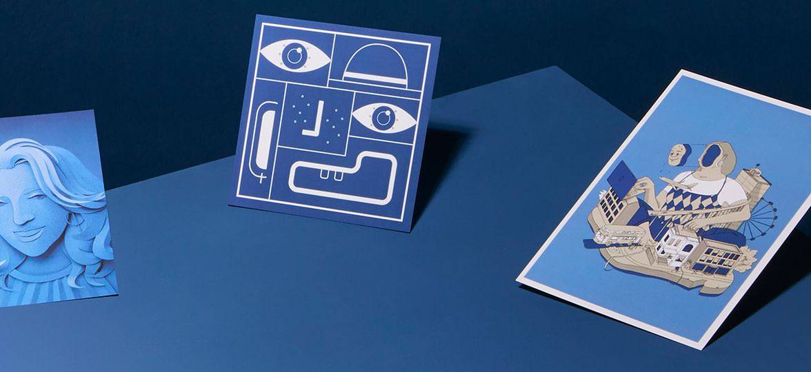
Following the announcement, we set our Instagram community a unique one-line brief: create a self-portrait inspired by Classic Blue. The entrants had one week to design, photograph, paint, sew (you name it) their self portraits. We saw over 100 entries and were so excited and inspired by the talent and creativity that lives in our online community. The creative team here at MOO had the tricky task of choosing just three winners. The winners received $250 MOO credit and their self-portrait printed on MOO Postcards.
So, ready to meet the winners? Drum roll, please…
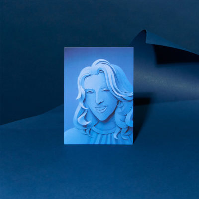
1. Gail Armstrong
Gail is a London-based illustrator working entirely in paper sculpture, a medium she discovered while studying at the Glasgow School of Art. She was recently included in Creative Boom’s ‘Exciting Illustrators to Follow in 2020’ list and her client list includes brands such as Paperchase, Kleenex, United Nations, Nestlé and Macy’s. Her paper sculpture approach to her self portrait in Classic Blue made her entry one of our favourites. Here’s more about Gail, her entry and her work, in her own words…
Talk us through your entry…
I work as a paper sculpture illustrator and have been planning to do a portrait for a while, but I just couldn’t decide who! Then when I saw the brief for this, I thought “perfect!”
What did you think of this year’s Pantone Color of the Year, Classic Blue?
I love creating paper sculptures in single colour, but generally I use all white, so using a rich, dark colour was a new challenge. Often darker colours absorb too much light so the image can seem flat and ‘dead’, and details get lost in the shadows. But the Classic Blue works incredibly well in paper, catching light and shade really well and giving the image a good sense of depth and form. It’s also a good foil for other colours, so I will be using it more in future images.
What feeling does it bring to mind?
The immediate association when someone says “blue” is something melancholy or depressing, but not in this case. I find this blue implies a feeling of authority and calm assurance. I love the sense of richness and depth it brings.
If you could sum up your self portrait in 3 words, what would you say?
Realistic, flowing and papery.
How do you stay inspired?
I’m fortunate living in the vibrant and creative city of London, with all the galleries and exhibitions it has to offer, but my main inspiration is from paper. Be it patterned, textured, or just a plain colour, this everyday, humble medium can be completely transformed with a simple cut or fold, into an object of beauty. I spend hours at a time just playing with paper.
What’s the best advice you’ve been given in your creative career so far?
Keep pushing your own boundaries. Once you start falling back on old tricks and set ways of doing things, the creativity goes, the boredom sets in and the joy has gone. I treat each new project as a fresh challenge, and, once I’ve committed to a project, I give it my all, to make it the best it can possibly be, regardless of whether the finished image will be seen by millions or sit hidden in a box in my studio. That’s why I love what I do.
Inspired by Gail’s designs? Make your own Postcards here.
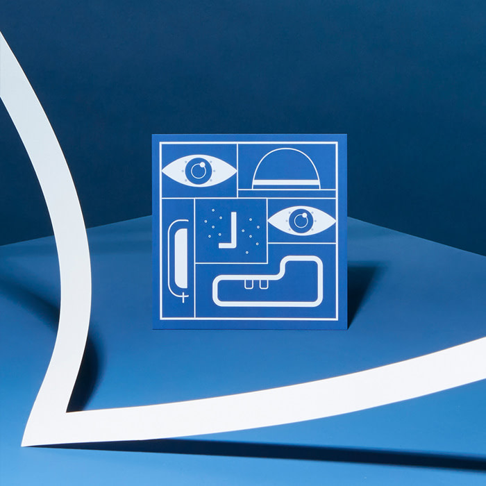
2. Justine Senee
Justine is a Motion Design artist in her last year at university in Paris. She runs a design and branding agency LA MAIN,with her partner, Erwan – their services include visual identity, branding, illustration, motion design and more. Justine’s playful, graphic video entry to our #MOObriefs competition was a hit with our MOO creative team. We chatted to Justine to find out more about her design and her work.
Talk us through your entry…
I saw the Instagram post explaining the #MOObriefs competition. I thought it was a fun and challenging reason for me to create new content, so I thought, “Let’s do it!”
What did you think of this year’s Pantone Color of the Year, Classic Blue?
For me choosing a blue colour was maybe a bit of a safe choice, I wish I’d been more surprised. But what I like about this colour is its strong and deep aspect.
What feeling does it bring to mind?
Confidence.
If you could sum up your self portrait in 3 words, what would you say?
Observant, smiling, adventurous.
How do you stay inspired?
Reading, watching movies, travelling… I think we can find inspiration in everything. I also like looking at the work of other designers. I was curious to see all the self-portraits people created for the #MOObriefs competition, all the different interpretations, techniques and ideations were so interesting.
What’s the best advice you’ve ever been given in your creative career so far?
“Always try to create something to stand out from the crowd”. I don’t know who said that but it became my motto and still is.
Go square and design your own Postcards.
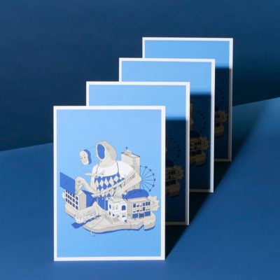
3. Yulia Grabuzova
Yulia is a freelance designer and graphic design student at the Chelsea College of Arts which is a part of the University of the Arts London. Her beautiful, chaotic, intricate design made its mark on our creative team. Here’s a bit more about Yulia, her design and how she’s found her way to “enjoy the confusion”…
Talk us through your entry…
I love MOO, I love myself. Creating a self-portrait for MOO seemed like a logical thing to do.
What did you think of this year’s Pantone Color of the Year, Classic Blue?
Even though I am definitely drawn to its simplicity, I can’t say that this is my favourite colour. Perhaps because I find it too universal and democratic. However, it’s been amazing seeing everyone’s interpretations of the Classic Blue in this competition. This only proves that this is just a colour and it’s in our power to give it a new meaning.
What feeling does it bring to mind?
It feels like standing in a queue to an ATM and having a conversation with some old gentleman about the weather.
If you could sum up your self portrait in 3 words, what would you say?
Chaos. Routine. Celebration (of chaos and routine).
How do you stay inspired?
I’m not always inspired. In fact, I’m learning how to be ok with that. But I do find a lot of inspiration in Scandinavian, Japanese and soviet graphic design, as well as in people-watching, listening to music from the 50s and 60s and watching videos of old people dancing on TikTok. I have another trick that really helps me when I need a dose of inspiration ASAP. I do is I turn the lights off, put earplugs in, lay down and let my mind wander off. Sometimes that leads me to the craziest and most exciting ideas. However, there is always a risk of falling asleep, so use this power carefully.
What’s the best advice you’ve ever been given in your creative career so far?
One of my favourite tutors on my BA course once told us to “enjoy the confusion” (Shout out to Nigel “Papa Nige” Bents, the true legend). It applies to both my daily life and my work. Things don’t always work out, your ideas are not always successful, it’s ok to be a beginner in something, it’s ok to fail and not understand why, it’s ok to be confused. Life is messy and chaotic and that shouldn’t stop you from trying new things, from taking risks. Instead, find beauty and peace in how unpredictable and confusing everything is. And that’s what my self-portrait is all about.
Make your Postcard Designs stand out with Classic Blue.
Keep in touch
Get design inspiration, business tips and special offers straight to your inbox with our MOOsletter, out every two weeks.
