Alice Mollon: illustration as a visual punchline
We spoke to Alice about her editorial illustration work and her (fascinating) working process.
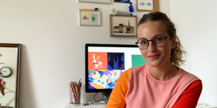
Alice Mollon creates bright digital illustrations for a range of prestigious clients, from The New York Times to Vogue. She uses colors and symbols to create eye-catching designs that can translate any topic into a dazzling visual narrative.
We met the French-born, London-based illustrator (and occasional gif-maker) to talk about her artistic journey, her editorial illustration work and the way she approaches visual storytelling.
Tell us a bit more about yourself. How did your interest in illustration begin?
Growing up, I was always busy creating – making things, drawing, painting, filling sketchbooks and notebooks with stories and all sorts of things I collected. I don’t think I can say that I had a specific interest in illustration, so much as a general love for anything remotely creative.
We moved to England from France when I was four, and every summer we’d drive all the way down to the South of France to spend our holidays. I remember that, anxious that inspiration might strike during those long summer weeks, and that I wouldn’t have the tools I needed to fulfil my creative ambitions, I’d pack as many arts & craft supplies as I could into our already-too-packed, family-of-six car. My siblings were very kind to put up with that!
How did you end up launching your own illustration business?
I graduated from Oxford in 2014 with a fine art degree. Looking for any job that would take me to London, I found myself working for a startup that ran short coding courses. My “Customer Experience Manager” role turned out to be pretty fluid, and I quickly began working alongside the main designer, creating a lot of our brand assets, including illustrations. When the company closed down two years later, I’d just taken on a couple of freelance illustration projects on the side, so I thought I’d give full-time freelance a go.
At the beginning, I worked with a lot of web-based companies and local startups, gaining clients through word of mouth. As my portfolio grew, I began to get commissions from other sectors too, like editorial and publishing.
In truth, I followed a general, and perhaps naive, “I-like-to-be-creative-so-let’s-see-where-that-takes-me” path rather than a carefully laid out career plan. I’m not even sure I fully knew I wanted to be an illustrator until I actually became one!
You create stunning visual narratives with your illustrations. How would you describe your style?
I think my style has evolved in a form-follows-function kind of way. Whether commissioned or personal, my illustrations are generally concept-led and quite single-minded. I like to have a sort of visual “punchline” that’s immediately clear to the viewer. I try to keep everything relatively pared back, using bold, block colors and minimal detail to avoid distracting them from the main message. Though my style has definitely evolved since I started, I think these core elements have remained the same.

You’ve worked for some prestigious book and magazine titles. How did you break into editorial illustration?
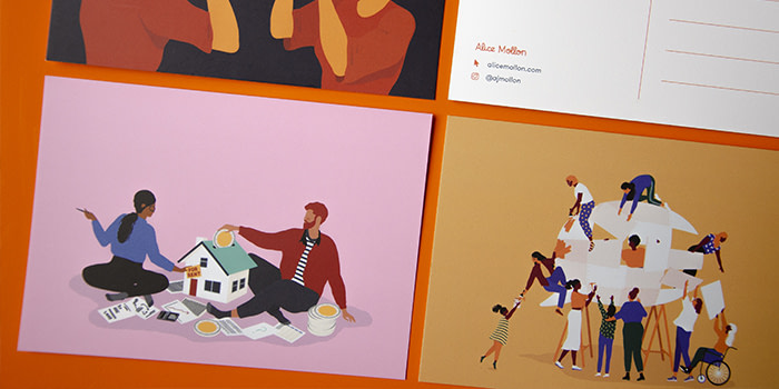
By starting out in illustration working with tech startups, I got quite good at learning how to turn pretty niche, dry topics into tangible, interesting illustrations. I created a portfolio site showing the ones I thought were the strongest, supplementing it with personal illustrations that reflected the sort of editorial work I was interested in. Once ready, I shared it with all the art directors I could find the contact details of, either via email or via postcards, with my details and the link on one side, and an example of my work on the other side.
I also used my Instagram (and still do) as a sort of secondary, more “casual” portfolio, which helped me access an audience I wouldn’t have been able to reach on my own. A lot of the more prestigious publications that I’ve worked with actually found me there.
How do you choose illustration projects?
Thankfully, most projects that come my way are ones that I’d really like to take on. If I refuse a job, it’s generally because I already have too much on. Occasionally, it might be because the budget is unjustifiably small and the client is neither willing to negotiate, nor flexible with what they want for that price. That being said, there’s been a few occasions when I’ve just had a bad feeling about a project or a client, and said no for that reason.
Although I love seeing where illustration can take me, I particularly love editorial commissions. There’s such a breadth of topics to tackle, it never gets boring! Editorial art directors also (in my experience) tend to be the most open to taking creative risks.
Which illustration project are you most proud of to date?
It’s very very hard to pick one! Top of the list would be my first commission for The New York Times, which included a frame-by-frame animated header; a piece I did for Vogue about the rise in people renting their wardrobes online, which was recently longlisted for the World Illustration Awards; and finally, a piece on the race to find a Coronavirus vaccine, for The Economist.
More recently, I’m really excited to have collaborated with DrawFor – a nonprofit that partners with artists to raise funds for current issues, through sales of exclusive prints. They launched earlier this year with DrawForNHS and DrawFor Equality, raising money for NHS Charities Together and Stand Up To Racism. For this latest campaign, DrawForYoungLives, they’ll be donating profits to PAPYRUS, who are dedicated to the prevention of your suicide. It’s rewarding to know that something I’ve created can have a direct positive impact on the world.
You use a lot of metaphors and symbolism in your work. How do you approach visual storytelling?
I always start with words rather than pictures, scribbling down any key words or themes that stick out to me and progressively adding more related words and themes. Even topics that seem completely abstract can eventually be broken down into, or linked to more tangible entities.
Based on these lists and “mind maps”, I start to pull together wider visual concepts, which I turn into quick thumbnail drafts. At this point I can quickly see which concepts aren’t going to work, and which ones I should take forward to more developed sketches, until I get to the final artwork.
How do you use MOO for your brand?
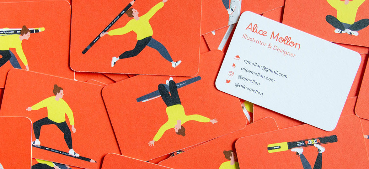
One of the first things I did when I started freelancing was design some business cards. I created a whole bunch of tiny illustrations of me using different pens and tools, and used Printfinity to print a different one on the back of each card. They’re a really good example of the joy and playfulness that is integral to my work. Every so often, I also create postcards with some of my most recent pieces of work, which I then send to art directors and clients I’d like to work with.
Two years ago, I started creating holiday cards I send out to people I’ve worked with over the year to say thank you, but also to people I’d like to work with the following year. I used gold foil in the last ones and I was so happy with the extra touch of sparkle!
Have you ever used MOO products in any different or unusual ways?
Back at my first job, we ran a one-week course in partnership with The Prince’s Trust, teaching young people about app development. Over the course of the week, the participants would come up with an idea for an app and create a basic prototype of it. In order to help them come up with ideas, I created a little card game with prompts, using Printfinity and the rounded business cards. I’d actually love to do something like that again…!
What three key pieces of advice would you give to graduates hoping to become freelance illustrators?
- Know your worth. Just because you love what you do, does not make it any less valuable to the client.
- Build a network of “colleagues”, whether virtually or in real life who you can reach out to if you ever come up against work specific issues – these can include trade associations (like the AOI) and industry advocates, as well as peers.
- Finally, don’t be afraid to ask for more! More money, more time, more flexibility, more work. Whatever you need to really flourish. If you don’t ask, you won’t get!
Share your illustration portfolio in a creative way with business cards and postcards.
Keep in touch
Get design inspiration, business tips and special offers straight to your inbox with our MOOsletter, out every two weeks.


