Aidan Gooding Donoghue: the art of marrying music and design
We asked the London-based designer what it takes to succeed as a graphic designer in the music industry.

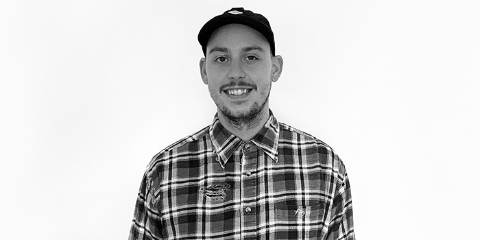
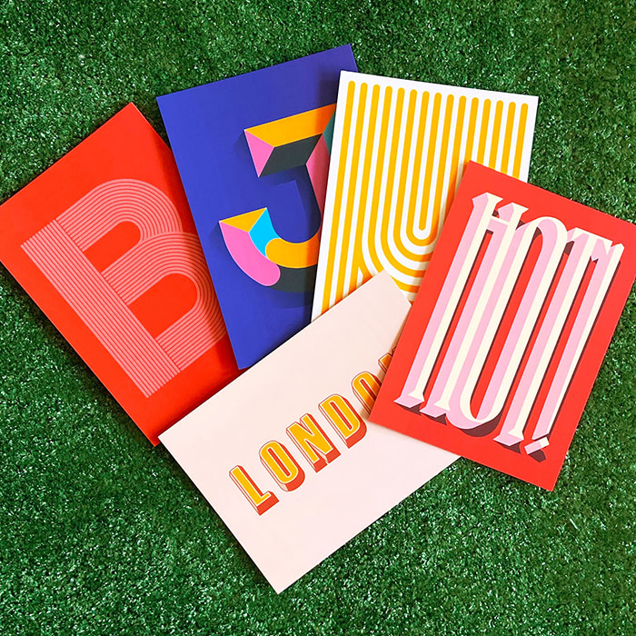
Graphic designer Aidan Gooding Donoghue (aka MadeYouLook) plays with typography and bright colors to create bold designs that tell a story. He masters the art of visual storytelling with striking compositions that caught the eye of the music industry – among others.
We met Aidan to talk about his work with typography, the evolution of his style and how he conveys the power of music through graphic design.
Tell us a bit more about yourself. How did your interest in graphic design begin?
I’ve always been interested in art and, as a child, I was always drawing and coloring. Art was my favorite subject at school and I used to bunk off my lessons to go and work on my latest projects. I used to do a lot of mixed media work and gradually found out more about screen printing and technical drawing which started to lead me down the graphic design route.
It actually took me quite a while to start doing digital work, as I’d never really had the opportunity to before. It was only my second year of university when I really started to learn about the softwares and became involved with design.
Your work has a very distinctive, bold style. How did it evolve over time?
I never initially had a bold or bright style to start with. My art was very grungy and predominantly quite dark. One day, I went to a job interview with my portfolio and they asked if I had anything more colorful – which I didn’t. This made me think “Why have I been so scared of using color?”. I started incorporating more and more color into my designs and now to the point where there’s barely any black within them!
Music plays an intrinsic part in your portfolio. What led you towards designing band merchandise?
I’ve always been interested in music, but I’m absolutely hopeless at playing it. I always wanted to be part of the music scene and found that my design skills were something that I could offer bands.
Funnily enough, for my secondary school graphics course, I chose to create a fictional piece of design for a band that I liked as my main project. I created a piece of merchandise and a way to promote it along with a CD (when CDs were the predominant format to listen to music!). It also included a T-shirt, packaged along with the album in one box which could be sold at shows and online. I think this project gave me an idea of what I actually wanted to do, and I was lucky enough to end up working as a graphic designer in the music industry.
What was your first design for a music brand, and how did you land it?
I’ve always worked with friend’s bands and the local scene, but my first actual music design job was for Latitude festival when I started working for Firebrand Live on their merchandise and the event program which I was lucky enough to design the cover for. By continuing to work with Firebrand, I’ve been able to work and collaborate with a huge variety of bands and music festivals.
These projects gave me a great opportunity to work with clients I dreamed about working with. I believe that my passion for music and design has led me to this point and I think dedication can get you anywhere.
Want to design your own event program? Get started here.
What piece of advice would you give to design graduates hoping to break into the musical arena?
Keep persistent with designing. It doesn’t matter how much attention it gets just as long as you’re getting your work out there and getting seen.
Design for who you want to work for. Create your own briefs and work towards them, support your local bands and just do your best to get involved within the local scene. People will remember that and it can take you a long way.
How do you approach a merchandising brief from a band?
When a new brief comes in for a merchandise range, I have to take on board the artist’s ideas and do the best I can to work that into a design. However, a lot of the work is also about finding out what the fans want too. There’s always a lot of research which goes into who the fans are and the music that surrounds them. Unfortunately, what the fans want and what the artist wants isn’t always the same thing, so it can be difficult to merge the two together.
Another big part of the process is about how the design is used. Before anything is ever made, I create a vast amount of mockups to get an idea of how it will all look. It’s very easy to get wrapped up in creating artwork digitally, especially with short deadlines, but taking that extra time to experiment physically is essential as, at the end of the day, I’m designing for a physical product so it will never look like it does on screen.
Do you listen to music while you work, and is it an important part of the creative process for you?
I almost always listen to music when I’m working, especially when I’m working for a band. I try to listen to their music as well as similar artists to get myself in the right headspace. It gives me a better idea of what the bands are about. I also sometimes use their lyrics within the designs.
I find listening to music in general really focuses me onto a project. Album covers are also a great source of inspiration for creativity as they can really open your eyes to different styles and mediums.
Typography also features heavily in your work. What do you love about it, and why did you choose to focus on it?
I love the versatility of typography. You can convey the same message in so many different ways, it’s pretty limitless. I started working with typography as an easy way to practice a style of design or a new skill. I think that was because with a typeface, you already have something to work with. It’s a good starting point and you can even reinvent the initial purpose of the type by designing around it.
How have you used MOO products to help strengthen your brand?
Starting to look more into my own personal branding, MOO has been a great help with creating products that allow me to do that and reach new audiences with physical items that I feel people appreciate in a whole different way than when it’s on a digital screen.
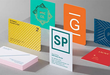
I punched holes into my business cards to incorporate my logo design in a novel way. I like the idea of being able to create something with movement in a tangible way where the customer can interact with things differently, giving them a unique experience and hopefully making it memorable.
What is your favorite piece or collaboration to date?
Picking one piece is pretty tough! I think my favorite product has to be the Kaiser Chiefs skateboard I designed, because I’ve always wanted to do board graphics and think it came out pretty well. My favorite merchandise range would be the Creamfields range last year. I think it worked really well together and fitted the audience well. And my favorite collaboration would be the T-shirt designs I created for Arctic Monkeys, mainly because I’m a big fan of theirs and it was pretty cool getting to work with them!
Unfortunately, due to the pandemic, the music industry has taken a big hit, but I’ve got a few projects that I’m working on which are non merchandise-based, which is exciting and a bit different, but still music-based. I’m also having a piece exhibited in the Secret 7” exhibition later on this year which is always a great exhibition to go to and an honor to be part of.
Express your creativity (and get your business noticed) with MOO business cards.
Keep in touch
Get design inspiration, business tips and special offers straight to your inbox with our MOOsletter, out every two weeks.
