Less is more with minimalist Business Card designs
Sometimes, less is more, and that applies to Business Cards too.
Tap into the trend and give your Business Card the edge by holding back a little and creating a simple yet pristine design.
Why choose a minimalist design for your Business Cards?
The minimalist look carries a lot of meaning – that may sound a bit deep for something as ordinary, but when it comes to sharing your painstakingly designed minimalist Business Card, you’re not looking to be ordinary. Here are some of the perks:
The impression of organization
As the saying goes, ‘tidy room, tidy mind’. Simple, clean design gives the impression of ‘everything in its’ place’ and the idea that your brand knows precisely what it’s doing. You’re not relying on gaudy design or heavy-handedness, you simply say what needs to be said, no more, no less. When looking at your minimalist Business Card design, your potential clients can therefore assume a smooth, easy and clean overall experience.
A blank canvas
When your brand isn’t boxed in by a creative direction, it also makes it easier for customers to align their own ideas with yours. Just think of working in a space full of blank, white walls, versus a room draped in busy wallpaper. That’s not to say your minimal designs can’t be as impactful, but it can also be more inviting and much less divisive.
The promise of betterment
Did you know minimalist design ideas have even been found to benefit overall wellness? They’re a mainstay of skincare, health foods and Scandi-chic, so introducing this concept to your marketing materials will also promote a sense of wellness with your customers and make your brand seem like a place where complications and convoluted details are banned.
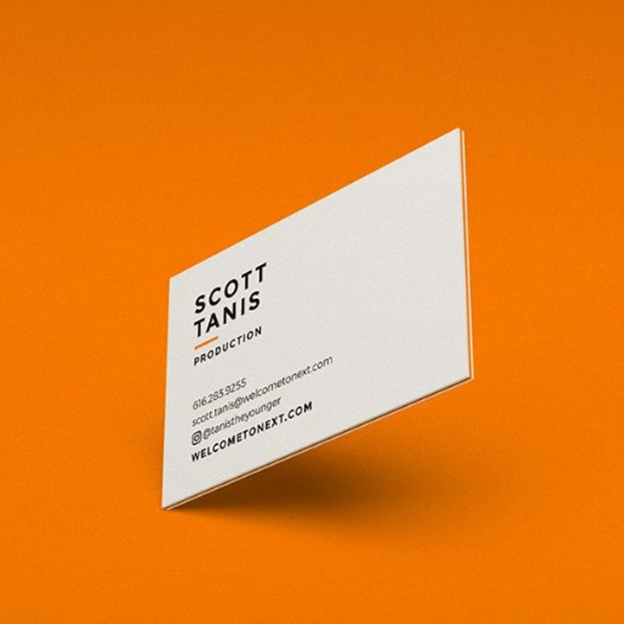
How to jazz up a minimalist Business Card
Minimalist graphic designers aren’t constrained to just black and white and Arial (although some truly amazing designs can be created in monotone) and there are plenty of ways to still add a real pop of creativity to your designs even with a minimal feel.
1. Play with color
Like we said, there’s nothing more minimal than black and white, and it’s a classic color combination that’s unlikely to fail, but minimal design doesn’t mean you always have to play it safe. How about trading black and white for black and gold, orange and purple, or pink and grey?
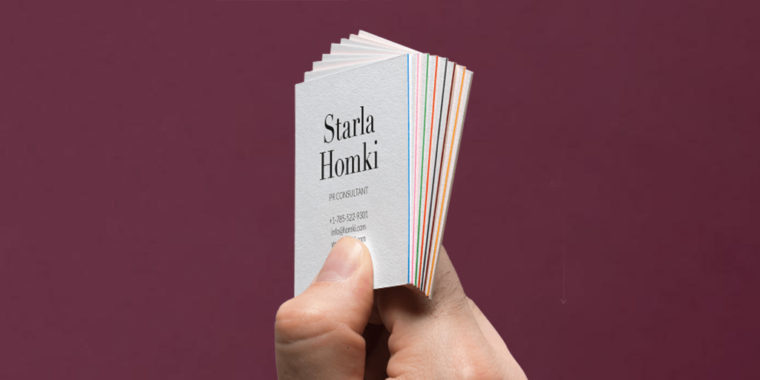
So long as you stick to beautifully complementary colors, you might be surprised by how much impactful color you can still fit into a simple design. Besides, with Printfinity, you can still enjoy all the colors of the rainbow in your one pack of minimalist design business cards so you don’t have to stress over precisely which two colors to pick. Try it all!
2. Find the best font
Fonts are a vital element in any design, especially when it comes to logos. A minimalist logo can retain its simplicity even with a fancier font – so long as you keep the rest of the design clean. The modern minimalist logo, as you are sure to have spotted on many a trending lifestyle brand, favors sans serif fonts of uniform height, but consider creative outlets like lifestyle blogs and handwritten script on a white background is the go-to font of choice, look at urban fashion brands and you might even find wide, gothic fonts at play on plain color block backgrounds. The main takeaway here? Even the boldest of fonts can be rendered into a stunning minimalist logo design, so long as the rest of the design lets it.
3. Finishing touches
Take your design to the next level by adding something tactile. Our Business Cards offer gorgeous finishes like Spot Gloss and subtle yet luxurious Letterpress. With additions like this providing a whole new dimension of design and a premium feel, your cards don’t need to be much more than a beautifully minimalist logo – MOO’s finishes will do the rest.
4. Be multifunctional
Minimal design doesn’t mean minimal function. A simple and clean grid design can let your café’s Business Card double as a loyalty card, a design where the typeface does all the talking can say something extra special like “10% off with this card”. Reigning in your design definitely doesn’t mean reigning in your ideas, and there are plenty of alternative uses for Business Cards you can employ.
3 modern & minimalist Business Card designs
Don’t just take our word for it, here are some of our favorite designs that put it all into action, to create some truly stunning minimalist business cards.
Nordan Design
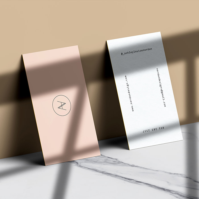
Ashley Nordan is a Minneapolis-based artist and designer. After finishing her M.A. in web and graphic design, she built a career on her multidisciplinary approach – from selling her hand-printed artwork, to designing logos for clients.
When it comes to finding inspiration, Ashley explores a diverse range of design mediums. “I see the value in studying all different areas of design such as architecture, art, and fashion,” she tells MOO. “The more I understand about design, the better I can apply it to creating a client’s brand.”
Despite her passion for variety, the branding for Nordan Design is minimal. “I chose a font that would let me combine my initials into one mark,” explains Ashley. “The simplicity isn’t just about aesthetics, but utility. My details need to be easy to read and give a sense of my style. The gloss finish on the Super Business Cards adds a touch of sophistication that complements the strong, feminine design.”
Make your branding pop with gloss finish Super Business Cards.
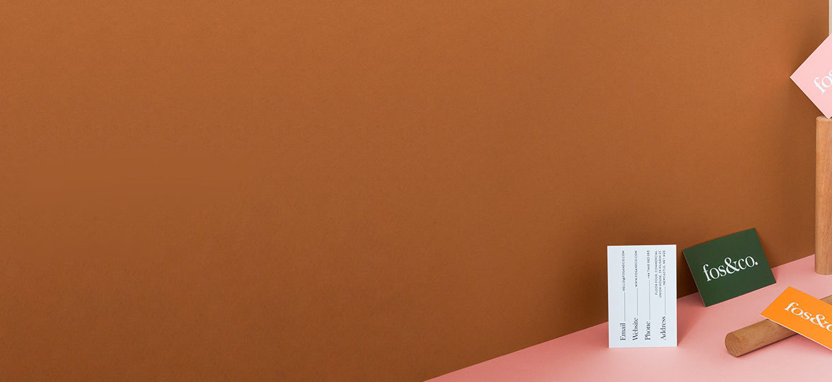
Fos&Co.
Meaningful branding, design solutions and art direction is what drives the creative brains at Fos&Co. The UK-based studio is led by creative director, Charlotte Fosdike, who began her journey as a freelance graphic designer before taking the next step and teaming up with other creatives on projects. Through collaboration, Fos&Co was born.
At Fos&Co, a personal approach is always taken to understand each individual project. “We firmly believe in drawing inspiration from the product or service first,” Charlotte tells us. “The process begins with gaining insights into the brand’s story, which will then influence the creative direction.”
When considering their own branding, Fos&Co put the customer at the heart of their decision making. “Our cards were designed to draw the eye at first glance and display our contact details in an interesting way. The vibrancy of the different colors and the natural feeling of the cotton card stock really stands out from others – it reminds the customer that we aren’t your usual design studio.”
Stand out from the crowd with Cotton Business Cards.
Great Good Creative
Great Good Creative is a branding and graphic design service with social impact at its heart. Led by brand coordinator turned business owner, Lorelle Skelton, Great Good Creative supports charities and social enterprises, aiming to make a difference in the world through bold design that inspires action.
“Put simply, we’re creative with a heart,” explains Lorelle. “Great Good Creative is all about great creative for good causes, so I felt a clean brand aesthetic was appropriate. I wanted it to reflect not only the integrity and honesty of the important initiatives my clients work on, but also how I endeavour to run my business.”
Lorelle ensured that the brand values of transparency and honesty were carried right through to her printed materials “I went for the matte option on my Square Business Cards to further reinforce these themes – nothing shiny or showy, just a beautiful, smooth finish,” she tells us. “I love that they’re an unconventional shape. It was so important for me to show that, as a designer, I’m not afraid to do things differently. They’re a really handy size too, so I can always carry some with me.”
Add a unique twist to your branding with Square Business Cards.
Ready to create minimalist business cards? From gold foil to spot UV and Letterpress, print cards with extra eye-catching papers, color print that pops and oh-so-customizable templates.
Keep in touch
Get design inspiration, business tips and special offers straight to your inbox with our MOOsletter, out every two weeks.
