4 tips to spice up your menu design
Stand out from the crowd and showcase your signature dishes in style with our menu design tips.

Your menu is a window into your restaurant. More than just a list of your food and drinks, it’s a unique opportunity to give customers a taste of your offer and create a full brand experience. A beautiful, attractive AND practical menu design is key to stand head and shoulders above the rest – and make customers come back for more.
Stand out from the crowd and showcase your signature dishes in style with our 4 best menu design tips to create mouth-watering drink lists and food menus.

Logic is key
Before you think about palettes, fonts and other ways to create a cool menu design, think about the user experience. Your objective here is to make it easy for clients to familiarize themselves with your offer and make a choice – preferably ordering everything on the menu. If your design is a work of art but customers can’t find what they’re looking for, you might as well frame your masterpiece on the wall and start over.
Start off by listing everything on the menu, and sort the items into different categories. Do you need a separate menu for drinks? Could you create a whole section for vegan dishes? Think logically, based on the customer experience. You can then think about the order of your sections. For example, customers are likely to order starters and sharing platters before mains and desserts. A San Francisco University study indicates customers tend to read food menus like a book, starting from the top left corner.

Keep it simple
Albert Einstein phrased it well: “out of clutter, find simplicity.” This principle applies perfectly to food menu design – and to life in general. Once you’ve organized the structure of information, making it clear and easy to understand is essential to make your menu attractive to customers.
Choose fonts and colors keeping readability in mind – again, a beautiful design is no use if you can’t make sense of it. Avoid intricate cursive fonts or ultra thin types, and play with contrasts and complementary colors to make your menu pop. Using three colors maximum is usually a good rule of thumb when designing marketing materials. If you need more, try using darker or lighter variations of your palette.

Keep your eyes on the prize! When creating your restaurant’s menu design, consider using simple lines and boxes to separate sections or highlight the items you want to draw attention to. The simpler it is to find your signature dishes or drinks, the more likely your customers are to order them.
Stay consistent
We’ll never say it enough. Consistency is key! Good branding is like a signature: it should be unique and instantly recognizable. If your food or drink menu design is using different fonts and colors than the rest of your marketing materials – both physical and digital – you might confuse your customers (and we don’t want that). Good branding is essential to convey a sense of who you are as a business, and a seamless brand experience sends your customers a positive message. It allows them to get a clear idea of your brand identity, and helps build trust that they’ll receive a reliable, quality service from you. Plus, it makes coming up with a cool menu design much easier.
To ensure you build a strong, consistent brand from A to Z, try to use similar fonts and colors in your online and offline communications – and don’t forget your logo. If you’re not happy with your current brand identity, work out if it’s time for you to rebrand with our expert tips.
Think outside the box
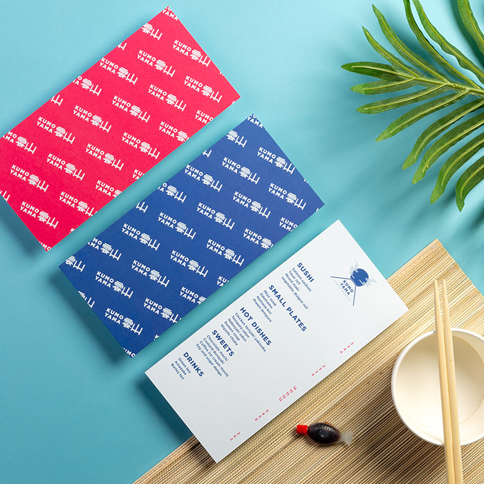
Don’t be afraid of doing things a little differently. Why restrain yourself to a classic menu design idea when so many shapes, sizes, and materials are at your disposal? Going for an original – and relevant – format guarantees you’ll create an eye-catching menu design your customers won’t soon forget. Whether you go for Flyers, Postcards, or even Stickers, we have plenty of shapes and sizes for you to choose from. Sky’s the limit.

Looking for inspiration? Nick Bampton’s clever menu design idea is a great example of smart, out-of-the-box design. For his client Pappe Bar & Café, he addressed the unique design challenge arising from new COVID-19 rules in Germany. Preventing the use of traditional table menus, the new rules forced Nick to get extra creative when imagining the bar and café’s menu design for their summer drinks. His client needed a menu that was fixed to the tables and could be cleaned and disinfected easily and effectively. Unable to go for a traditional menu card design, Nick came up with an ingenious design solution to their problem. Using MOO’s Rectangular Stickers, he created six unique “menu stickers”, inspired by the reversible nature of playing cards, featuring diametric text and artwork that is viewable from both sides of the table – simple, clear and effective.
Create a mouth-watering restaurant menu design with MOO Flyers, Postcards or Stickers.
Keep in touch
Get design inspiration, business tips and special offers straight to your inbox with our MOOsletter, out every two weeks.


