Celebrate International Women’s Day with MOO
We asked our design services team to create event materials for International Women’s Day.

International Women’s Day is just around the corner. So we asked our design team to imagine a suite of marketing materials for a fictional event to celebrate.
Graphic designers Ellie Shenton and Ricky Perrotta rose to the challenge. If this wasn’t a fictional scenario, we’d be getting our tickets already.
The brief
KUBE Coworking, a (fictional) coworking company, will be hosting an event called “Why Women Work” on March 8th for International Women’s Day. At the event, aimed at a younger audience, speakers from industries like tech, health and journalism will discuss the changing role of women at work.
The International Women’s Day event will be promoted with Posters, Invitations and Flyers. Every guest will also be given a goodie bag to take away with them.

Shopping list
For such a big event, KUBE will need a full range of marketing materials. They also need to bring their “A” game when it comes to event gifting. Here’s what MOO’s design services team created for them, to make sure nothing’s left to chance.
Eye-catching event materials
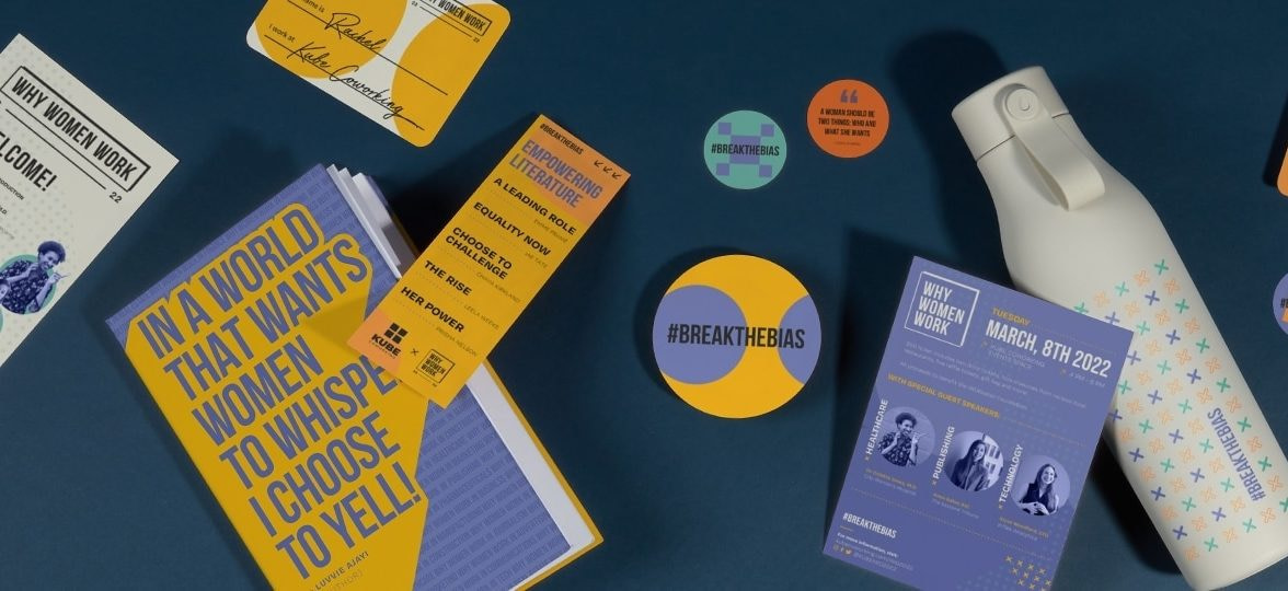
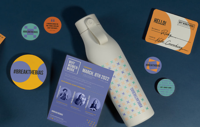
There’s no event without a good invite. Ellie and Ricky chose a Medium Postcard to promote it, including the guest speakers and details like the venue, time and booking info.
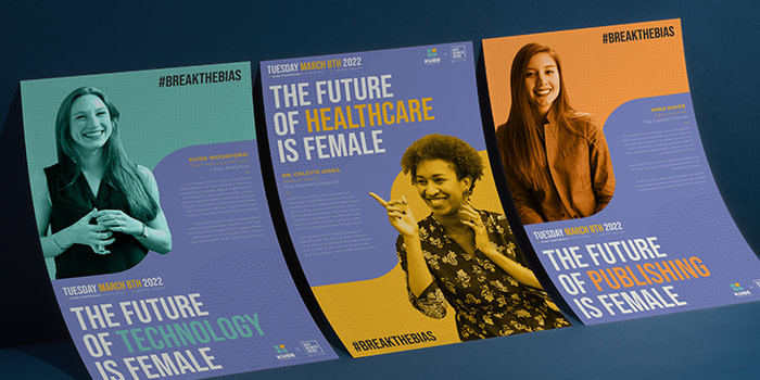
They picked a Rack Card for the event program – its long format being perfect for listing the schedule. They also advertised “Why Women Work” with three large Posters (available with a business plan) introducing each speaker, and made name tags to help with networking after the talks.
The team chose Cotton paper for most of the collaterals. “We all know that taking care of the planet is a must, which is why more companies are taking steps to become more eco-friendly. Because of this, we wanted our designs printed predominantly on MOO’s Cotton paper stock, made from recycled T-shirt fabric. We also felt the importance to promote sustainability as KUBE coworking is new, modern and in the now.”

The perfect gift bag
Event gifting should be relevant to both the event and its audience. The team created the perfect goodie bag so attendees could enjoy the event, promote it and remember it. They designed colorful Round Stickers in two sizes to inspire them, and a bookmark (available with a business plan) listing some book recommendations.
Ellie and Ricky also created gifts that would be useful to attendees during the event, but also leave a lasting impression afterwards. They designed a custom Water Bottle to keep them hydrated and a beautiful full print Notebook to take notes during – and after – the event.
“We wanted to showcase full print Notebooks because of the design flexibility they offer. The bold, colorful graphics could extend across the entire cover and spine, hopefully inspiring our customers on how to do something similar with their own brands. For the Water Bottles, we decided to use a four-color print design, rather than laser engraved, because we wanted the Water Bottle to complement the other products in the suite. Using the four color process allowed us to showcase the fun, bold colors and patterns we used in the other designs.”
Top tip: we now offer a 15% discount for business customers that order at least 25 Hardcover Notebooks and Water Bottles at the same time.
The design team
Ellie and Ricky have different experiences of International Women’s Day. For Ellie, it’s a story of empowerment and recognition. “For me, this day celebrates the accomplishments of women who work in industries that were predominantly led by men, and I’m pleased to see this being continuously recognized. This is encouraging for me on a personal level as a woman who wants to grow within my field of work.”
Ricky, on the other side, loved diving deeper into a celebration he wasn’t very familiar with. “This was a great learning experience for me. The most important thing about International Women’s Month to me is the promotion of equal rights. From the beginnings of the women’s suffrage movement to equality and leadership in the workplace, it’s important for us to reflect on how far we’ve come but to also understand there is more work to be done to ensure equality for all.”
Finding inspiration
Ellie and Ricky drew inspiration from this year’s International Women’s Day campaign, “Break the Bias”, to design a suite that highlights both KUBE’s brand identity and the theme of the event.
“While doing our research, we learned the theme for this year’s International Women’s Day will focus on building a gender-equal world free of bias, stereotypes, and discrimination. We wanted our messaging to mirror this theme and for people to question and gain an understanding of why women work in their particular industries, especially fields that tend to be more male-dominated.”
“The event focuses on the important role women play in technology – it inspired us to use big, bold shapes and patterns resembling a style used by other tech brands.” They decided to pair these bold designs with a subtle nod to the campaign. “To support this year’s theme, #breakthebias, we also see many women with arms crossed to show solidarity on social media. We wanted to incorporate the cross in our designs to recognize this.”
Piecing the design together
With their direction set, the team started picking the ingredients to make the design magic happen. Fonts, colors, layout… Ellie and Ricky created the perfect recipe for the event.
“We wanted to show how MOO’s products could help any type of business put on an event similar to this. We also wanted to communicate how design can convey a powerful, relatable message. We felt we achieved this by using bold, colorful graphics paired with strong type. Of course, we also made a conscious choice to avoid an overly clichéd and feminine color palette.”
The fonts
“KUBE Coworking and the “Why Women Work” event are both quite relevant to our current times and modern world of work. We wanted the products for the event to reflect that and have a contemporary feel. With this in mind, we stuck with sans serif fonts that complement each other. We chose Bebas for our headline text as it is powerful and striking. We chose Degular Light and Semibold for the body text because of its legibility and modernity.”
The colors
For the colors, the team was inspired by traditional International Women’s Month colors – purple, green and white – and this year’s Pantone color of the year, Very Peri. “We had a young audience and company in mind so the palette was adjusted to create a relatable impact whilst being on brand.”
The layout
The layout was influenced by the products themselves. “We thought about how the products will ultimately be displayed for the event and in the gift bag. For example, the Invitations are more likely to be held up close, so we wanted to make sure the most important details, like the date of the event, stood out.
“Alternatively, the Posters are more likely to be viewed from a distance. So the “Future is Female” headlines and the headshots of our speakers needed to be visible from far away. It’s always important to keep in mind that form follows function, so while we wanted to design something striking and fun, we also had to ensure the content was being communicated effectively.”
“The designs for the event had to complement the branding”
“While designing, it was important for us to keep in mind that the designs for the event would have to complement the branding for KUBE Coworking. The products themselves also needed to be harmonious and work together as a suite. We achieved this by carrying the fonts, complementary colors and patterns throughout the designs for each product. The layouts themselves also needed to have a good sense of hierarchy so those interacting with the pieces could easily take in the information.”
Planning an event with design services
Like what you see? Enjoy the expertise of our design services by subscribing to a business plan. Fill out the form below and a friendly account manager will get in touch.
October 2022 update: This article references the way we used to make Cotton Business Cards. We now use a different process.
Keep in touch
Get design inspiration, business tips and special offers straight to your inbox with our MOOsletter, out every two weeks.


