7 design tips for designing a business letterhead

In a mostly digital world, premium business stationery is like a breath of fresh air. Wondering how to design a letterhead? Weighty, vivid, and a tactile treat, here’s everything you need to start crafting a business letterhead to take pride in.
When only paper will do
You may use emails and phone calls to do 90% of your business communication, but sometimes, a letter on headed paper is the only appropriate medium. That’s why designing a company letterhead that reflects your brand and values is key.
Maybe it’s a formal letter of appointment or an agreement in writing with a new supplier. Maybe you’re writing to confirm an employee bonus (and including a life-changing check). Or maybe you have been asked to supply a statement, reference or other formal document on company-headed paper.
Whatever the use case for your company letterhead, there’s no doubt that it takes your message to a higher level than an everyday channel like email, and that it’s worth spending a little time and effort making something that’s worthy of your brand.
Need some letterhead design tips? Here are seven steps to designing a company letterhead you’ll be happy to use for years to come.

1. Decide on the content
Before you worry about how to design a letterhead, you have to think about what goes on it. What information should your letterhead include? You need enough information to make your identity clear, but not so much letterhead content that you risk making the page look cluttered.
In some regions, there are legal requirements for what should go on letterheads. For example, in the UK you need to include the registered office address, company number and which part of the country you operate in in the letterhead body text, whereas the USA has no such requirements. It’s worth checking if there are any minimum standards in your part of the world.
It’s also worth considering how specific you need to be. For example, will more than one business location use the design? Or is there a chance you’ll be moving offices in the foreseeable future?
If so, including your head office address as part of the letterhead design may not be the best course of action. Similarly, email addresses and websites need to be included only if you know they’ll apply in every use case of the letterhead and will be valid for some time to come.
Consider using a generic company email address like ‘hello@yourbusinessname.com’ or ‘info@yourbusinessname.com’ so the address will work no matter who uses the stationery in the future.
2. Go back to your brand
Your company brand guidelines can help you set some design parameters for your letterhead to make sure it’s in line with the rest of your business. It will help you save some time in picking out the right colors and the best fonts for your business letterhead, too.
As well as looking at the practical guidelines like color, font and sizing, review your brand values and company tone of voice. This will help make sure you’re expressing the complete brand personality rather than just a consistent visual impression.
If you don’t have brand guidelines in place, your previous brand building can still help. Revisit your branding process, looking at your notebooks, early designs, email trails within the company and more, to help you refresh your ideas about who you are and how you want to be seen.
It’s also a good idea to gather together the key assets that best represent your current brand – this could include your email templates, website, printed marketing materials like Business Cards, social profile pages and product packaging. Seeing them all in one place will help you to picture your letterhead design and think of it as part of a wider brand ecosystem.

3. Find a font
What’s the best font for your company’s letterhead? The font you use on your letterhead may be one you’ve already picked as part of your whole-company branding exercise, or you may be starting from scratch.
If it’s the latter, think about some of the basics first before you jump headlong into font websites and lists, as these kinds of resources can quickly become overwhelming if you don’t know what you’re looking for.
Consider:
- Serif or sans serif?
Serif fonts have a more traditional feel, while sans serif creates a more modern impression and may be easier to read when printed small. For that reason, the latter is often considered the best font for letterhead. - Font family
Fonts come in families, variations that share a visual resemblance. If you choose a font with a large family, like Arial or Verdana, you’ll have lots of ‘relatives’ to choose from. This can make branding easier as you can use several related fonts and get a consistent look and feel. - Font size
Consider the letterhead text size. Think about how big the pre-printed wording on your letterhead will be. The same font can look surprisingly different at different sizes, and will also look smaller when printed out than it does on screen. Remember too that the wording will sit alongside the content of a letter, which may be differently styled, larger or smaller than the font you choose. Print out a few ‘trial runs’ to make sure your chosen letterhead font looks great in all these situations.
Once you know roughly what you’re looking for, you’re free to explore the wonderful world of fonts to find the one or two that will grace your company’s letterhead. Dafont, Typedepot and Google Fonts are all places worth exploring during your search. Once you’ve found the best font for your professional letterhead, you’ll be ready to move on to one of the most exciting steps: the layout.

4. Choose your layout
There are lots of different ways to set out a letterhead. As with other elements of your branding, you’re free to push the limits of convention and create your own approach. But if you’re comfortable sticking to the basics, there are a few tried and tested ways to lay out your letterhead that are worth knowing about. We’ll explore these here.
With MOO’s Printfinity service, you can have up to 50 different designs within a single order, so there’s no requirement to limit yourself to a single layout. You could have a variety of letterheads for different purposes, or create bespoke ones for different people in the company.
Whatever you choose, remember that the goal is to create a canvas for a future letter, not a finished piece of artwork. Your branding and design should play a supporting role in the content of the finished letter and should never compete with or overwhelm the wording. If in doubt, keep your letterhead layout minimal. As with the font, try mocking up and printing a few variations to see what looks best.
Here are a few basic layouts and letterhead best practices you can use as a starting point for your design.
- Full border
Color and design is placed all around the outside of the paper in a consistent square shape. - Graphic border
Shape and color is used around the edge of the body text in a creative way. - Header and footer
Design is restricted to the top and bottom of the page. Keep it relatively small compared to the letterhead size. - Background graphics
Watermark-style graphics in a low-contrast shade across the body of the letter.
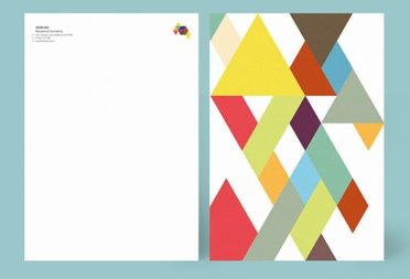
Worried about your letterhead’s format? If you don’t have time to worry about design, another option is to use a pre-set business letterhead template. MOO’s online design tools include a large selection of business letterhead templates you can use as they are or customize to suit your own logo and colors. They range from minimalist text-only layouts to more creative designs with graphical elements and color on the back and front of the page.

5. Pick your paper stock
As a general rule, the heavier-weight your paper is, the more premium and professional the end result will be. Beyond that, however, you have a few more options such as the paper finish – smooth or textured – and the color tone of the paper itself. White is the best choice for many businesses, but you may go for a warmer white, a cream or pale blue if it fits your brand.
MOO Letterheads can be printed on either the Original paperstock, which is a classic smooth 120 GSM finish that plays well with most styles and designs, or the Luxe, which is Mohawk Superfine 118 GSM with a unique and award-winning finish and texture.

6. Consider color
Your brand colors should be reflected in your letterhead design, but that doesn’t mean they all need to make an appearance, especially if your logo or company font is ornate or detailed. Remember, the letterhead is a supporting actor, not the star of the show.
If you have a brand color palette, this is a great place to start from when choosing your colors. If not, revisit your logo design and choose two or three contrasting hues from it to act as your palette.
If you choose a letterhead from MOO, you can print on both sides of the paper and add color or additional designs to the reverse, giving you more space to play with color and express your brand without compromising the letter’s content.
7. Get the set – add other stationery
To get an even more ‘put together’ feel for your finished letter, think about creating other bespoke stationery to go with your letterhead, such as an envelope or note cards
A letter that arrives with a hand-written compliments slip can create a more personal, thoughtful feel than a letter on its own, and is a handy way of adding some personal regards that aren’t suitable for the main text.
Now you know how to design a company letterhead. Creating more branded materials? Check out our guide to creating a logo for your business. Explore MOO Business Services for custom print solutions for your brand. To get started, fill in this simple form and one of our team members will be in touch shortly.
Keep in touch
Get design inspiration, business tips and special offers straight to your inbox with our MOOsletter, out every two weeks.


