Business Card ideas we’ve loved this season
Here’s the inside scoop on what’s hot in the world of business cards.

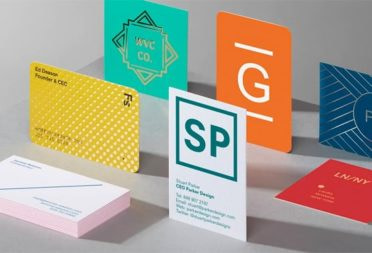
Business Cards have been around for quite some time (since the 17th century apparently). But they haven’t stayed the same. In fact, we think it’s quite important to move with the times and ensure your cards stand out. And so we asked our Design Services team to identify some of their favorite customer business card ideas this season. From design to finishes to functionality, here’s what they found.
Big Bold Graphic Shapes by Sonder Design

Sonder Collective is a non-profit organization of specialist designers and researchers from around the world, dedicated to creating a more equal and sustainable future. They recently ordered our Business Cards for a client of theirs, Open Concept Lab.
Chosen by one of our Production Artists, Paul McNamara, he explained his reasoning for picking the Business Card and style as one of his recent favorite trends. “We love the high contrast between the text, shapes and card’s background. The chosen font pairs brilliantly with the bold shapes. While the collaborative, open-source nature of the company itself is reflected perfectly by the large circles highlighted on the details side of the card.”
When it comes to adapting this for your own branding, Paul suggests, “This year I can see our customers utilizing bold shapes in combination with bright colors to communicate the feel and energy of their brand. Dynamic and fun, bold shapes and colors are a staple to 90s fashion and design, which seems to be a key source of inspiration in 2023.”
The duo-tone effect by Thinkpiece

Thinkpiece specializes in marketing research for technology, healthcare, and finance innovators. They have used our Business Card templates and have also ordered Rectangular Stickers, Standard Postcards and Notecards.
Eleanor Shenton from our Design Services team picked the two-tone look as her favorite trend of the season. “We love the acidic hues and use of two contrasting colors that immediately catch your eye and create visual interest. This design also has a unique use of iconography to direct your eye to the contact details.”
She told us that the brand also utilized our business platform to create multiple, editable templates to showcase its full duo-tone color range. This feature also gave their staff the freedom to choose between various designs.
Eleanor envisions customers using this trend to incorporate a broader palette beyond a brand’s primary colors. But also, “Use it to highlight focal points in their designs in a visually pleasing way.”
Spot Gloss by Hatlen Properties

Another trend that our team is currently loving is the use of Spot Gloss – especially when it highlights a pattern. This was perfectly carried out by Hatlen Properties – a boutique real estate firm owned by four generations of women. As well as Business Cards, the company also printed Postcards, Stickers and Greeting Cards with us.
Trevor Seymour, our Production Artist told us about the design, “We love that Hatlen Properties used their logo to create a fun, playful pattern and how they utilized Raised Spot Gloss to highlight these graphics in a subtle way. The extra texture and shine elevate their branding to a new level giving their design the ‘wow’ factor.”
Trevor also went on to explain that the brand requested three template variations on their business platforms – one being Spot Gloss. One other was a custom design in which they uploaded their own details. Since then, Hatlen Properties have gone on to use our Design Services to create other product templates.
He recommends businesses use this trend to highlight brand elements and make their Business Cards stand out from the crowd.
Printfinity photography by CalArts

If you’re a graphic designer or photographer, a great trend and tool to take advantage of is our Printfinity feature, as perfectly demonstrated by Joshua Sassower of CalArts. California Institute of the Arts is an educational institution for professional artists offering more than 70 comprehensive degree programs in the visual, performing, media and literary arts. CalArts has printed and designed Business Cards with MOO within a selection of sizes; Standard, Square and MiniCards.
Cammie Niles, our Junior Graphic Designer who picked this trend said, “We loved that CalArts utilized Printfinity to showcase a range of expressive, colorful photography that represent the institute’s values, creativity and degree programs. We also love that the detail side of their card is minimal allowing the photography to really take centre stage.”
CalArts were looking to use Business Cards that they could give to students as a networking tool. Cammie told us, “We worked with CalArts to create a couple of different options based on their requirements submitted via a design questionnaire. After an initial round of feedback, we finalized a design and created an editable template that the students use on their MOO platform.”
Printfinity is a great way to exhibit more of your work and Cammie is a big believer in the trend taking off this year. “Our customers have been using photography more and more on Business Cards as a way to promote their brand. Whether it’s to show a wider portfolio of work or to promote a broader range of products, we imagine customers will continue to adopt this trend utilizing MOO’s Printfinity option to show off their brand at its best!”
The QR code by Michele Noiset, Rubicube Design and Qwynto

Our last trend is more of a practical one – the QR code. For this, our Artwork Specialist Max Reinhard picked Michele Noiset to focus on. Michele Noiset is a professional illustrator, educator and artist, living and working in Memphis, Tennessee. She came to MOO on behalf of a client, to print a beautifully illustrated set of Postcards as invitations and Business Cards for people to RSVP for a wedding. Michele worked alongside Rubicube Design and Qwynto on the final product itself.
Max said, “We adore the clever use of a Business Card as an accompaniment to a wedding invitation. Perfect to stick on the fridge, or pinned above a desk as a little reminder of a loved one’s special day, this design complete with a QR Code provides a quick and practical way for guests to RSVP.”
And in regards to the artwork, Max continues, “The illustration has a wonderful, energetic charm, and together with the vibrant color palette exudes personality.”
A well-placed QR code is great for catching the attention of customers and is fast becoming a key statement for designs. Max suggested, “With our Square Business Cards especially, we often see customers utilizing the whole of one side of the design, making their QR code the focal point. At this larger size, logos and brand colors are often a part of or reflected within the design of the code itself. We expect this to continue as small businesses seek to take full advantage of the opportunity to connect with their customers.”
He also adds that they’re seeing them pop up on a lot of print. As “they’re a great way to spontaneously engage with customers.” He also said, “More and more we are seeing Business Cards as an essential part of our customer’s wedding stationery. It’s great on RSVP cards and save-the-dates. Business Cards are a wonderfully practical product for all the useful information you want your guests to have to hand on the day itself.”
Ready to get creative with Business Cards? From Gold Foil to Spot Gloss, try something new today!
Keep in touch
Get design inspiration, business tips and special offers straight to your inbox with our MOOsletter, out every two weeks.
