Choosing product colors with Laura Perryman
Discover a fresh perspective on color and materials.

When it comes to color, Laura Perryman is (quite literally) the expert.
As a Color, Materials, and Finish (CMF) designer and consultant, trend forecaster, and author of ‘The Color Bible’, she’s been helping businesses create better color experiences for over 15 years.
Throughout her career, Laura has consistently highlighted the transformative power of color, from textile weaving to the creation of color palettes for brands and products. Her book, ‘The Color Bible’, encourages designers and artists to make color a focal point in their work – not just for its visual appeal, but also for its ability to evoke emotions, set the mood, and even transform lives.

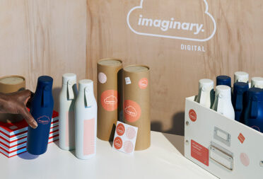
In 2022, we worked with Laura to create a new set of product colors for our Water Bottles and Notebooks. Read on to discover more about how Laura’s worked with our product team and learn how to get to grips with color for your own products.
Color defines (and refines) us
Color is not just a visual element; it has the power to influence our thoughts, decisions, and emotions. And when it comes to product design, choosing the right color(s) is a big decision.
“Colors have connotations and color semiotics that are embedded in them. We are surrounded by colors that have unique characteristics. For example, green is naturally verdant and has fresh, nourishing qualities. Similarly, black is not just a single color, it has a range of tones and depths to choose from. It is still considered a traditional luxury color and personifies sleekness, premium, and neutrality”, Laura told us.
To solidify our own commitment to beautiful branded merchandise, it was important for us to work with a color expert. Laura’s guidance helped us narrow down colors that would look stunning in the physical world.
She worked closely with our product team to identify key expressions of the MOO brand – in other words, what we stand for. These expressions were then translated into a variety of color shades. “To find inspiration for the colors, we explored cultural design trends and sought ways to embody MOO’s design principles”, said Laura.
Toby Hextall, Director of Product Design here at MOO, added; “Color is so subjective. Everyone has their own biases and thoughts about color. An expert can digest the needs of your business, cut through some of the historical baggage, and set up something that’s fresh and considered. Laura took ‘Great Design for Everyone’, flipped it, and said ‘What does Great CMF Design for everyone look like?’”

The process of selecting the right colors
Laura organized MOO color inspirations both digitally and physically, grouping them by trend, color family, and brand category areas. Which streamlined the process for our team, making it easier to digest all the options and their suitability.
“Since the color palette was specifically for physical products, it was important to select colors that were in line with materials and application processes. We also considered that color is transformed by finish and surface, and made sure to have a strong palette that could develop a visual connection across print, plastics, powder coating, and paper”, she explained.

Felix Ackermann, our Lead Product Designer, told us; “It’s a balancing act between having colors that are classic and evergreen but also having a palette that’s ownable. And that our customers can also use as a blank canvas for customization. Our goal was to provide an exciting and sustainable color offering for both our customers and our business”.
The outcome? 19 custom color palettes and combination guidelines, offering (you and us) choice and flexibility.
Color in 2024
We decided to pick Laura’s brain further and asked her some questions about color trends for 2024.
How do you think brands will use color in 2024?
“Understanding trends and cultural shifts is crucial to determining which colors will be relevant. Instead of just thinking about basic colors such as ‘red’, it is important to consider more specific shades like ‘soft reds’ or ‘deep rust reds’.
Various factors such as ecology, the cost of living crisis, and advancements in AI can all influence color choices, aesthetics, and visual communication. In our studio, we focus on topics and track how and why colors change and the sentiment behind them.

When it comes to color and materials, I believe in being mindful and conscious of our approach. Sustainability and emotional qualities are key considerations in the design briefs that we work on. We give priority to helping our clients make sustainable and circular choices for colors and materials.
“While no color is completely off the table, it’s important to choose the right color for the market, consumer, and product’s life cycle”.
This approach naturally acts as a filter for the color spectrum, but it aligns with our responsibility for a sustainable future. I approach color development with the mindset that color relevance is key rather than just color trends. While no color is completely off the table, it’s important to choose the right color for the market, consumer, and product’s life cycle. We do consider color trends and different shades of colors while keeping the bigger picture in mind”.
Is Pantone’s ‘Color of the Year’ still relevant?
“Pantone’s Color of the Year is a significant tool for various industries. Interior paint companies have been using it as a color strategy method to focus on a single color while showcasing its relevance in the market.
The nature of the Color of the Year, including its vibrancy, lightness, or neutrality, is more important than the color itself. Last year’s Pantone shade, Viva Magenta, was a powerful and bold color, which we have seen set the tone for color at the same vibrancy level.
The selection of colors is influenced by social, cultural, technological, and political events. The new Peach Fuzz color – a bright pastel with a soft warm chroma is perhaps a kickback to the doom and gloom of the current cultural climate. However, it offers a sense of softness in color that is more forgiving, which is perhaps what we need at this moment”.

5 tips for product color selection
Looking for some tangible takeouts to inspire your next product color palette? Here’s a rundown of Laura’s top 5 ways to use color for your products.
1. Use color semiotics
Make sure you have a clear understanding of your product’s or range’s core expression. Brainstorm keywords that describe your product’s personality, such as optimistic, playful, approachable, techy, soft, natural, elegant, innovative, easy, human, etc. Use these keywords to guide your color selection.
2. Work with color trends
Analyze visual images, like art pieces, and identify key colors. Find or create color references to match them.
3. Pay attention to the perception of form
For example, lighter and warmer tones make a form feel more approachable and friendly, while darker and cooler tones are more forgiving to wear and tear and are perceived as more professional.
4. Start simple
Remember that end products will likely have more than one color, and ranges need multiple shades.
5. Consider the detail
Color is a powerful tool that can help sell products. Think about where you want to draw attention and if there are any features you want consumers to see or interact with.
Inspired for your next project? Don’t forget we’re here to help. Simply fill in your details below and a member of our team will be in touch to talk about your project
Keep in touch
Get design inspiration, business tips and special offers straight to your inbox with our MOOsletter, out every two weeks.


