The art of metaphor: How Cat O’Neil broke into editorial

The freelance illustrator and Friday Night Sketch host talks to MOO about the challenges of her chosen medium, and how to break into editorial illustration.
Cat O’Neil is an award-winning freelance illustrator, producing intricate designs for publications including The Financial Times and Time Out.
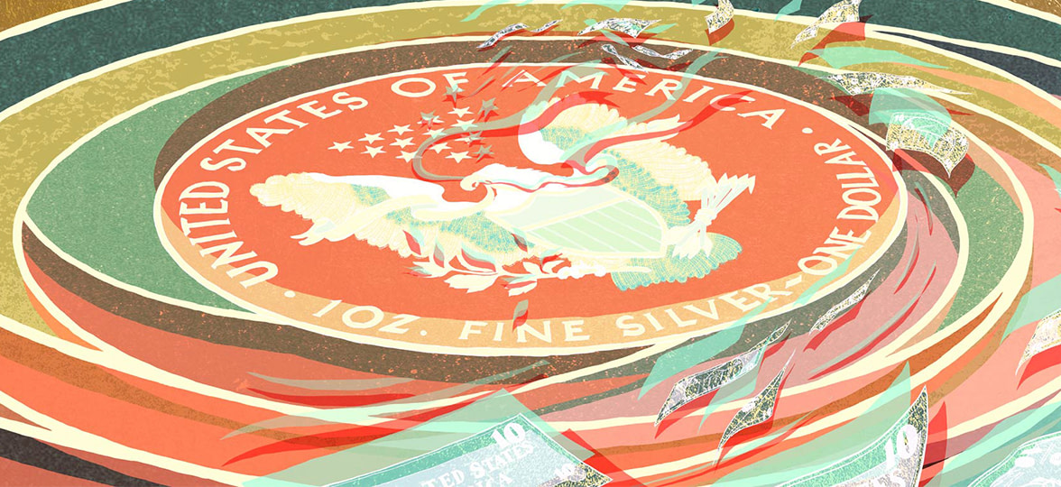
The topics she tackles are as varied and challenging as renewable energy, the works of Debussy, and motivation. She has also produced a graphic novel, Returning Home, exploring what is meant by ‘home,’ and inspired by Cat’s mixed-race heritage.
Cat’s work is built on in-depth knowledge of the history of illustration, and her influences include Japanese woodblock printing and the work of Norman Rockwell. From these foundations, Cat has developed a captivating style that’s completely her own.
As the host of Friday Night Sketch at The Design Museum on the subject of visual metaphor, we caught up with Cat to discuss how to build a solid client base, the art of maintaining originality, and the evolution of her artistic approach.
How did you start out as an illustrator?
I studied illustration at the Edinburgh College of Art (ECA), graduating in 2011. I began promoting my work during my final year, so by the time I graduated I hit the ground running.
At ECA, I had a part-time job as the Graduate Studio Assistant, which included teaching workshops. Next, I was an Artist in Residence, which was paid in free studio space and access to the facilities. So it was a pretty gradual transition from student to fully fledged illustrator.
What have been the biggest influences on your work?
At ECA, I was really into Ukiyo-e – Japanese woodblock printing – and the Surrealists, and would also look at as much contemporary illustration as possible. Having worked in art education, I had cultivated a good knowledge and understanding of the history of my discipline.
After graduating, I began looking into the roots of illustration, from Honore Daumier and Gustave Doré to more recent work by artists such as Norman Rockwell and E. H. Shepard. I also started reading more graphic novels.
As I grew more experienced, I began to distil exactly what I loved in illustration. The work I wanted to follow the most was very much about the concept: work which is just so damn clever, I look at it and think, ‘Wow! That’s so brilliant.’
Day to day, I try not to look at too much contemporary illustration, because I don’t want to be influenced. It’s important to know the roots of your discipline, but also to look away from external influences if you want to make work that’s truly your own.
How did you move towards using visual metaphor in your work?
It was gradual. In school, drawing things accurately was important to me, and having that background in precise drawing means I have quite a handy skill set now.
It became less important when I realized I was more concerned with how interesting my final piece of artwork was, rather than how accurately it depicted something – a lot of the work I love is not realistic at all.
What’s your process when responding to a brief?
Coming up with visual metaphors is partly down to the way you look at things. It’s important that I understand everything in an article I’m illustrating, which can mean doing a fair bit of research. Then I go through a process of idea generation, starting with mind-mapping and word association.
Say your brief is ‘eco-friendly.’ You might think of grass, then of things that aren’t eco-friendly, such as factories. That might lead to the thought, ‘Why don’t I draw a factory made of plants?’ and BOOM! There’s your first idea.
And that’s just the idea – there are so many ways of drawing it. The challenge is that you don’t want your image to be clichéd, but it also has to make sense to the viewer.
Some jobs are surprising, because the content seems dull – but then you find a visual solution that’s really enjoyable to work on. For each piece, I come up with as many concepts as possible, and choose the strongest. Then, I send at least three rough ideas over for each final illustration.
I draw the image out in pencil, then ink it up using brush pens, mapping nibs or brushes with Indian ink. I color everything digitally, using Photoshop and a Wacom Cintiq drawing tablet.. I see drawing roughs similar to composing music, while making the final artwork is like the performance.
My use of color is very intuitive – it just kind of happens. But it also massively affects the mood and impact of an illustration. Color is where the magic happens for me – it can bring a piece to life, and totally enhance the concept.
How did you break into editorial and build such an eclectic client base?
Working in editorial came the most naturally to me – I think it’s worth looking at what content you like to engage with the most, as that says something about what kind of work you will enjoy.
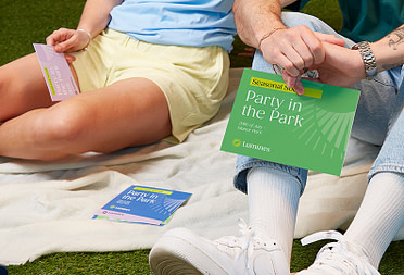
Self-promotion is where products like MOO’s are super useful. My methods have stayed the same – I research which publications I want to work with and who the Art Director is, then send them a Postcard with one of my illustrations, a bio and a link to my website.
I follow up with emails and phone calls – it’s a lot of work, and you can’t take it personally when people don’t respond to you. Everyone is busy, especially in editorial.
You might not get a job now, but in a few years time, when an art director sees you’re consistent, you’ll have earned a credible reputation.
Sometimes an Art Director is waiting for the right job to come up, or perhaps they’ll love your work, never reply to your emails, then give you a job five years later. You have to think about it as a long game.
What excited you about hosting the Friday Night Sketch on Visual Metaphor at The Design Museum?
It’s always exciting to be working with people who are engaged in the subject, which is what I loved about teaching.
People’s enthusiasm is a joyful thing to share, and everyone can be creative, no matter what their skill level at drawing.
How do you structure your work time?
For me to be able to work well, it’s important to be healthy, so I try to make sure I get a decent amount of sleep and go running a lot. I try not to work too late, but it happens – I’m also quite bad for working over the weekends.
My workspace is in my flat, and I’m quite a solitary person, so I can quite happily go for days without seeing anyone. That’s probably not very healthy, but it works for me.
What’s your favorite project to date?
Last year, I did a piece on Debussy for the New York Times. Any job about music is going to be fun, but I was also working with a really good art director – rather than giving me dimensions, he just let me make it whatever size and shape I wanted.
I was so happy with how the piece turned out, and it was my first job with the New York Times, so it was very special to me.
Make your mark with personalized Postcards
Keep in touch
Get design inspiration, business tips and special offers straight to your inbox with our MOOsletter, out every two weeks.


