Back in time: 5 eye-catching vintage-inspired designs
From retro stickers to vintage type, get inspired with 5 creatives who embraced vintage aesthetics.
The vintage trend is far from new – but a global pandemic has further reinforced our craving for those simpler times. Celebrating eras associated with authenticity, slow-living and free-spirited creativity, the popularity of retro aesthetics keeps on growing. Its influence on design is undeniable. Fashion, music, interior design… creatives are embracing nostalgia and adding their own modern twist, for designs that reflect the aspirations of our time.
Looking for some retro inspiration? From retro stickers to vintage type, get inspired with five brands and creatives who embraced vintage aesthetics.
Fig & Date: celebrating authenticity
Partners in life and work, Melissa and Rachel are the creative minds behind Fig & Date, an illustration studio specialising in pennant flags, prints and cards. Based in Portland, Oregon, the two illustrators and makers draw inspiration from their Pacific Northwest life, but also from their love of the beautiful imperfections that make handcrafted goods so unique. Hence their love of vintage aesthetics: “in the digital age, we find ourselves even more drawn to handmade items. We feel like they have a story in all their imperfections just like vintage items hint at their history.”
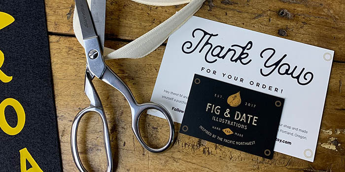
To provide their customers with a unique unboxing experience, Melissa and Rachel designed Business Cards and Thank You Cards to slip into every order. Their idea? Creating cards that would evoke the design of a pennant flag, with a matte finish for a more authentic feel (plus, their vintage logo is an absolute treat). They also left the back of their Thank You Cards unlaminated to add a personalised note. “Our favourite thing about our cards is that we can write handwritten notes for our customers. As a small business, it feels so good to have a personal touch to every order we receive. We also love the overall feel of them – the matte finish just makes it feel so smooth and a tad more unconventional than a glossy finish or even organic paper feel.”
Sad Girl: groovy goodness
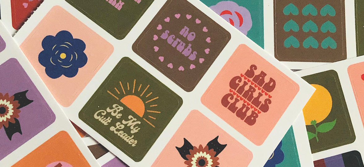
British artist Amy Cecilia Leigh describes her brand Sad Girl as a one stop shop for kink-friendly art, colourful floral prints and sassy feminist illustrations. With a keen eye for colours and a razor-sharp sense of humour, Amy creates bold illustrations which marry fun designs to important topics like feminism and mental health. Playing with typography and illustration in intentionally busy designs, her eclectic style aims to illustrate mental illness and societal issues. “When designing, I listen to a lot of music, podcasts and audiobooks on varying subjects including cats, politics, cults, feminism and true crime to name a few. I write down words or colours that spring to mind on pieces of paper or at the back of a notebook. How a song makes me feel or a phrase from a book can become the starting point for my designs.” Retro and vintage aesthetics are also a source of inspiration for the artist: “I am drawn to the vintage aesthetic because it is warm and bathed in yellows and oranges, every time I listen to something new it offers an escape to me, like being in an old film. You can go from seductive sadness to becoming wrapped in a warm romance.”
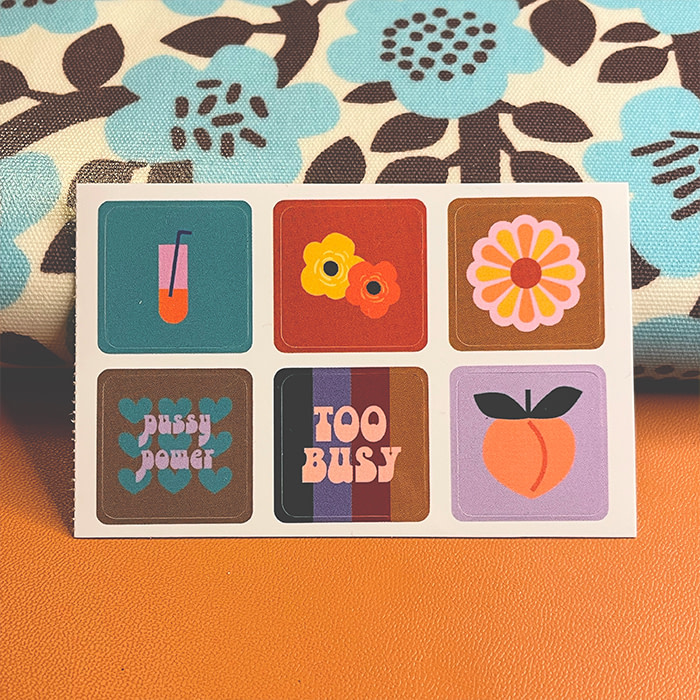
Amy made the best of MOO’s StickerBook with a range of quirky, colourful retro stickers with cute illustrations and sassy quotes in a funky vintage type. She believes Stickers are a great way to make art more accessible. “When I was younger and extremely broke, I would go to a lot of exhibitions and see so many beautiful pieces of art that I could never afford. Everyone should be able to experience and afford art in all of its forms! Surrounding yourself with art is so intrinsically linked to happiness and stickers are such a good way for people on a budget to purchase a piece of art! You can completely personalise your surroundings with stickers because they’re so small and versatile.”
Her own colourful Stickers perfectly found their place in her online shop – and personal life. “I decorate gift-wrapped presents with them, add them as extras in my Etsy shop orders, and now I even sell them as sheets due to their popularity. […] My favourite thing is that they take on a whole new life when sent to someone else! People generally put them on laptops and phones alongside other stickers which transforms them into their own works of art! It is about transforming everyday objects into things of joy, whether it is a motivational phrase or a picture of a cat!”
Abby Leighton: a journey back in time
Visual artist Abby Leighton lives in the red rocks of Utah, where she thrives on capturing the beauty and character of National Parks, the West, and nature as a whole. A creative at heart, she likes to explore these themes through illustration, but also graphic design and film photography. In March 2021, Abby gathered her vintage-inspired, illustrated maps of every single National Park in America in a unique book entirely written, illustrated and hand-lettered by her. Her nature illustrations and map designs are reminiscent of vintage travel guides, with a great instinct for colour, font and composition she elevates with her very own art style.
“Researching vintage postcards and maps from the 60s-80s really inspire me in my designs. There is a timeless feel to them, and they feel authentic, straight to the point, and handmade. Incorporating hand typography into my designs is really important to me as well because it ties the illustrations typography together. Older designs resonate with me because they don’t follow any trends and were designed with purpose. In the current world of low-cost and cheaply-made items, it’s important to me to draw inspiration from a time where everything was made to last – including the quality of my products.”
Abby uses MOO’s Soft Touch Postcards and premium matte Posters for her prints. “I love making my Postcards and prints bright, inviting, and approachable, but with a classic feel to them. I like them to not only be used as Postcards but also as little art prints that people can collect and use for decoration. Making them cohesive and having the ability to mix and match them is also super important to me!” It’s simple: we want them all.
BirdDog Partners: nostalgia in colours
Based in Colorado, creative director and designer Allison Bozeman specialises in branding, packaging, surface pattern and website design for – in her own words – outside-of-the-box makers, movers and shakers in the small biz universe. Inspired by her beloved dog, she founded BirdDog Partners, a creative agency that aims to be a brand’s best friend.
For Teaspoon Willie’s, Allison designed a series of colourful vintage-inspired patterns to illustrate how the brand’s Everything Sauce goes with… well, everything. Drawing inspiration from the brand’s quintessentially retro logo and their old-school American cartoon style, she created a set of inspiring compositions. “For the Teaspoon Willie’s cards, I had designed a series of patterns based on all of the recipes and foodie styles that [they] serve – meat lovers, vegans, vegetarians, sea-foodies and more! We wanted to infuse [the brand’s] timeless style of family home cooking, recipes, ingredients and how it all comes together in these cards.” Just like Teaspoon Willie’s signature sauce, these retro designs have a memorable quality. “My favourite thing is that the detail and mix-match patterns never allow them to become something someone tosses out. They tell a story and invite a conversation. They are memorabilia.”
Allison used the Printfinity option to translate the design concept into mouth-watering Business Cards with three “pick-your-flavour” styles and colours with a shiny Silver Foil accent to evoke the brand logo’s giant spoon design. “I wanted to offer multiple backs with these bright colourful patterns and also couldn’t resist adding a nod to the silver spoon with the silver foil option. The smooth velvety texture of MOO’s signature card stock is a bonus too – like a great sauce, no?!”
Studio Retrospective: wavy 70s
Studio Retrospective founder Eva Berthière is nothing if not passionate about retro aesthetics and future-minded sustainability. The French fashion history-lover thrives on hunting hidden treasures and uncovering the history of the garments she curates for her vintage clothing shop – with a mix of French flair and British exuberance. While craftsmanship and historical value are close to her heart, sustainability is also a key element for Eva. She believes that second-hand clothing is the future of fashion. To her, vintage fashion is a way to express our creativity through fashion in a responsible way. What she loves most about it? “Life shouldn’t be boring and it simply can’t be with vintage aesthetics – it brings your inner free-spirited child out in creative and merry fashion. The bold, joyous, sunny mix of colours and patterns – psychedelic, floral, geometrical…– simply makes me feel joyful and alive.”
Eva has a soft spot for the small details that make all the difference. That’s why she designed Round Stickers and Square Postcards with her wavy vintage logo to include in every order. “My Cards and Stickers are the perfect way to express the personality of my shop (and my own) through the handwritten notes I can write at the back of the thank you card. A personal touch that can be missing from digital shopping and that reminds you there are individuals behind the clothes – buying from a small business owner is a more intimate, human experience than buying from a big online retailer.” Inspired by one of her favourite vintage 1970s jumpers, she combined a wavy design and a retro palette with a bold Serif font to convey her love for retro and vintage aesthetics in a few lines. For her thank you Postcards, she used the matte, textured Luxe paper to add handwritten notes for each customer, with a bright orange seam to match the main design.
Give your retro designs an authentic, quality feel with MOO’s print materials.
Keep in touch
Get design inspiration, business tips and special offers straight to your inbox with our MOOsletter, out every two weeks.


