4 photographer Business Cards that deserve to be framed
Get inspired with four photographers whose Business Cards are worth a shot.

To find your audience as a photographer, business cards are a must. But if a picture is worth a thousand words, how do you convey a thousand pictures? As a photographer, showing your entire portfolio in one tiny rectangle of paper can be a challenge.
Our photographer community rose to it. Get inspired with four photographers whose Business Cards are worth a shot.
Emma Ogilvie: meno mosso
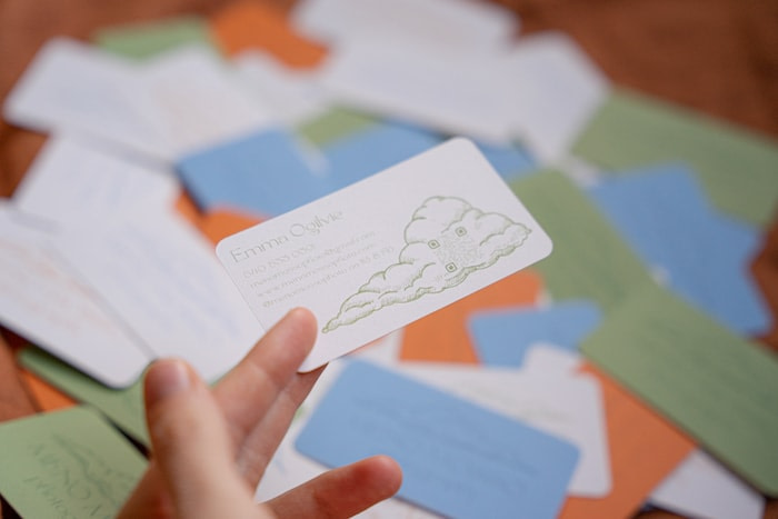
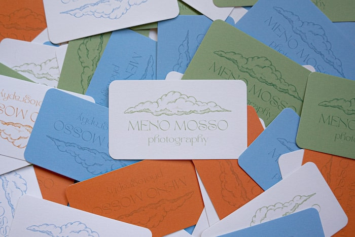
Emma Ogilvie is the eye behind Meno Mosso Photography. Based in Winchester, Virginia, she travels across the state to capture moments suspended in time. To reflect her photography, her Business Card designs were created with the same thoughtful and intentional approach.
“In musical notation, meno mosso directs the musician to move less quickly. I believe photography helps us to do the same, and I wanted my design to speak to that. I think the cloud illustration, hand-drawn by Valerie Bodnar, really conveys the feeling behind my philosophy. There’s nothing that gets you situated in the present moment like watching a cloud slowly drift across the sky!”
Her choice of font echoed this sense of spirituality and mindfulness. “I went with something a little magical to offset the corporate feeling of handing someone a business card. I also tucked a cute and functional QR code into a cloud on the back of the card, which adds an interactive element.” Emma’s head might be in the stars, but her design is very much down to earth.
Colour-wise, she took full advantage of the Printfinity option by printing her cards in various soothing colours. “I love how many colours I was able to use! It’s fun to play the game of gauging which card will have the best effect on the person I’m handing it to.”
She chose the recycled Cotton paper because it aligned with her values – but also to highlight the softness of the design. “It was the most sustainable option and I’m all for reducing waste in the fashion industry! Plus, the texture of the paper, combined with the rounded corner finish, really lent itself to the soft and magical look I wanted.”
Tillmann Lenz: small man in a big world
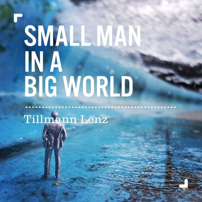
Tillmann Lenz is a British architect and artist. With Small Man in a Big World, he developed an ongoing macro-photography series discovering the world from a fresh perspective – that of a 2-inch tall man.
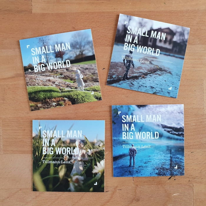
He chose a square Business Card to mirror his Instagram series, using a MOO template to make the design even easier. “The square format appealed to me as it fitted my photography project so well and looks a bit different. I liked them to be double-sided, with a punchy image and name on one side and the details on the other.”
The cards, originally created to be shared at exhibitions, soon found an extra purpose. “[I’ve] also used them for my architectural practice as they look really attractive and are always a good conversation starter.”
With more than 700 posts, being able to showcase a few of his favourites was a plus. “I loved the fact that I could put a number of different images on the design, so I have a selection of cards that look the same in style but have different images on the front – I currently have four.”
Sean Scheidt: precious nostalgia
Based in Los Angeles, Sean Scheidt is an editorial fashion, lifestyle and portrait photographer. The time came for his to redesign his photographer business cards when he relocated to LA from Baltimore in 2020.
“At that point, I had the same branding for twelve or so years. It no longer reflected the work I was doing. So I asked my very talented girlfriend [Sophie Nolan] if she would work with me on a full rebrand for my business. This included everything from cards to website to Letterhead and a style guide. The works! And yes, while I did get a boyfriend discount, I did pay for this! Haha.“ We can’t provide the designer girlfriend, but our templates are made with love (not the same, we know).
Sean had a clear idea of the direction he wanted to follow. “There has always been a bit of nostalgia in my photography and my house is full of mid-century design elements and family heirlooms. One of those was a collection of Agatha Christie dime novels that my grandfather collected. Something about the design sensibilities, colours, tones and overall vibe struck a chord with me. I also had my start in the fine art world as a painter so I wanted that to be reflected as well.”
Sophie got to work and they soon selected a design to reflect Sean’s visual universe. “This process was a lot of fun for me and really helped refine what I was going for and ensure that the design and overall style supported the work I was making. I think we landed in a really nice place. I am awfully proud of the work she did.”
They picked Gold Foil Business Cards because of their opulent and tactile experience. “They just feel nice. Affordable without feeling cheap. The gold foil was also crucial for the design to be fully expressed.”
Something about having a tangible object that is also designed well means you will be remembered
For Sean, having a business card is key to growing his audience as an artist. “More than ever our lives are lived out online. We scan QR codes and take photos of things or go directly to Instagram. Having cards these days (especially in my field) really helps you stand out. Something about having a tangible object that is also designed well means you will be remembered. And since my work is freelance, I am all about being “front of mind” to any potential clients.”
“These cards are ALWAYS remarked upon when I hand them out. Cards are also great to facilitate a personal connection. And at the end of the day, we are all just people working together. Everything is about connection.”
Laulinea: the power of authenticity
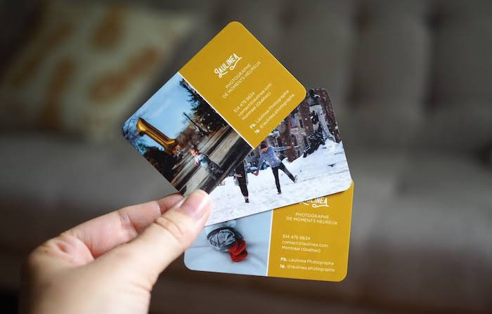
Laurène is a French photographer, graphic designer and blogger based in Montreal. Under the alias Laulinea, she specialises in maternity and family lifestyle photography. Her work’s about those natural, authentic moments in life, big or small.
She picked glossy Business Cards with rounded corners to promote her photography. “The rounded corners bring a softness that evokes the themes of femininity and maternity you find in my work. It’s also a way to stand out from more traditional cards. The gloss finish brings a light that’s quite representative of my work.”
For her Business Card design, she wanted something simple and powerful that would make her photos pop. “I used two pictures to show my range. The text here is secondary but it needed to be readable. That’s why I chose a plain colour background and a simple, clear font. Mustard yellow is part of my colour palette for its warm and natural yet powerful feel.”
Her favourite part? “Everything! I loved the fact I could add different designs to bring variety. The printing quality amazed me, from the pictures to the colours and the text (despite its size). Even the cards at the bottom of my bag are still in good shape!”
Like these photographers’ Business Card ideas? Create your own and give more exposure to your photography with Business Card designs that pack a punch.
October 2022 update: This article references the way we used to make Cotton Business Cards. We now use a different process.
Keep in touch
Get design inspiration, business tips and special offers straight to your inbox with our MOOsletter, out every two weeks.
