Olympic level branding: lessons from iconic sports design
Infuse your brand with the dynamic sporting spirit.
-
 The MOO Team
Sport unites and inspires people across the globe, transcending borders and cultures. And nowhere is this unity and energy more evident than in the Olympic Games.
It’s little wonder that Olympic branding is often so innovative and memorable. From iconic logos and striking typography to sports kits that could easily make their way onto a runway, sports design is breaking new ground and setting trends.
Read on to discover some of our favourite Olympic designs and see how you can infuse your branding with that same dynamic sporting spirit.
The Mongolia kit: Celebrate your authenticity
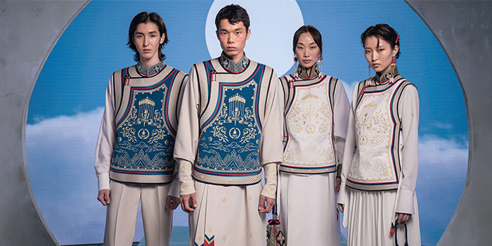
Sport meets haute couture in the Mongolian 2024 kit. Designers Michel and Amazonka took an innovative approach to traditional sportswear. They paired a white shirt with trousers, a skirt, and gold-embroidered tunics. By delving into Mongolia’s history and traditions, Michel and Amazonka crafted an authentic design that evokes national pride.
Mongolia’s striking design is an excellent example of using your differences to create something unique. Your Business Card—the most important thing in your marketing toolbox—is a chance to highlight your individuality. Bring in authentic brand elements that will instantly make you memorable to your customers.
Mexico ’68 logo: Incorporate cultural elements
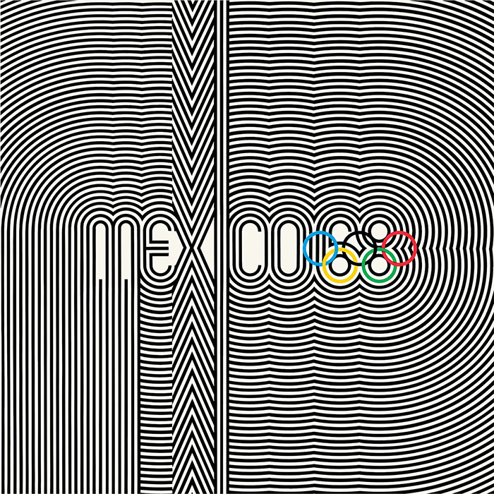
In 1968, Pedro Ramirez Vazquez and his team designed the emblem for the Mexico City Olympics. They ingeniously combined patterns from the Huichol, an Indigenous Mexican culture, with the five Olympic rings and the year. The design also embraced the psychedelic art movement which was something of a cultural phenomenon. The bold design captivated the world, portraying Mexico as a modern nation with a rich heritage. It also set a new standard by tying the Olympic Games to its host country.
Consider blending cultural elements with contemporary design to craft a distinctive brand identity. For example, you might create impactful Branded Merchandise for a major event, seamlessly integrating cultural themes with your brand to create something truly unforgettable.
Rio 2016 logo: Say it with type
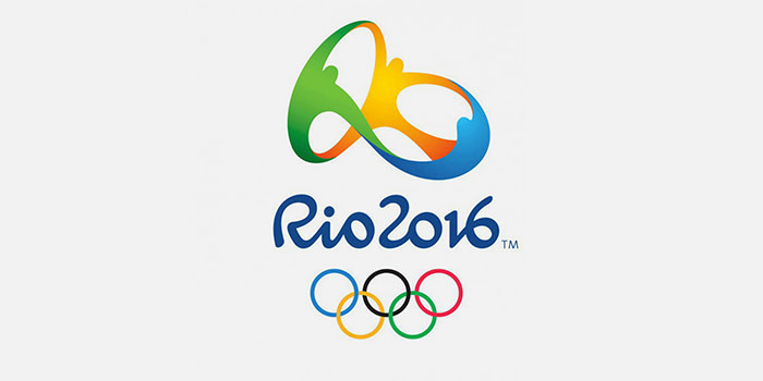
Before the 2016 Olympic Games, Rio de Janeiro’s reputation was marred by crime and corruption. Designer Frederico Gelli sought to change this with a logo that captured Rio’s vibrant spirit. His design featured three figures in Olympic colours holding hands in an abstract infinity symbol, symbolizing harmony and unity. Dalton Maag’s soft, curved typeface added warmth and approachability. The result was a logo that redefined Rio as a city of inclusivity.
Typography is key to shaping brand perception. By selecting typefaces that complement your design’s message and tone, you can enhance the emotional impact of your brand identity. For instance, using distinct typefaces on branded Water Bottles can effectively showcase your brand’s message no matter where you are.
London 2012 poster: Keep it playful
Rachel Whiteread brought a fresh perspective to the 2012 London Olympics with her innovative poster design, using bottle-print art. Her approach featured overlapping circles in Olympic colours, offering an edgy twist on the traditional Olympic logo. Resembling the rings left by glasses or bottles on a table, the design symbolized social gatherings and connections. The poster effectively pushes the themes of unity and interconnectedness in a playful and fresh way.
Don’t underestimate the power of play when delivering impactful messages. Postcards are an excellent way to infuse your brand with personality. Using fun visuals as inserts in packaging, for example, can create delight. Stickers are another great way to add a playful touch to your brand identity.
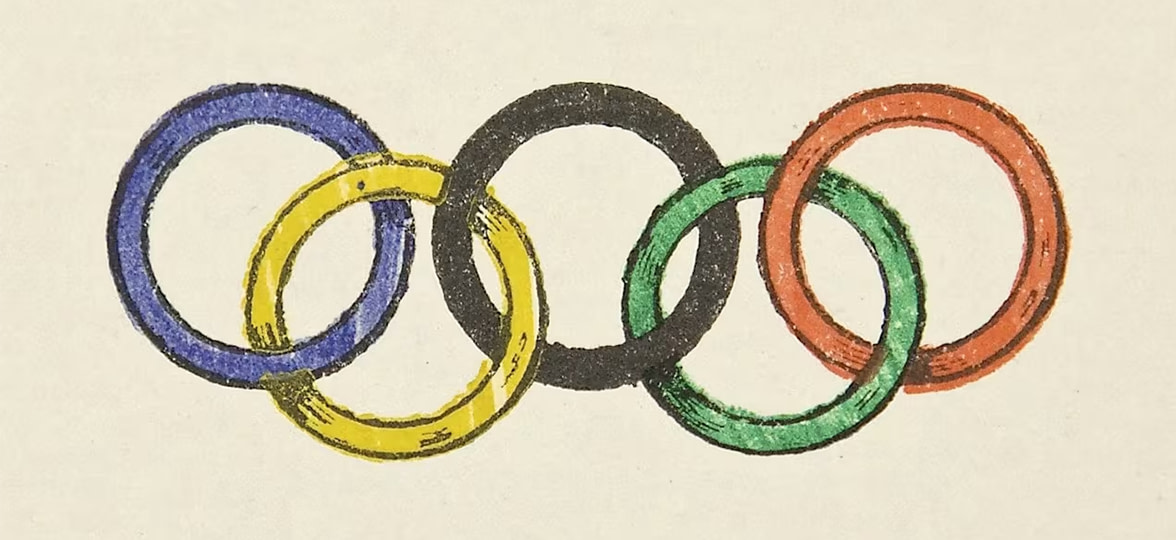
The Olympic Rings: The power of simplicity
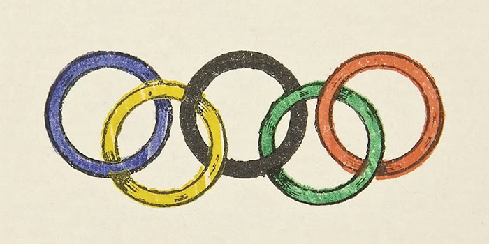
You can’t have the Olympic Games without the Olympic rings. Designed by Pierre de Coubertin’s in 1913, the five multi-coloured rings represent the five continents: blue for Europe, yellow for Asia, black for Africa, green for Australia, and red for America. The interlacing design pushes the idea of unity and connection further. Clever, eh? Over a hundred years later, the Olympic logo has barely changed.
The enduring legacy of the Olympic rings demonstrates how simple designs can stand the test of time. When it comes to designing your Marketing Materials, take a leaf out of Coubertin’s book and don’t overcomplicate it. Opt for a high-quality design that communicates a clear, single message.
Ready to go for gold?
With professional design and premium print, MOO can make your brand a champion. Get bespoke support with our MOO Business Services. Or, fill in this form, and one of our team members will be in touch.
Keep in touch
Get design inspiration, business tips and special offers straight to your inbox with our MOOsletter, out every two weeks.
Keep in touch
Get design inspiration, business tips and special offers straight to your inbox with our MOOsletter, out every two weeks.


