Five fresh ways to elevate your Flyers
Discover how you can elevate your Flyer designs to boost your business.

Flyers are a great way to get the word out about what your brand has to offer. Whether you’re presenting at a trade show, launching a product or advertising a store opening – with a Flyer, you can share your message in style.
Big, small and everything in between
Since we’ve mentioned Flyers are a great way to elevate your brand, here’s how to create your own, size-wise. There are five options available: A6, Square, DL, A5 and A4. Our smallest version is still capable of making a big impact. Opt for this if you’re not adding much text, or need a package insert or event handout.
Square Flyers are a great alternative way to draw attention, whereas our DL flyers are obviously best for menus and price lists. They also lend themselves to event programs. But if you’ve got more to shout about, take a look at our A5 and A4 options.

Be bold with your design
Consider the paper
It’s a great way to first get yourself noticed, so don’t overlook this. Think of it as the foundation of your design. Our Premium paper is glossy and offers attention-grabbing shine to your well-crafted design. It’s especially good if you’re adding photos, as it’s a perfect way to make them pop. Alternatively, there’s matte, which is smooth with a natural finish. It’s the perfect choice for a smart and understated design. And finally, we have the Pearlescent paper stock, which offers a dramatic metallic finish. It’s a little bit weightier and is the kind of thing you want to keep ahold of.
What font to use
Ultimately, when it comes to choosing font, legibility should be the first thing to consider. Avoid swirly, intricate fonts for your contact details and important information. Instead, opt for something minimal like sans serif fonts which are more readable. Another thing is keeping it consistent with the rest of your brand. If you’re already using a specific font on your website and social media, it may be best to use the same on marketing materials for a consistent look.
Colour choices
The palette you choose should reflect your brand and whatever it is you’re advertising. Additionally, you should consider whether you want to focus on the text (in which case, keep the design and colour simple) or your product and services (in which case, choose colours that complement).

Portrait vs landscape
Lastly, seeing as Flyers can vary in size, you should also think about whether to go portrait or landscape. Should it be top-to-bottom or side-to-side – it’s completely up to you. A portrait layout is the most popular, but don’t let convention stop you from doing it landscape style. It’s easy enough to divide the content down the page with sub-headings and sections. This style works especially well if you’ve got more than one thing to promote.
Got a lot to say?
Give more information to your customers to take away by summarising services, propositions and offers. Our biggest Flyers, A4, give you plenty of room to introduce your brand or any new offering. They’re great for pinning to shop windows or notice boards. Plus, with bigger sizes, you can add larger images and really show off your product details or your design skills.

Add a QR code for simplicity
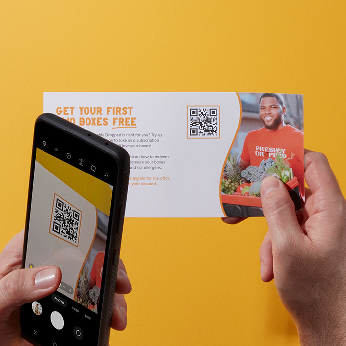
Even if you’re choosing the biggest size available – you could still make use of a QR code. Adding that small black and white square is a great hands-free way to promote almost anything. Use a QR code to promote your website. If you’d prefer to keep your message nice and simple or focus on design rather than text, then you can add a code directing customers to your website to learn more about your brand.
Alternatively, you could use a QR code to link to your portfolio – whether that be a full-on website or a social platform. Create a stand-out Flyer and experiment with paper stocks and colour to represent your brand. Then give potential clients and customers the opportunity to see more of your work online.
Add more of your brand with Printfinity
Our Printfinity feature gives you a whole new way to design your marketing materials. We’ve removed the restrictions between what your business offers and what you can show to customers. So when it comes to showcasing your entire range of products or services, you can do this, at no extra cost.

So next time you’re in need of some eye-catching marketing materials, take a look at our Flyers. And if you’re looking for a helping hand with your next paper project, simply fill in our form below and a MOO Expert will be in touch to get you started.
Keep in touch
Get design inspiration, business tips and special offers straight to your inbox with our MOOsletter, out every two weeks.


